viz.
Visual Rhetoric - Visual Culture - Pedagogy
Site informationRecent Blog Posts
|
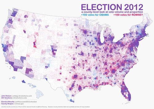
MappingHow USA Really Voted on November 6
Submitted by Chris Ortiz y P... on Sat, 2012-11-17 10:10
Image Credit: IDV Solutions What a wonderful map! This IS the popular vote on November 6, 2012. John Nelson gave us this map, and we thank him for it. It's called a "pointillist map:" one blue dot for every 100 votes for President Obama, randomly distributed in the county in which the votes were cast. One red dot for every 100 votes for Mr. Romney. You've heard of purple states? Well here's our purple country. Click the link on the image credit to find a large and hi-def version of this map. Then meet me back here, won't you?
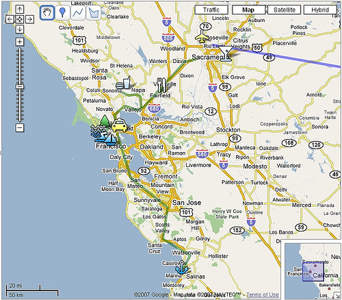
Google Maps Assignment by Sean McCarthy
Image Credit: billolen For a handout, download the PDF document outlining this assignment. Objectives: In this assignment, students are asked to create a GoogleMap to map a topic. GoogleMaps allows students to create their own journeys and annotate place markers with text and multimedia content; they can upload their own photos to their map, link to YouTube clips, write text and link to blogs and other kinds of websites. This free service encourages them to build maps that tell stories in a visually interesting, geographically situated way, and all sorts of people, from news agencies to public transportation services, are now using maps to create new kinds of content (commonly called 'mashups'). GoogleMaps shows how fun and creative writing on the web can really be. With no experience and lots of imagination students can join the most creative people currently delivering content on the web. In this assignment students will literally "map" a topic of their own choosing that relates to globalization. In other words, they are going to use the multimedia environment of GoogleMaps to tell their story and present their research to the rest of the class (and the rest of the world, if they wish!). Materials/Equipment: Internet access and a Google Account. Preparation: Students need to be taught how to navigate GoogleMaps. Fortunately, GoogleMaps are really easy to use. These introductory videos will show you the basics. Here’s the page that gives you step-by-step instructions on how to build your map. This YouTube video shows you how to create interactive place markers. Finally, Google Maps Mania is a great blog that shows how people are using GoogleMaps around the world. It provides links to hundreds of maps and is a great place to start thinking about your own map. Procedure: Midterm maps due: week 10/28 Final Map Due: 12/4 Accompanying Paper: due 12/4 Assignment Specifics: The map will be evaluated as a Learning Record work sample. So, be sure to make observations about what you are learning as you are creating your map and use the work samples as a way of building your research. A draft of the map is due the week of 10/28, when we will spend the week on presentations of your maps. The final map is due the last day of class as a work sample in your LR. In addition, you need to produce a two-page, single-spaced explanation of your choices for the map. In this short paper you will explain the idea behind the map—the intended audience, the choice of sources, why you chose that particular layout. etc. My criteria for assessing your map are simple: how well do you use the map technology? How clear is the story you are trying to tell? How do you balance writing in the map with multimedia content? Will this map be useful and legible for your defined audience? Will they understand what this map is about without having been in this class? There are a number of ways you can fill in your map. It must have at least 8 placemarkers that contain text, and some sort of reference to other multimedia resources (photos, hyperlinks, YouTube clips etc). The writing must by your own, though you obviously can use links to other text, audio and visual material to help tell your story. Part of the skill you will develop will be to decide what information to write into the placemarker and what you will leave to your hyperlinked sources. For example, how well can you tell the story within your map without forcing your audience to jump to other websites to fill in the gaps? These are the kinds of important choices you must make. The success of your map will depend on the clarity of your writing, what sources you use and how you incorporate them, and the overall coherence of the project (in other words, can the reader easily understand the whole idea behind the map?). You will need to do some research, but that research could include your own photographs (or photos you find on the web); your own interview or podcast (or one you find on the web), a really cool YouTube clip, or an informative website or blog. Remember, your GoogleMap and midterm paper can be on the same topic, so research for the map can count as an opportunity to develop your research for your midterm paper. The only real rules are that the map must in some way relate to the ideas we are talking about in class. It must be informative (in other words, it shows research) and there must be writing to assess. DON’T present me with just a bunch of photos or hyperlinks; it’s how you write about them that counts. Presentations will be on the week of 10/28. The feedback you get from the class during these presentations you will be able to clarify your ideas and build a better map. After the presentations you will buddy with two other classmates. For the rest of the semester, you will be helping each other evaluate your maps using the map rating function built into GoogleMaps. Critical Cartography: Aram Bartholl's "Map"
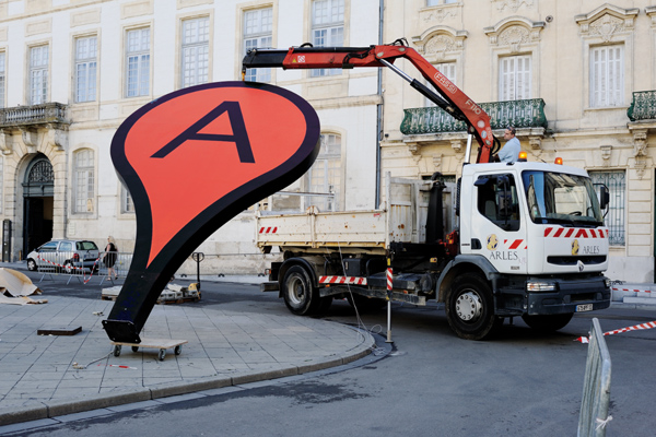
Submitted by Lisa Gulesserian on Thu, 2011-09-22 08:00
Image credit: Aram Bartholl's "Map" Google Maps is a godsend—in our daily lives, we use the site to find a new place to live, track the settings of a public controversy, catch lawbreakers in the act, and claim land that’s been long-contested. Border scuffles and all, Google Maps is helping us reimagine the terrains, cities, and spaces of the real world. It was only a matter of time before we witnessed the melding of Google Maps virtual and Real World spatial. That time is now: Berlin-based artist Aram Bartholl has spent the last five years working on a project that brings Google Maps’ digital location markers into real city spaces. His installations in different cities in Europe and Asia—all entitled “Map”—ask us to question the lines between real and virtual, center and periphery.
Tags:
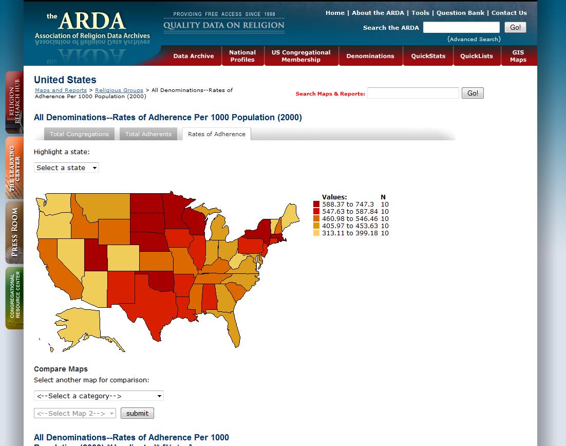
Mapping Religious Adherence: Association of Religion Data Archives
Submitted by ladysquires on Sun, 2011-02-06 20:45
(Image Credits: Association of Religion Data Archives) What do people mean when they say that the United States is a religious nation, or even a Christian nation? The Association of Religion Data Archives (ARDA) compiles data taken from census records and surveys to provide comprehensive information on expressions of faith throughout the nation. Of particular interest to this blog is the impressive interactive map database that allows you to choose and compare data sets in order to gain specific information about rates of adherence, denominational affiliation, and demographics. I have used these in my Literature and Religion class to help students begin to think about the relationship between faith and other socio-cultural forces, such as immigration patterns and socio-economic changes in a region.
Report from the Classroom, Part 2
Submitted by Laura T. Smith on Mon, 2010-04-12 22:48
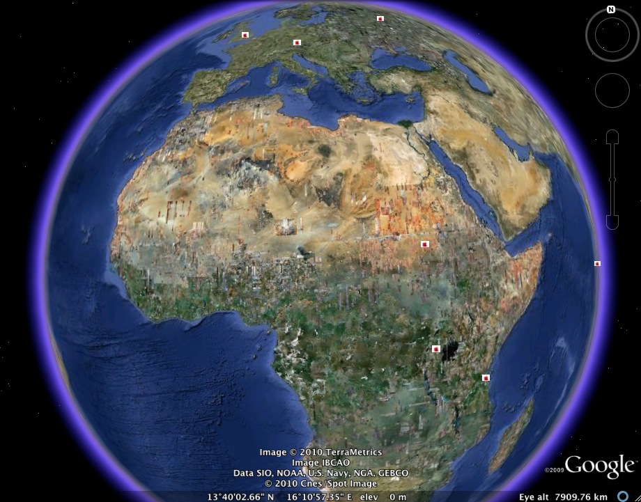
(Image credit: Google Earth map created by Smith's RHE 306) Caroline and I completed our Food Geographies Collaborative Writing Workshop last week. My students decided to keep their class map broad, not restricting it to Austin, to Texas, or to the United States. As a result, the geographies they trace are provocative, but also somewhat diffuse. That is, we might have gotten better results by densely mapping a limited area, but patterns emerge on our worldwide map that would not otherwise have been visible. While many students chose to map sites in the Austin area or the United States, the above map shows the efforts of two students who worked on mapping some non-U.S. sites, including major World Food Program sites, fast food locations in developing counties, and key sugar-producing sites. More detail on these sites and others, after the jump. Taco Geography
Submitted by Laura T. Smith on Mon, 2010-03-29 20:03
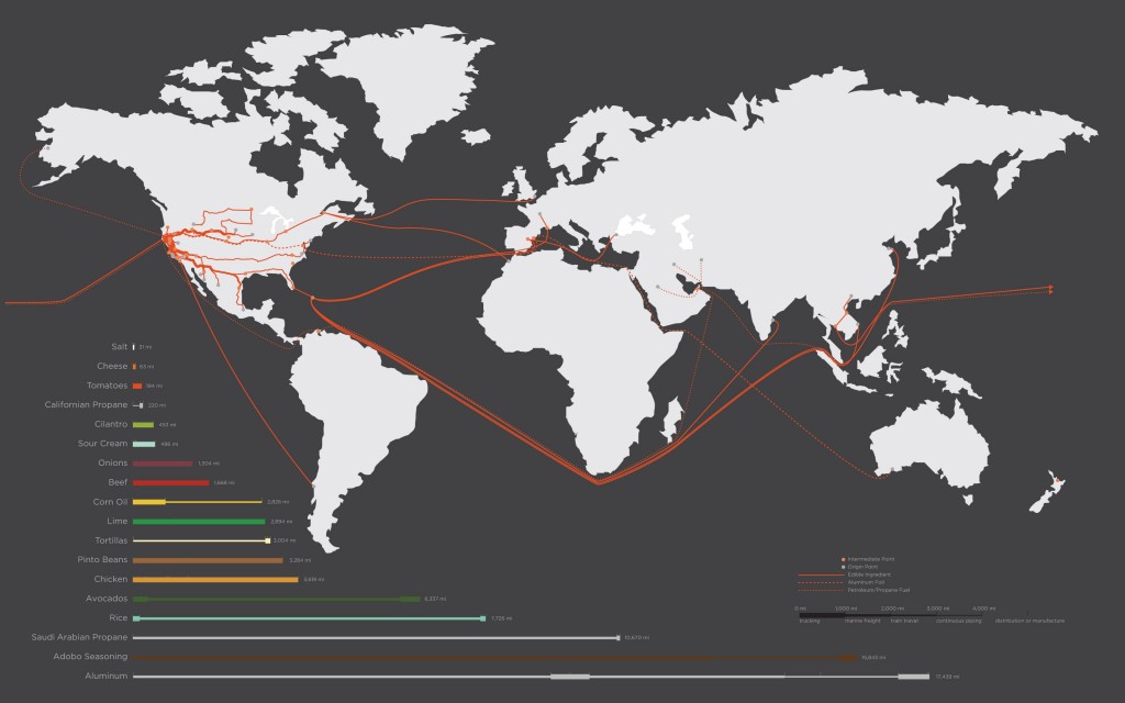
The folks over at Good Blog have published early results from a California College of the Arts assignment that took place in a landscape architecture class. Like a lot of classes here at UT, this class was asked to analyze the “tacoshed” for a single taco bought in San Francisco’s Mission District, from Juan’s Taco Truck. “Tacoshed” refers to the “geographical boundaries of a taco’s origins.” Because the project was a conducted by landscape architecture as well as art and design students, the presentation of results was a crucial part of the analysis, and in this case, the researchers collaboratively constructed the above map, visually charting the provenance a single taco. Google Earth Pedagogies: Beyond “That’s So Cool”
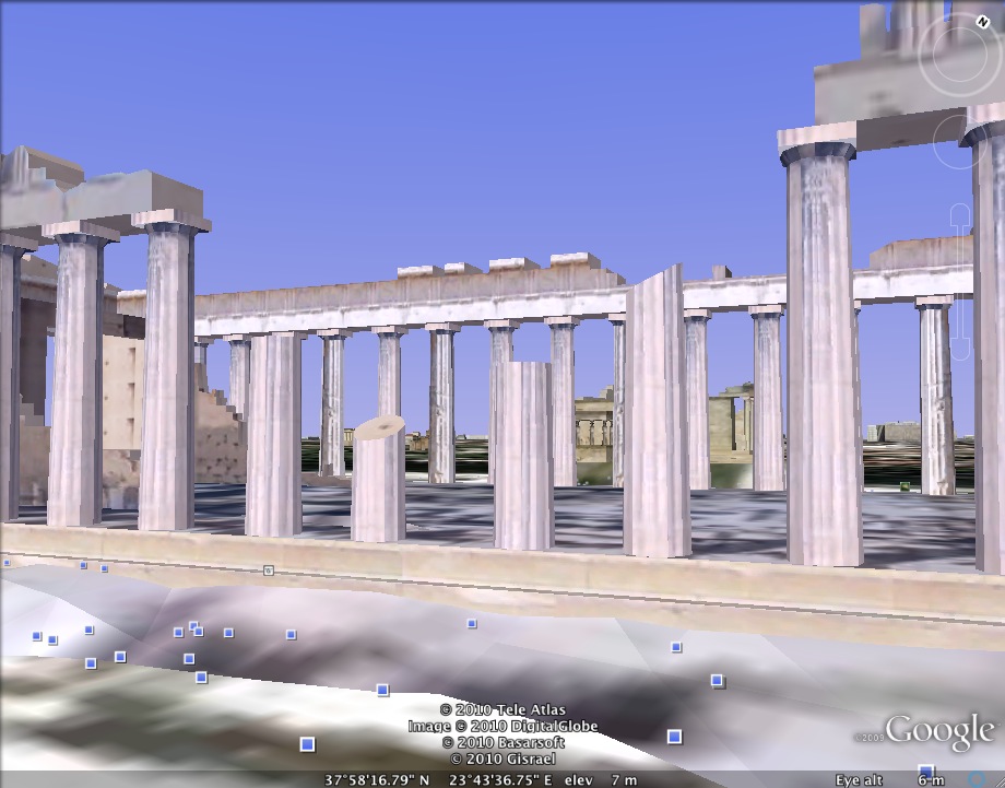
Submitted by Laura T. Smith on Mon, 2010-02-22 13:54
(Image credit: Image capture of the Parthenon in Athens, Greece from Google Earth) A fellow graduate student recently mentioned to me that his
rhetoric professor had used Google Maps to show classical Athens to the class. He told me, “I kept thinking how much
cooler it would have been if we were looking at it in Google Earth, walking
around down there in street view.” Google Earth Pedagogies: A Survey of Pedagogical Applications
Submitted by Laura T. Smith on Mon, 2010-02-15 11:33
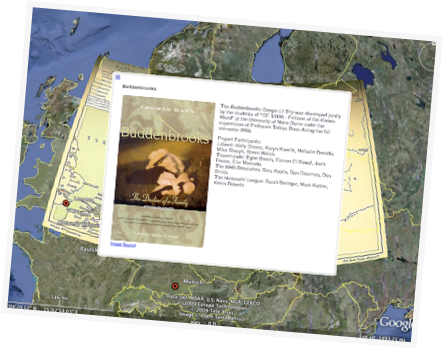
(Image Credit: Google LitTrips) As I’ve been previewing Google Earth educational applications on the web, I’ve noticed that while many disciplines (science, geography, history) are using Google Earth to engage students and invite them to create within the software, applications for the English classroom (at least those that are featured and discussed on the web) overwhelmingly take the form of teacher-made presentations. I imagine that this tendency speaks to an ongoing conservatism about the design of writing assignments, a desire to retain the five-page paper as the product of the literature and writing classroom.
Tags:
|
|
Recent comments
2 years 29 weeks ago
2 years 44 weeks ago
2 years 44 weeks ago
2 years 50 weeks ago
3 years 4 weeks ago
3 years 4 weeks ago
3 years 4 weeks ago
3 years 6 weeks ago
3 years 6 weeks ago
3 years 6 weeks ago