viz.
Visual Rhetoric - Visual Culture - Pedagogy
Site informationRecent Blog Posts
|
VisualizationVizualize Your Health!*
Submitted by Jenn Shapland on Thu, 2013-11-21 14:28
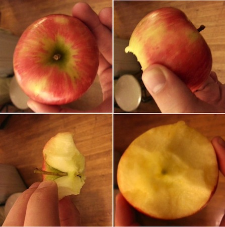
Image from "Apple Cores Are a Myth" on www.theatlantic.com One of my favorite things about yoga class is when the instructor, Iva, talks about how the various poses transform the inside of the body. In butterfly pose, she tells you about the rejuvenation of your spleen, kidney, and stomach meridians (i.e. channels of energy that run through the body according to Ayurveda). When you find yourself in a handstand, and it feels for a few seconds like floating, it’s probably because it’s one of the only times your organs get to hang upside down and all the blood in your body can recirculate. Twisting, as many a hungover yogi will know, detoxifies your body and wrings out your organs. Yoga instructors say these same things over and over, and after practicing for awhile, it’s hard not to believe them.
We're Watching You - Google Analytics and viz. Readership
Submitted by Cate Blouke on Thu, 2011-05-05 18:34
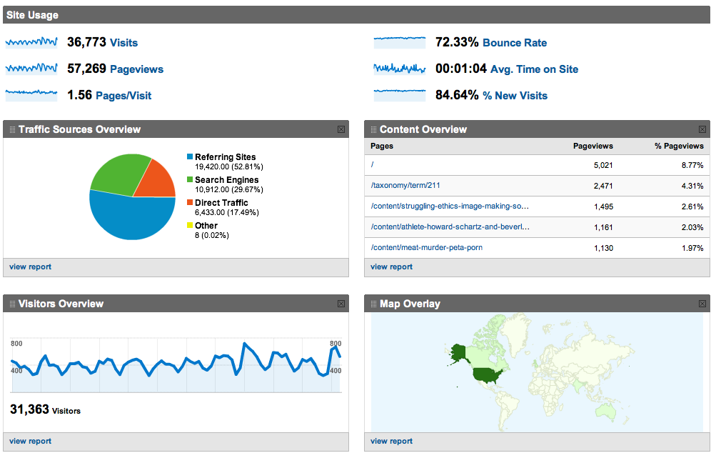
Screen Shot of Google Analytics dashboard view for viz. Earlier this semester, we here at viz. decided it might be nice to get a better sense of who we were talking to. As good rhetoricians, we felt it might be pertinent to know more about our audience. So we installed the handy-dandy (free) Google Analytics tool for tracking all sorts of information about our readership. The results have been surprising at times, reassuring on the whole, and ultimately quite useful for thinking about how better to serve you, our readers. The following is a discussion of both Google Analytics itself and the trends we've noticed on our site over the past few months. Visual Budget
Submitted by ebfrye on Wed, 2011-03-16 11:31
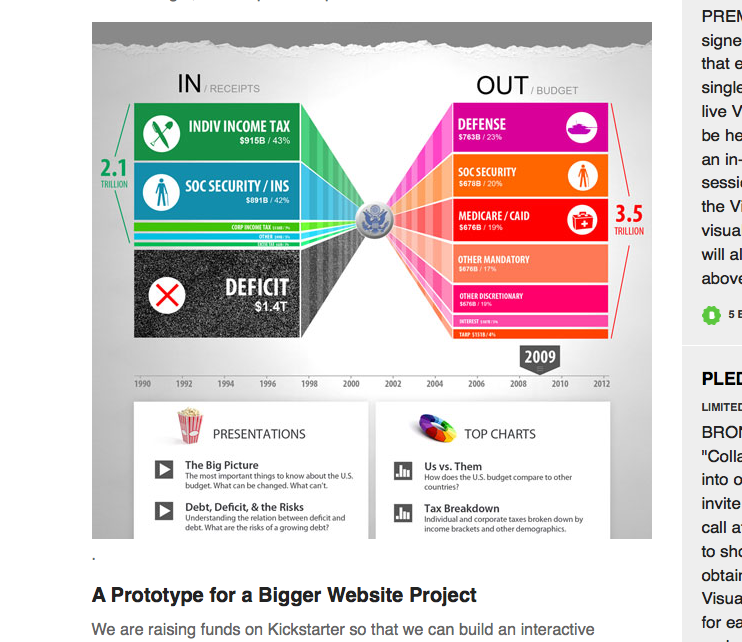
Image Credit: screenshot of Visual Budget, kickstarter.com Visualizations are a necessary part of the way the media interprets government spending for the average viewer. Those of us who are not math whizzes, who may have trouble keeping our own accounts, find a simple graph or pie chart to be a useful aid. However, those representations often present an oversimplified view. Enter Visual Budget, a "cutting-edge data-visualization web site" that attempts to explain the nuances of government spending to the common citizen. Mapping Religious Adherence: Association of Religion Data Archives
Submitted by ladysquires on Sun, 2011-02-06 20:45
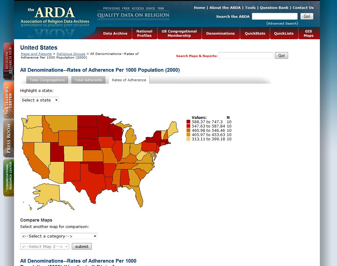
(Image Credits: Association of Religion Data Archives) What do people mean when they say that the United States is a religious nation, or even a Christian nation? The Association of Religion Data Archives (ARDA) compiles data taken from census records and surveys to provide comprehensive information on expressions of faith throughout the nation. Of particular interest to this blog is the impressive interactive map database that allows you to choose and compare data sets in order to gain specific information about rates of adherence, denominational affiliation, and demographics. I have used these in my Literature and Religion class to help students begin to think about the relationship between faith and other socio-cultural forces, such as immigration patterns and socio-economic changes in a region.
Peripheral Vision
Submitted by emcg on Wed, 2010-11-17 22:28
Image Credit: Drew Berry/The Walter and Eliza Hall Institute of Medical Research Via The New York Times On Monday, the science writer Jonah Lehrer, author of Proust Was a Neuroscientist and How We Decide, skyped into my “Literature and Biology” classroom. During his virtual visit, Lehrer shared many smart, engaging ideas (bonus: he’s also rather comely!). However, the take-away was that innovation often comes from those on the periphery of a field, which makes for a compelling, practical reason for openness and conversation across disciplines. Better Living Through Visualization
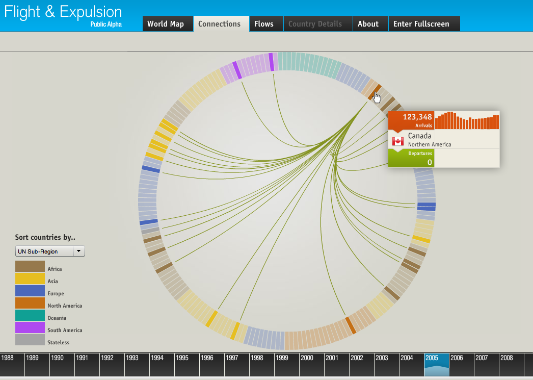
Submitted by emcg on Wed, 2010-10-20 18:24
Image Credit: Christian Behrens, "Flight & Expulsion" On the heels of touring the Texas Advanced Computing Center’s visualization lab, I thought I’d highlight a new social-media platform for data visualization. Launched earlier this month by GE and SEED Media Group, visualizing.org is a collaborative space for visualizing complex issues like climate change, human migration, and food insecurity. Visualization, Texas-Sized
Submitted by emcg on Wed, 2010-10-13 16:17
Image Credit: TACC H / T to Scott Nelson In my very first post for viz., I marveled at Ben Fry’s visualization tool The Preservation of Favoured Traces, which helps us to visualize Darwin’s revision of Origin of Species over six editions. With a background in computer science, statistics, and graphic design, Fry had managed to approach the problem of visualizing textual history with striking economy and elegance. In my post, I wondered about the unorthodox solutions (and research questions) we might discover if we engaged in digital collaborations with designers and engineers. This question resurfaced yesterday as I toured the visualization lab at UT’s Texas Advanced Computing Center (TACC). Tags:
Mannahatta my city
Submitted by emcg on Tue, 2009-11-17 20:52
Image Credit: Markley Boyer/Wildlife Conservation Society H/T to The New Yorker Next month, I’ll be making a long-awaited trip to New York City, my adopted hometown. To prepare, I’ve been studying Adam Platt’s latest restaurant reviews, reciting Walt Whitman’s “Give Me the Splendid Silent Sun” nightly like prayer, and spending quality time with landscape ecologist Eric Sanderson’s Mannahatta Project. A digital map of the island as it appeared in 1609, when Hudson first sailed into New York Bay, this visualization tool offers an intriguing argument about the city’s ecological future. Visualizing GDP
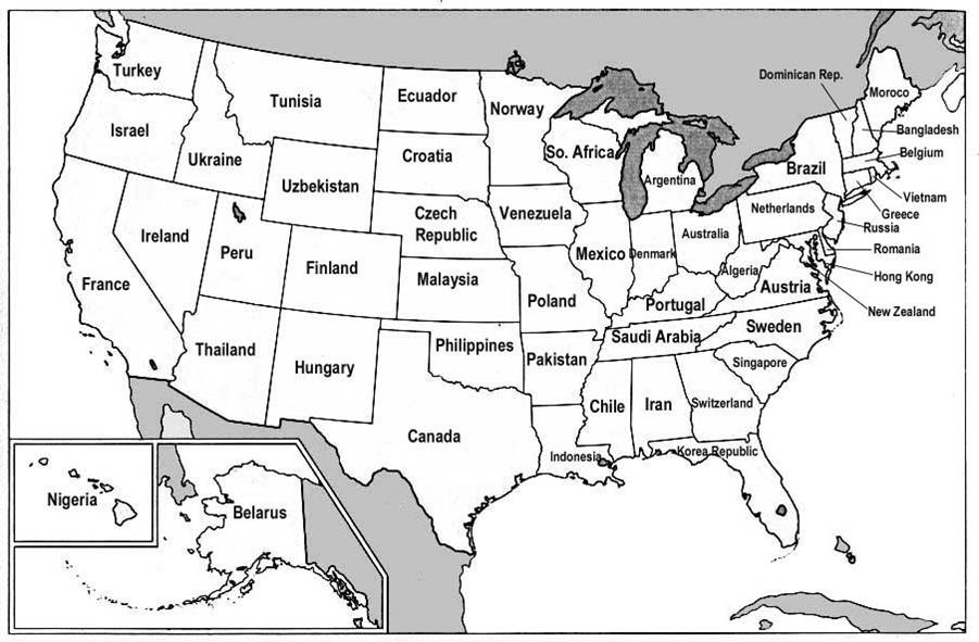
Submitted by Nate Kreuter on Thu, 2007-06-28 11:47
I found an interesting post on Reason magazine's Hit & Run blog in which the Gross Domestic Products (GDPs) of various nations are correlated with the GDPs of US states. The map is a fascinating comment on global economics, and more info on its background is available through the original Hit & Run post.
Tags:
|
|


Recent comments
2 years 29 weeks ago
2 years 44 weeks ago
2 years 44 weeks ago
2 years 50 weeks ago
3 years 4 weeks ago
3 years 4 weeks ago
3 years 4 weeks ago
3 years 6 weeks ago
3 years 6 weeks ago
3 years 6 weeks ago