viz.
Visual Rhetoric - Visual Culture - Pedagogy
Site informationRecent Blog Posts
|
graphic designSeeking a Universal Language of Symbols: The Noun Project's Crowd-sourced Creation of Icons for Communication Across Languages
Submitted by Todd Battistelli on Thu, 2012-10-18 14:16
Image Credit: UNOCHA How can you quickly communicate concrete concepts to an audience that includes speakers of many languages and those who can't read? The Noun Project sees an answer in symbols, and it offers a platform for people to submit icon designs that others can download and use. On its "About" page, the Noun Project describes itself as: a platform empowering the community to build a global visual language that everyone can understand. Visual communication is incredibly powerful. Symbols have the ability to transcend cultural and language barriers and deliver concise information effortlessly and instantaneously. For the first time, this image-based system of communication is being combined with technology to create a social language that unites the world. But do symbols "have the ability to transcend cultural and language barriers" as they suggest? In looking at the symbols on the site, I wonder whether these icons rely just as much on enculturation for understanding as any written language does. The benefits of speed of comprehension and intelligibility across languages and cultures seem to depend on a similar learning process to that any literate person goes through if, perhaps, abbreviated.
Form, Function, and Fonts: Eric Gill’s Branding Type
Submitted by Rachel Schneider on Tue, 2012-04-10 01:03
Image Credit: The Library of Congress Eric Gill’s illustrated 1931 The Four Gospels of the Lord Jesus Christ According to the Authorized Version of King James I may be the most beautiful text in the Harry Ransom Center’s King James Bible exhibition. Gill, who was a graphic designer, a sculptor, and a firm Catholic, melded his minimalist design aesthetics with Catholic art’s gilded tradition to make what the Library of Congress calls “a modern homage to the tradition of illuminated text.” Gill’s black and white figures, however, dance around the elegant typeface to create a Catholicism aesthetically rebranded for the twentieth century: sparse but still striking. (Slightly NSFW after the break.) Lolita's Legs and Cover Images
Submitted by Michael Widner on Tue, 2011-03-08 08:30
Movie poster from Stanley Kubrick's film adaptation of the novel Lolita Having just finished teaching Lolita again, I find myself thinking about representations of Dolores Haze and of the novel. While my classroom discussions often revolve around how Humbert Humbert depicts her character, I'm interested here in the related issue of how publishers (and movie producers) metonymically depict the work through the image of a girl. Some potentially NSFW images after the break.
Tags:
The Inner Life of Toys - The Art of Jason Freeny
Submitted by Cate Blouke on Tue, 2010-10-19 08:18
Image Credit: Jason Freeny Moist Productions Elieen's viz. post from a few weeks ago on Justine Cooper's photo-documentation of the American Museum of Natural History in New York has been bouncing around in my head ever since. It (re)kindled a long-standing interest I've had in both natural history museums and slightly morbid kinds of art. In both digital images and sculpture, artist Jason Freeny invests familiar children's toys with anatomical interiors, suggesting an inner life/death that both unsettles and intrigues.
All that glitters is not gold... or in good taste
Submitted by Cate Blouke on Mon, 2010-09-20 15:15
Image Credit: posted by "Hellen Killer" on Regresty, originating from PeachyProfiles.com H/T to Megan Eatman for sending me the blog As recent Twilight films have demonstrated, sparkling is one of the few things that doesn't translate well into new media. It also makes it hard to take anything seriously - regardless of authorial intention or gravity of subject matter.
Save the Words (through Images)
Submitted by emcg on Mon, 2010-09-06 22:55
Image Credit: Screenshot of Save the Words H/T to Elaine and Very Short List To kick off my return to Viz. this semester, I’m excited to share two artifacts at the intersection of verbal and visual cultures. After the jump: a design savvy website that functions as a Linguistic Extinction List of sorts. Also, a short film that invites viewers to consider the neuroscience of language. Tags:
Type Directors Club
Submitted by micklethwait on Mon, 2009-04-27 16:43
After putting together my own rudimentary bibliography on graphic design, an old acquaintance posted a link on Facebook to this bibliography of around 50 books on typography at the Type Directors Club.
Plenty of summer reading. Tags:
Apocalypse Infographed
Submitted by timturner on Sun, 2009-03-22 19:26
Just spotted a link to this at Andrew Sullivan's blog (h/t): check out the wonderful compilation of explanations of the current financial crisis by graphic designers at FlowingData. FlowingData is a site that "explores how designers, statisticians, and computer scientists are using data to understand ourselves better - mainly through data visualization. Money spent, reps at the gym, time you waste, and personal information you enter online are all forms of data. How can we understand these data flows? Data visualization lets non-experts make sense of it all." To my knowledge, the site hasn't been linked on viz. before--but I think it's something our readers would really like (but then, they probably already know about it). Helvetica and Shapes of Things to Come
Submitted by micklethwait on Mon, 2009-02-23 14:22
A few weeks ago I caught an episode of Independent Lens on PBS about the font Helvetica. In the undisputed manifesto of modern graphic design, The New Typography, author Jan Tschichold argues in vaguely Heideggerian terms that modernity requires a typeface consistent with its worldview. In fact, typeface has always been consistent, in his opinion, with the worldview of the civilization that used it, insofar as he sees that worldview as an expression of the relationship between with individual, the whole of society, and the technae they employ to shape and frame the world around them. Then over the last week I caught sight of this pair of advertisements for the typeface Helvetica font featured on Ffffound.com. Image from Ffffound.com.
Image from Ffffound.com. |
|

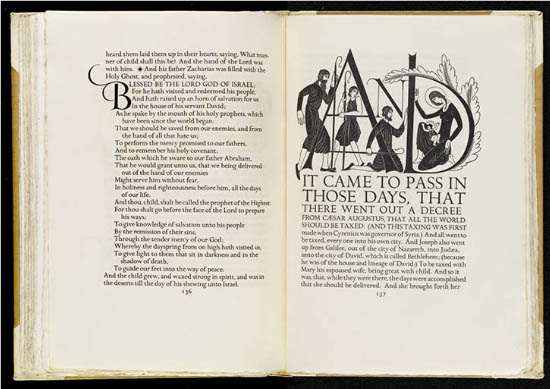
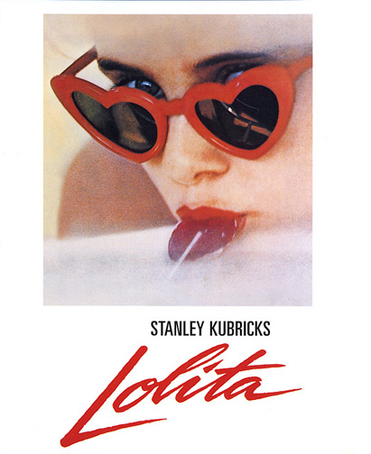
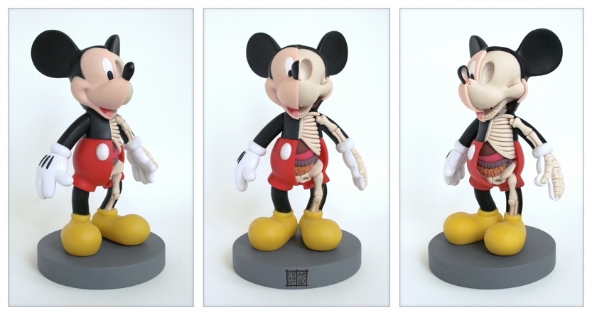
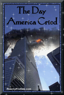
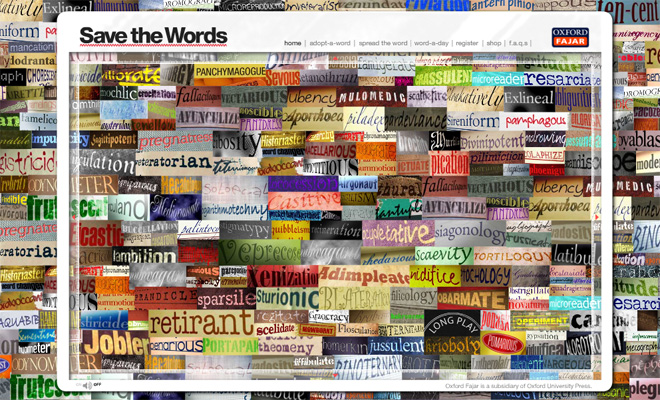

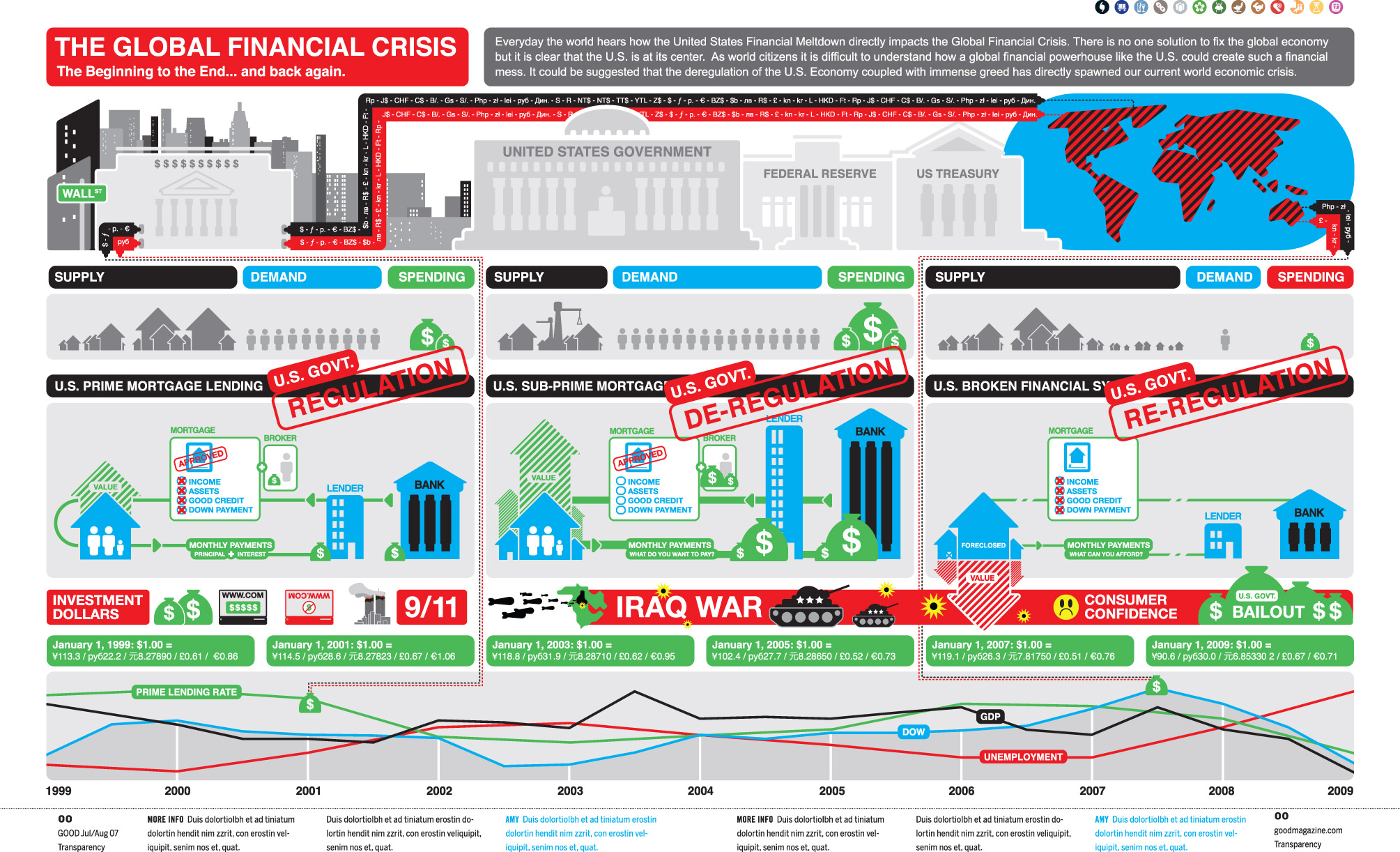 Image credit: cypher13 via flowingdata.com
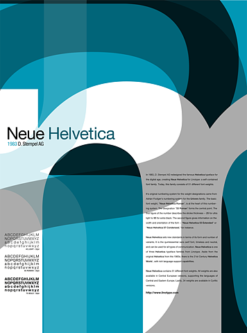
Recent comments
2 years 29 weeks ago
2 years 44 weeks ago
2 years 44 weeks ago
2 years 50 weeks ago
3 years 4 weeks ago
3 years 4 weeks ago
3 years 4 weeks ago
3 years 6 weeks ago
3 years 6 weeks ago
3 years 6 weeks ago