
Movie poster from Stanley Kubrick's film adaptation of the novel Lolita
Having just finished teaching Lolita again, I find myself thinking about representations of Dolores Haze and of the novel. While my classroom discussions often revolve around how Humbert Humbert depicts her character, I'm interested here in the related issue of how publishers (and movie producers) metonymically depict the work through the image of a girl.
Some potentially NSFW images after the break.
The poster for Kubrick's movie is probably the most famous image of Lolita: red, heart-shaped sunglasses, red lollipop, red lips, and red title. (The image is appropriate: H.H. first sees Dolores Haze sunbathing and wearing sunglasses in a garden; he calls her the reincarnation of his childhood Riviera love.) The poster girl is a seductive stand-in for the movie.We assume Humbert Humbert's gaze and breathe her "nymphean evil" as she manipulates the gentle, shy European professor.
%2c%20New%20York.jpg)
Cover image of Lolita, Random House, 1997
Browse a local book store and this edition is the one we often find (replete with the infamous Vanity Fair quote). From under a pleated skirt a girl's thin, bare legs bow inward in a demure, childish pose. Like the sliver of eyes peering over sunglasses and the red lips, here again we find a double metonymy (or, for purists, a synecdochal metonymy). The young girl's legs represent Lolita's sexual desirability as well as the novel itself. There's no indication of H.H.'s role, his complex mind, or his linguistic acrobatics.
We see the leg motif repeatedly in Lolita covers:
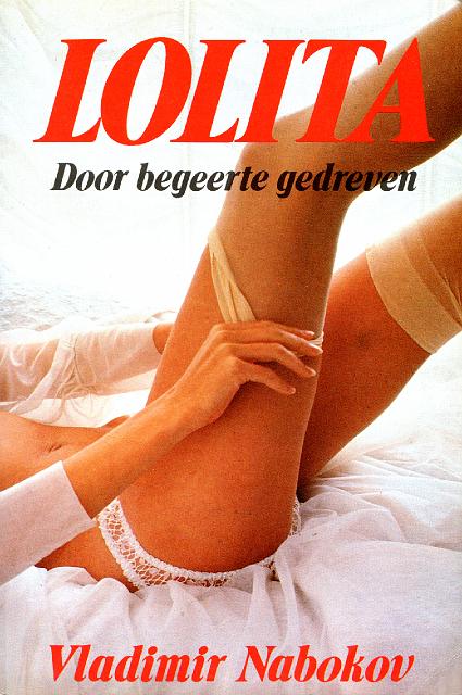
1970s NL Omega, Amsterdam
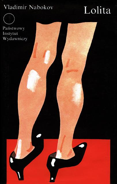
1991 POL Panstwowy Instytut Wydawniczy, Warsaw
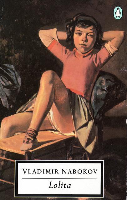
1995 GB Penguin, London
%2c%20Paris.jpg)
2001 FR Gallimard (Du monde entier), Paris

2007 POL Muza, Warszawa
All images and publisher information from Covering Lolita
Inhabiting a spectrum of sexuality from the demure to the frankly erotic, each of these images situates desire in a girl's legs. Sometimes she is seductress, at other times innocent prey. This visual motif for illicit desire, however, comes not from the novel. While H.H. does describe Dolly's limbs, he does so in the course of the many anatomical meditations that explore her entire body and which even express a desire to turn her inside out and see her lungs and heart. Indeed, if we might say there are body parts he fetishizes, they would be either armpits or hips, not legs. It is primarily the adult women, with their "thick thighs," whose legs the narrator notices most often.

2000 TAI Xian Jue, Taipei
%2c%20Tokyo.jpg)
2005 JAP Shinchosha (PB), Tokyo
Images and publisher information from Covering Lolita
The prevalence, then, of a girl's legs as synecdoche for Lolita-the-girl and metonym for Lolita-the- novel must come from elsewhere. Maybe the publishing houses are simply turning to images that seemed to work well for their predecessors, which appears to be the case for the two above. But these images carry meaning beyond a publisher's reliance on visual cliché. Legs easily differentiate woman from girl and are provocative yet still tame enough not to offend. They simultaneously embody sex and innocence while fragmenting a girl's body into fetishized object.
Still, all these covers leave me dissatisfied. The novel's focus is less the girl than the man who desires and abducts her. H.H.'s eloquently ambiguous narration spends more time conveying his variable moods and rationalizations than describing Dolores Haze. In one respect, however, the images correspond to the contents they cover; H.H. betrays little interest in Lolita as anything other than a desirable body that he catalogues in meticulous detail, piece by piece. Her mind remains a mystery, even though it might contain "a garden and a twilight, and a palace gate" forever forbidden him.
A fairly recent design contest, prompted by the Covering Lolita exhibit, attempted to address this bias toward lollipops and legs. John Bertram, the contest's sponsor, writes:
Nabokov’s work is masterful in its clarity and overflows with powerful and finely-wrought imagery and yet so few of the covers attempt to capture any of this richness, and many of them are merely absurd, or banal or a laughable combination of both.
Here's the winner of the contest:
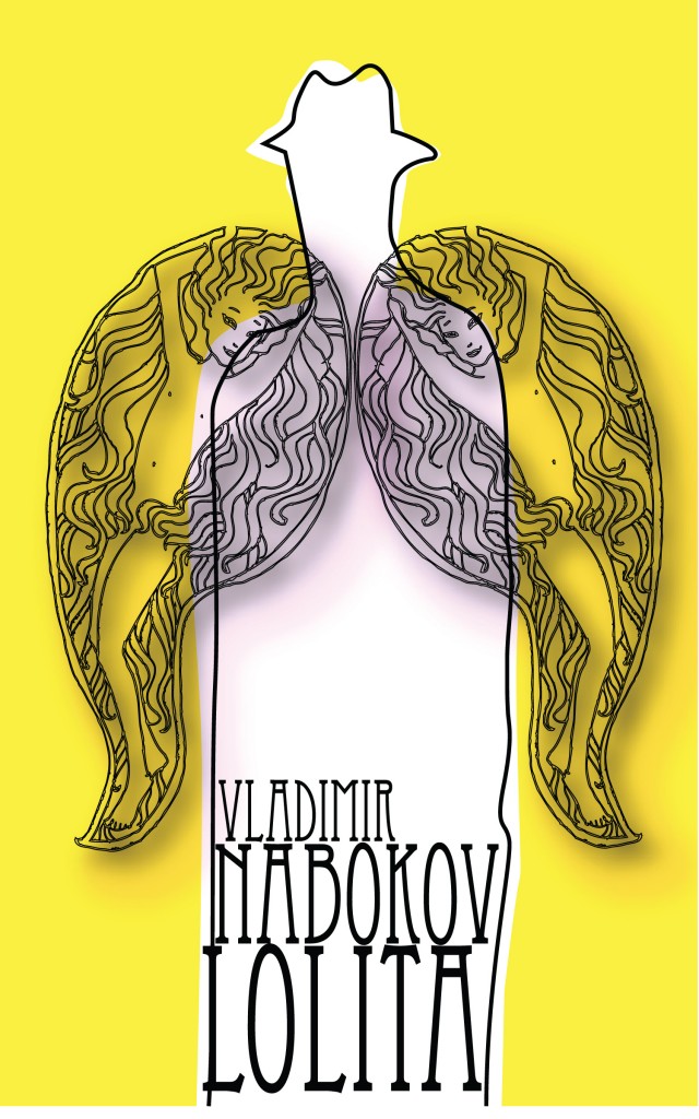
Image by Lyuba Haleva of Bulgaria
Bertram likes this image because "it really gets at the poetry of the novel. Humbert is transported by Lolita, so the wings are an intriguing choice. Whether they represent Lolita and Annabel Leigh or Lolita the fantasy and Lolita the real person I have no idea. Somehow it all feels right to me and very inspired, and although the typeface is anachronistic and suggests to me a classic European novel, it seems to work.” I have to agree. Unlike the vast majority of extant covers, this one not only blurs fantasy and reality (another prevalent theme of the novel), but also shows the narrator, a figure who is far more central than the girl(s) he desires. The girls are appropriately nymph-like rather than realistic; we see H.H. only in silhouette and as through a veil. His "slippery self" eludes us as it does his own narrative, yet remains indispensable.
Recent comments
2 years 29 weeks ago
2 years 44 weeks ago
2 years 44 weeks ago
2 years 50 weeks ago
3 years 4 weeks ago
3 years 4 weeks ago
3 years 4 weeks ago
3 years 6 weeks ago
3 years 6 weeks ago
3 years 6 weeks ago