viz.
Visual Rhetoric - Visual Culture - Pedagogy
Site informationRecent Blog Posts
|
information designWe Feel Fine
Submitted by EmilyBloom on Tue, 2009-11-03 17:44
Image Credit: We Feel Fine H/T: Stephanie Rosen I spent an inordinate amount of time today on Jonathan Harris and Sep Kamvar’s thought-provoking website, We Feel Fine. This website scans, or in their words “harvests,” weblogs for statements with the phrase “I feel.” Each of these statements is then represented as a colorful “particle” and organized into a variety of visual and statistical data. The website generates fascinating examples of how people communicate about feelings and gives a powerful impression of both the diversity and similarity among affective statements online. It also raises important questions about privacy. The statements and images on We Feel Fine are from blogs, MySpace and Flickr. Harvested statements whose writers’ also posted images are represented as a “Montage” with the text embedded in the image. Site users can then save and send these postcard-like pieces. For both its creative design and surveillance techniques, We Feel Fine provokes interesting questions regarding affect, privacy and online writing.
Tags:
Apocalypse Infographed
Submitted by timturner on Sun, 2009-03-22 19:26
Just spotted a link to this at Andrew Sullivan's blog (h/t): check out the wonderful compilation of explanations of the current financial crisis by graphic designers at FlowingData. FlowingData is a site that "explores how designers, statisticians, and computer scientists are using data to understand ourselves better - mainly through data visualization. Money spent, reps at the gym, time you waste, and personal information you enter online are all forms of data. How can we understand these data flows? Data visualization lets non-experts make sense of it all." To my knowledge, the site hasn't been linked on viz. before--but I think it's something our readers would really like (but then, they probably already know about it). The economy and design
Submitted by John Jones on Thu, 2008-12-11 13:24
I saw these two responses to the our recent economic woes on BoingBoing. The first, posted by guest-blogger Clay Shirky, is a graph showing the distribution of the returns of the S&P 500 in 10-percentage-point increments since 1825. The placement of 2008 adds a chilling perspective to our current crisis.
The second is a humorous response to the proposed auto industry bailout in the form of a car advertisement:
Origins of the bomb
Submitted by John Jones on Tue, 2008-12-09 14:34
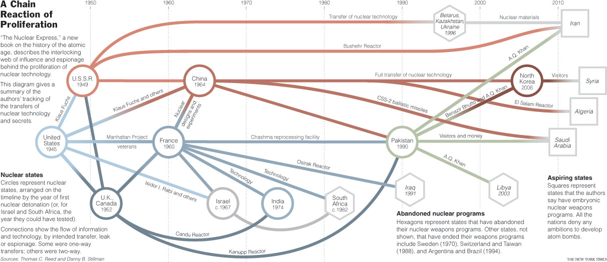
A recent New York Times article on the invention and dissemination of atomic weapons included the infographic above on the travels of the atomic bomb. The article references some new works on the history of the bomb, noting that it was only invented once:
FISA flowchart and alternatives to proposal arguments
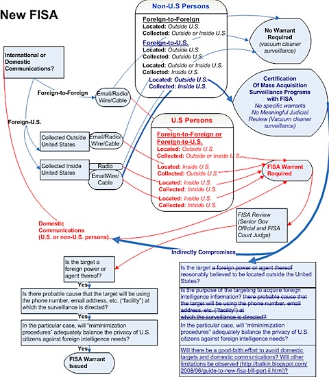
Submitted by John Jones on Wed, 2008-07-16 10:44
So many writing and rhetoric assignments require students to write proposal arguments responding to issues in their schools or communities. While instructors often imagine that these arguments will end up being published somewhere where they will actually have an impact on the community in question, in my experience this rarely happens. For whatever reason, students rarely take the time to polish and submit their work; to get them to take this step, instructors often have to make submission a course requirement, which is an iffy pedagogical move. I said all that to say this: I wonder if a project like this one outlining the Foreign Intelligence Surveillance Act in a flowchart might be a better means of achieving the goal of civic engagement that the proposal argument is supposed to fulfill. Perhaps the problem with proposal arguments in that they often feel artificial. Students have to dream up a project which they may or may not care about, and then translate that project for publication, a time-consuming task that requires a lot of interest on the part of the author. Consider this alternative: taking a difficult idea or concept and explaining it more clearly in another medium. The project’s usefulness—both on its own and as a skill that will be helpful to students outside the classroom—explains itself, and it can be published immediately online. I’m currently preparing for my fall Computers and Writing course, and I’m seriously considering having my students do something like this for a major assignment. link Ketchup and Caviar (via Boing Boing) Google, Twitter create Super Tuesday mashup
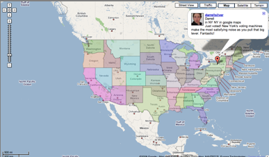
Submitted by John Jones on Tue, 2008-02-05 23:10
Google and Twitter have gotten together to create a mashup of Super Tuesday related tweets.
via TechCrunch Tags:
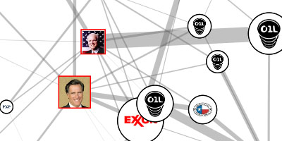
Track oil donations to presidential candidates
Submitted by John Jones on Thu, 2008-01-31 10:27
PriceofOil.org has posted a dynamic information graphic showing contributions from the oil industry to U.S. presidential candidates.
Yahoo! political dashboard
Submitted by John Jones on Tue, 2008-01-15 09:09
Yahoo! has created a political dashboard that collects primary and poll information in a real-time, interactive interface (click on the image for a larger view). I’ve been playing around with this tool since the beginning of the year, and I’ve found the way it mixes different kinds of information to be helpful in following the campaigns. Tags:
|
|

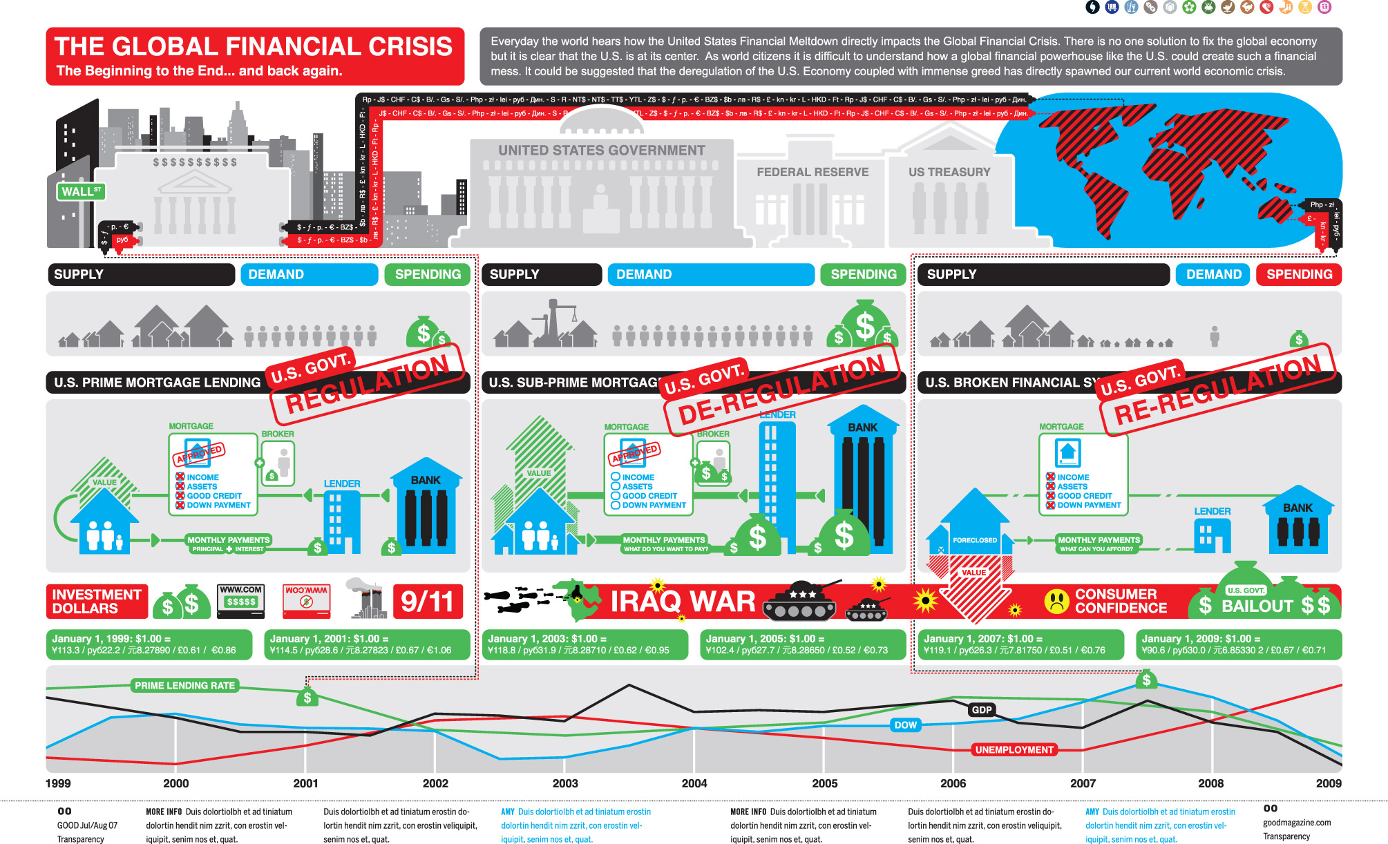 Image credit: cypher13 via flowingdata.com
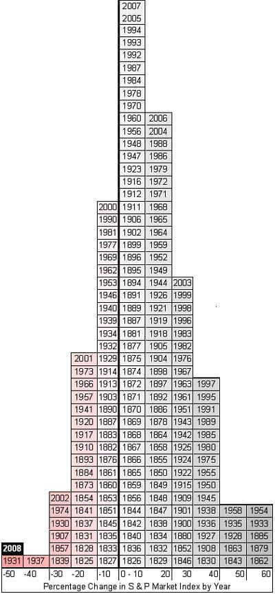


Recent comments
2 years 29 weeks ago
2 years 44 weeks ago
2 years 44 weeks ago
2 years 50 weeks ago
3 years 4 weeks ago
3 years 4 weeks ago
3 years 4 weeks ago
3 years 6 weeks ago
3 years 6 weeks ago
3 years 6 weeks ago