viz.
Visual Rhetoric - Visual Culture - Pedagogy
Site informationRecent Blog Posts
|
Reply to commentApocalypse Infographed
Submitted by timturner on Sun, 2009-03-22 19:26
Just spotted a link to this at Andrew Sullivan's blog (h/t): check out the wonderful compilation of explanations of the current financial crisis by graphic designers at FlowingData. FlowingData is a site that "explores how designers, statisticians, and computer scientists are using data to understand ourselves better - mainly through data visualization. Money spent, reps at the gym, time you waste, and personal information you enter online are all forms of data. How can we understand these data flows? Data visualization lets non-experts make sense of it all." To my knowledge, the site hasn't been linked on viz. before--but I think it's something our readers would really like (but then, they probably already know about it). ReplyYour contribution to the blog: Please Read Before PostingThe viz. blog is a forum for exploring the visual through identifying the connections between theory, rhetorical practice, popular culture, and the classroom. Keeping with this mission, comments on the blog should further discussion in the viz. community by extending (or critiquing) existing analysis, adding new analysis, providing interesting and relevant examples, or by making connections between that topic and theory, rhetoric, culture, or pedagogy. Trolling, spam, and any other messages not related to this purpose will be deleted immediately. Comments by anonymous users will be added to a moderation queue and examined for their relevance before publication. Authenticated users may post comments without moderation, but if those comments do not fit the above description they may be deleted. |
|
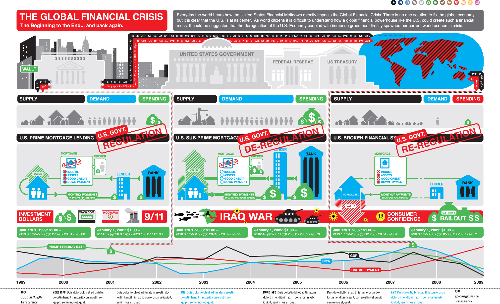 Image credit: cypher13 via flowingdata.com
Recent comments
2 years 29 weeks ago
2 years 44 weeks ago
2 years 44 weeks ago
2 years 50 weeks ago
3 years 4 weeks ago
3 years 4 weeks ago
3 years 4 weeks ago
3 years 6 weeks ago
3 years 6 weeks ago
3 years 6 weeks ago