viz.
Visual Rhetoric - Visual Culture - Pedagogy
Site informationRecent Blog Posts
|
EmilyBloom's blogLiteracies: Visual and Auditory
Submitted by EmilyBloom on Tue, 2009-12-01 16:16
Image Credit: The Guardian Samuel Beckett's Play (dir. Anthony Minghella, 2000) This is my last Viz posting for the year, so I thought I’d be introspective, or perhaps, self-referential. Specifically, I want to talk about podcasting pedagogy I’ve been experimenting with this semester and how it’s raised interesting questions in our classroom about the relationship between visual and auditory rhetoric. The final assignment for our class was a podcast in which students delivered an argument on a contemporary controversy. It was very strange for all of us to rely so heavily on voice without a piece of paper to mediate the exchange. Early twentieth-century theories of oral delivery such as those by T. Sturge Moore advocated that speakers of poetry should stand behind a curtain so that listeners could listen more attentively and W.B. Yeats suggested that his Abbey Theatre actors should be placed in barrels to train them against using distracting motions. Not wanting quite so drastic an approach, I at least thought that a focus on the auditory would push my students to consider their words in action and more carefully focus on simplicity, organization and delivery.
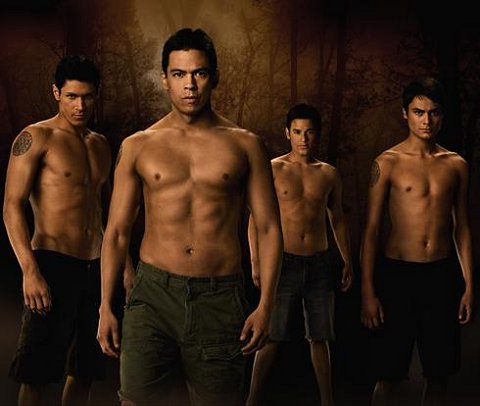
An American Tale
Submitted by EmilyBloom on Tue, 2009-11-24 16:41
Image Credit: Empire Movies There has been some controversy—though less than might be expected—about the racial politics of the new Twilight movie, New Moon. I went to see the film the other night and while I was prepared for smoldering gazes, repressed embraces, and some retrograde gender relations, I was not prepared for its representations of race. While several critics have protested the casting of predominately non-Native American actors in Native American roles, far less comment has been made about the portrayal of Native American characters as bare-chested pack animals that morph into wolves when they become angry. The main character in this storyline is Jacob Black who falls in love with Bella Swan and then comes down with puberty-induced werewolfism. He and the other wolves are all members of the Quileute tribe, which long ago signed a territorial treaty with the vampires. Sound familiar?
Tags:
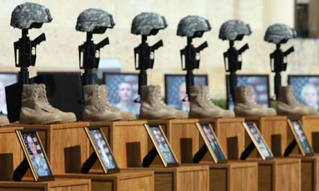
Fort Hood in Images
Submitted by EmilyBloom on Tue, 2009-11-10 17:41
Image Credit: The Guardian As the memorial service for the victims of the Fort Hood shooting begins, I want to spend some time considering the visual representations of this event in the media. Photographs representing the shooting seem to mirror our conflicted understanding of this event as both a military and a domestic tragedy. In the absence of more information about the shooter and his motives, this ambiguity marks the photographs that appear online and in print. Some photographs evoke Columbine, Virginia Tech or 9/11 by focusing on groups of mourners and the buildings where the shooting took place. In so doing, these images emphasize the effects of violence on a place and a community. However, other photographs more closely resemble traditional war photography in which the soldier is represented through metonymic devices such as a uniform or a gun. Tags:
We Feel Fine
Submitted by EmilyBloom on Tue, 2009-11-03 17:44
Image Credit: We Feel Fine H/T: Stephanie Rosen I spent an inordinate amount of time today on Jonathan Harris and Sep Kamvar’s thought-provoking website, We Feel Fine. This website scans, or in their words “harvests,” weblogs for statements with the phrase “I feel.” Each of these statements is then represented as a colorful “particle” and organized into a variety of visual and statistical data. The website generates fascinating examples of how people communicate about feelings and gives a powerful impression of both the diversity and similarity among affective statements online. It also raises important questions about privacy. The statements and images on We Feel Fine are from blogs, MySpace and Flickr. Harvested statements whose writers’ also posted images are represented as a “Montage” with the text embedded in the image. Site users can then save and send these postcard-like pieces. For both its creative design and surveillance techniques, We Feel Fine provokes interesting questions regarding affect, privacy and online writing.
Tags:
Exhibiting Poetry and Rhetoric
Submitted by EmilyBloom on Tue, 2009-10-27 15:39
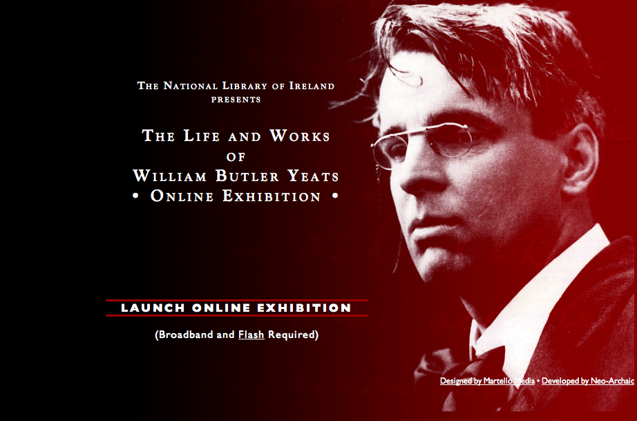
Image Credit: Screen Shot from the National Library of Ireland While conducting research on W.B. Yeats I encountered this fascinating online exhibition from the National Library of Ireland that raised interesting questions for me about the relationship between visual rhetoric and literary archives. Like many other graduate students teaching rhetoric while writing a dissertation on literature, I often wonder about the interconnections between the two fields and what ideas crossover and what do not. Yeats, in many ways, seems like the perfect place to start to blur lines between the rhetorical, the literary, the visual and the auditory. Navigating this website, I was struck by the extent to which the virtual museum brings together these fields and makes visible Yeats’s complicatedly interdisciplinary and multi-sensory career.
Tags:
Protecting Marriage
Submitted by EmilyBloom on Tue, 2009-10-20 16:46
Image Credit: Screen Shot from Pandora While listening to Pandora the other day, an advertisement interrupted my music. This advertisement told me that my life would be happier and more successful if I commit myself to a monogamous relationship. The advertiser was a website called twoofus.org which is sponsored by the National Healthy Marriage Resource Center (NHMRC) and provides resources for individuals and for Healthy Marriage Initiative (HMI) grantees. After a little digging around, I found that the Healthy Marriage Initiative was created in 1996 with the injunction to preserve the institution of marriage because “marriage is the foundation of a successful society.” Hearing this advertisment led me to consider how the traditionally conservative pro-marriage position becomes increasingly complicated, on both the left and the right, in the context of same-sex marriage debates. Would the creators of this ad feel they had succeeded if I was now persuaded to marry my same-sex partner? Does pro-marriage mean the same thing that it did to the creator's of the Healthy Marriage Initiative in 1996?
Tags:
Mapping Relations
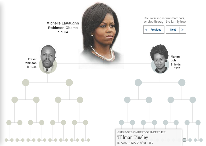
Submitted by EmilyBloom on Tue, 2009-10-13 16:54
Image Credit: New York Times
Family trees are distinctively antiquated visual representations, yet they remain ubiquitous. In the past week alone, The Boston Herald published a family tree by the New England Historic Genealogical Society showing that Ben Affleck and Matt Damon are related and New York Times ran an interactive tree based on the research of genealogist Megan Smolenyak documenting Michelle Obama’s family history. Both maps include the very familiar hierarchical arrangement of lines and circles or squares. The Damon-Affleck map cuts right to the chase, foregoing all other strands, and directly linking the actors to William Knowlton Jr. (1615-1655). The First Lady’s genealogy is much more interested in the journey than the destination; each node of the tree has a short description of the family member and links to their genealogical record. Looking at these two maps, I was led to consider why the family tree endures despite the wealth of technologies available for re-mapping relationships? Why does the old visual arrangement of radiating lines still seem to capture our attention? And finally, what are we really mapping when we map kinship on a family tree?
Tags:
Bodies of Evidence
Submitted by EmilyBloom on Tue, 2009-10-06 15:16
Image Credit: The Museum of Fat Love H/T: Layne Craig Amidst massive media coverage of the “obesity epidemic,” visual arguments have emerged online that challenge the terms of the current debate. One example is the website, The Museum of Fat Love, which presents a collection of photographs of smiling couples. Similarly, Newsweek ran a series of photographs on their website titled “Happy, Heavy and Healthy” in which readers submitted pictures of themselves performing athletic feats. Both websites called for volunteers to submit evidence that individuals classified as overweight or obese can live healthy, happy lives. The use of visuals in both instances is striking—both websites are predicated on the understanding that overweight individuals have been misunderstood (perhaps even vilified) in the course of public debates on obesity and public health.
|
|


Recent comments
2 years 29 weeks ago
2 years 44 weeks ago
2 years 44 weeks ago
2 years 50 weeks ago
3 years 4 weeks ago
3 years 4 weeks ago
3 years 4 weeks ago
3 years 6 weeks ago
3 years 6 weeks ago
3 years 6 weeks ago