viz.
Visual Rhetoric - Visual Culture - Pedagogy
Site informationRecent Blog Posts
|
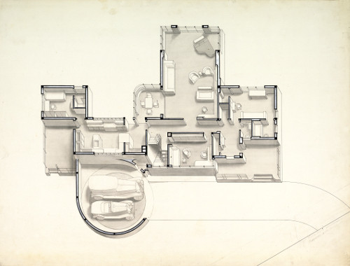
designNew Forms for Old Needs in Norman Bel Geddes’s "House of Tomorrow"
Submitted by Rachel Schneider on Wed, 2012-11-28 03:43
Image Credit: Metropolis Magazine Walking through the Harry Ransom Center’s excellent Norman Bel Geddes exhibit, one thing that struck me is that while Bel Geddes is particularly famous for his large industrial designs—radios, cars, cities, and stadiums, for example—he also directed his talents towards the intimate spaces of the American home. Before Bel Geddes designed prefabricated homes for the Housing Corporation for America in 1939, or published his 1932 book Horizons, he wrote an article called “The House of Tomorrow” for the April 1931 issue of the Ladies Home Journal. The “twentieth-century style” he describes is one that he sees uniting form and function anew for the needs of the twentieth-century individual—or rather, what he imagines the twentieth-century individual to be. The Lesser Known Bel Geddes: An Assessment of the Harry Ransom Center Exhibit
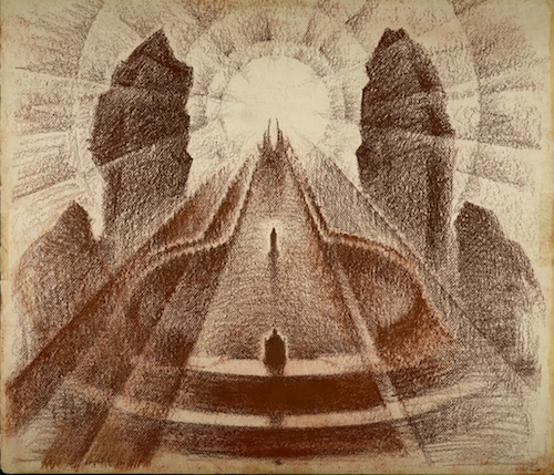
Submitted by Chris Ortiz y P... on Mon, 2012-11-26 16:43
Image Credit: Edith Lutyens and Norman Bel Geddes Foundation The Divine Comedy, scene rendering: In a path of blue-white light Beatrice steps down from her chariot to meet Dante, 1921-1930 Norman Bel Geddes lived a sixty-five years that connect two worlds, the Victorian past of 1893, the Atomic Age of 1958. His work reflects and resists that trajectory. The current exhibit on Bel Geddes at the Harry Ransom Center (UT Austin) divides his career into phases or stages of development. A highly creative childhood segued into a successful career as a stage and costume designer for New York Theater. Of all his work—in industrial design, in architecture, in “futurism”--his set and costume design remains my favorite. But in an important sense, Bel Geddes never left the theater.
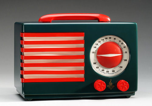
Conspicuous Radios
Submitted by Steven J LeMieux on Fri, 2012-04-13 08:00
Image Credit: The Metropolitan Museum of Art Before creating the “Patriot” radio, Norman Bel Geddes had long been involved with traditional, cabinet radio design. And while many of his cabinet radios follow the robust, furniture-esque aesthetic common to radios of the day this radio, created for the New York World Fair, 1939, breaks that mold. The “Patriot,” rather than simply blending into the décor of a room, forcefully makes itself known. This radio, rather conspicuously, embodies a particular patriotic flair. Most prominently, it features the seven red and six white stripes of the United States flag. Its knobs feature stars, and in most models red, white, and blue are the predominate colors. Art + Architecture: Diana Al-Hadid’s “Suspended After Image”
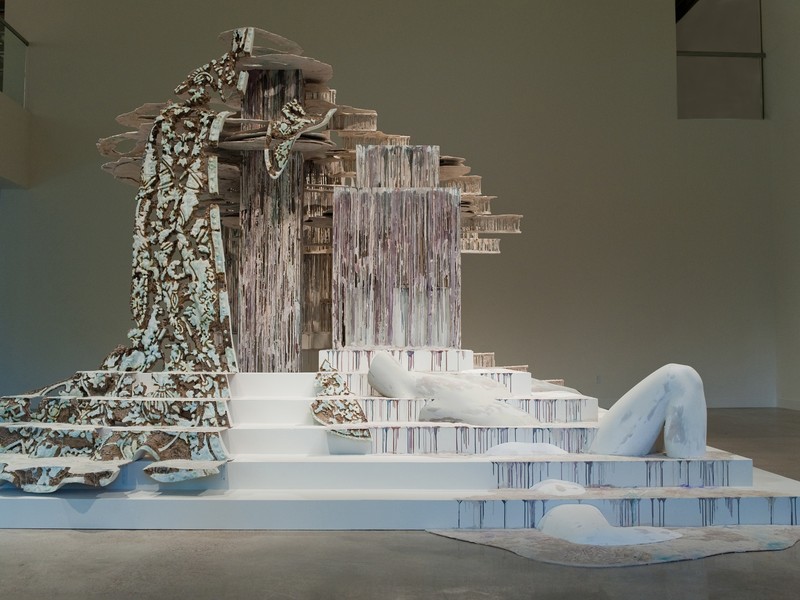
Submitted by Lisa Gulesserian on Mon, 2012-02-06 00:01
Image Credit: Sandy Carson, taken from CultureMap Austin For those of us interested in architectural sculpture, the last few months in Austin (especially on the UT campus) have felt like gifts from the art gods. I’ve already written about one exhibition (the recently-closed El Anatsui: When I Last Wrote to You about Africa show at the Blanton Museum of Art). This month ushered in a second sculptural exhibition. New York sculptor Diana Al-Hadid’s Suspended After Image, a site-specific installation at UT’s Visual Arts Center’s Vaulted Gallery, is a feat of texture and height. As a fantastic example of architectural art, Al-Hadid’s most recent work for the VAC asks viewers to circumambulate the sculpture and ponder the relationship between memory, built objects, and humanity.
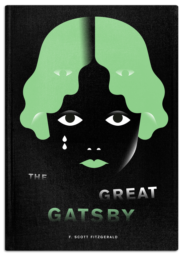
Re-Covering the Classics
Submitted by Cate Blouke on Sat, 2011-02-19 15:09
Contest winning re-designed book cover by Philipp Dornbierer for The Fox Is Black Elizabeth's post this week (about the Great Gatsby game) reminded me of a design contest I stumbled upon recently. TheFoxIsBlack.com, a blog about web and graphic design, has begun a series of monthly competitions inviting participants to redesign the covers of classic literature. Last month was The Great Gatsby (winner pictured above), and this month it's The Lord of the Flies. (The deadline is February 25th, so there's still time for you designers out there to get a shot at the $100 Amazon gift card). Obama's Design
Submitted by LaurenMitchell on Sat, 2008-04-05 00:31
As far as design goes, Obama has already won the presidency according to this New York Times article. Analysis of political campaign posters
Submitted by John Jones on Sat, 2007-11-24 11:41
The New York Times has posted a slideshow by Ward Sutton, “Reading Tea Leaves and Campaign Logos,” analyzing the posters and bumper stickers of presidential candidates.
MIT suing Gehry over impractical design
Submitted by John Jones on Wed, 2007-11-07 19:29
Last month I posted a link to Slate’s photo-essay on functional architecture. That essay emphasized the trend in architecture toward functional buildings over flashy—and often impractical—works like those Frank Gehry is known for. Now, MIT is suing Gehry for his design of the Stata center, pictured above.
Tags:
|
|

Recent comments
2 years 29 weeks ago
2 years 44 weeks ago
2 years 44 weeks ago
2 years 50 weeks ago
3 years 4 weeks ago
3 years 4 weeks ago
3 years 4 weeks ago
3 years 6 weeks ago
3 years 6 weeks ago
3 years 6 weeks ago