As far as design goes, Obama has already won the presidency according to this New York Times article.

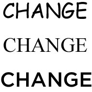
Apparently continuity in design is crucial to a campaign in the same way that a consistent message is, and Obama has been out-doing McCain and Clinton at least in this arena. Branding expert Brian Collins says that “From the bold ‘change’ signs to their engaging Web site to their recognizable lapel pins, [the Obama campaign has] used a single-minded visual strategy to deliver their campaign’s message with greater consistency and, as a result, greater collective impact.” Obama is also able to send a coherent message via the multitude of different media sources that we’re using today. It doesn’t stop there though--even Obama’s font is hip.

He’s using Gotham, which is modeled after the font used on signs at the Port Authority Bus Terminal in New York City. According to Collins, it has a “blunt, geometric simplicity” but also manages to be “warm.” I don’t know about all that, but it looks good to me.
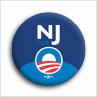
I also found it interesting that he’s been able to personalize his brand through the use of state-specific buttons that fuse a state’s abbreviation letters with his familiar “O” symbol.

I agree with Collins in that it’s appropriate for a man who is clearly in tune with the power of rhetoric to also understand the power of visual rhetoric and design.
Comments
generatioNext
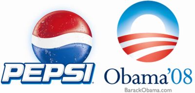
It is a pretty logo, isn't it? But in keeping with my deflationary style, I want to point out (and I'm not the first; the idea was not an original one of mine) the resemblance between Obama's logo and the logo for PepsiCo:
But maybe this is appropriate, given some of Pepsi's old slogans that would not be out of place in describing Obama or his supporters: "The Choice of a New Generation" or, more recently, "GeneratioNext."
To be clear, I'm not alleging plagiarism; just a slight similarity that is kind of funny to me. This logo has elicited a lot of commentary (in such a long primary cycle, what is left to talk about?): the slideshow in the NYT John wrote about earlier, which led to a lot of discussions elsewhere (see here or here).
But I think it also speaks to a point others have made about the extreme success the Obama campaign has had in marketing itself by branding itself. One blogger writes,
For more of this kind of this argument, see here or here or Google "Obama branding."
Political Marketing
Obama's use of political marketing is one of the most impressive in recent history, but he is not the first candidate to sell himself like cornflakes. Check this
http://www.youtube.com/watch?v=nplm1G7t5UE
This Kennedy ad and the image presented are evocative of the marketing techniques that were used in TV commercials during the late 1950s and early 1960s. Check this Brylcreem ad from the 1950s.
http://www.youtube.com/watch?v=jRcRIbExrfg
Kennedy exuded the kind of sexual charm that Brylcreem promised by turning a head of average hair into a well coiffed hairdo. Both the campaign ad and the commercial also make use of corny but catchy tunes that were common in television advertisements at the time.
Here are the videos