viz.
Visual Rhetoric - Visual Culture - Pedagogy
Site informationRecent Blog Posts
|
Re-Covering the Classics
Submitted by Cate Blouke on Sat, 2011-02-19 15:09
Contest winning re-designed book cover by Philipp Dornbierer for The Fox Is Black Elizabeth's post this week (about the Great Gatsby game) reminded me of a design contest I stumbled upon recently. TheFoxIsBlack.com, a blog about web and graphic design, has begun a series of monthly competitions inviting participants to redesign the covers of classic literature. Last month was The Great Gatsby (winner pictured above), and this month it's The Lord of the Flies. (The deadline is February 25th, so there's still time for you designers out there to get a shot at the $100 Amazon gift card).
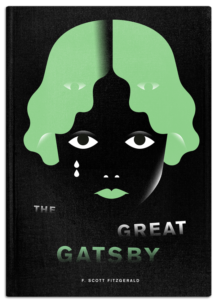
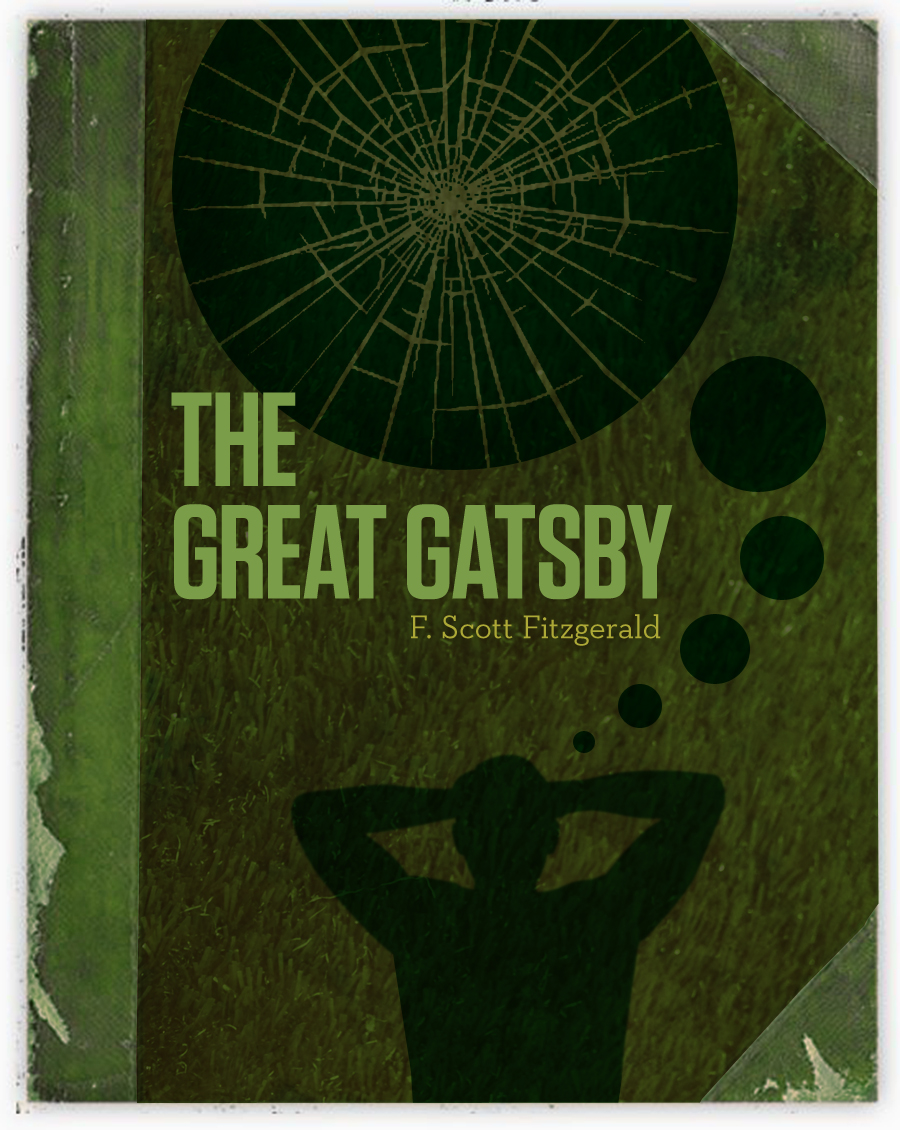
Re-designed book cover by Matthew Gore for The Fox Is Black It's interesting to think about the interaction of text and cover art, how the cover can shape our perception of and approach to a book. Aside from just being pretty cool to look at, the entries are fascinating to compare and could be used as a conversation starter in classrooms. For example, comparing the image above (Matthew Gore's entry) to the one below (Ian O. Phelan's entry). Though both feature the color green, what can we infer from the choice in hue? Also, the image above is more masculine and violent (with the broken glass), positioning Gatsby is the central figure, whereas the image below depicts a female figure and focuses our attention on Daisy.
Re-designed book cover by Ian O. Phelan for The Fox Is Black |
|

Recent comments
2 years 29 weeks ago
2 years 44 weeks ago
2 years 44 weeks ago
2 years 50 weeks ago
3 years 4 weeks ago
3 years 4 weeks ago
3 years 4 weeks ago
3 years 6 weeks ago
3 years 6 weeks ago
3 years 6 weeks ago