viz.
Visual Rhetoric - Visual Culture - Pedagogy
Site informationRecent Blog Posts
|
information designElections and Visual Conventions
Submitted by Brett Ommen on Sat, 2008-01-05 16:23
The Iowa Caucuses have come and gone, and as we prepare for New Hampshire and the remainder, we have some time to reflect on the visual dynamics of television news coverage of elections. Red and Blue states once had their debut to a national audience, and perhaps we’re on the threshold of a new visual convention.
BEHOLD ANDERSON COOPER’S MAGICAL FLOATING PIE CHART! Tags:
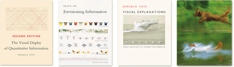
Tufte course in Austin, December 10–11
Submitted by John Jones on Wed, 2007-11-07 17:28
Information design guru Edward Tufte will be offering his one-day course “Presenting Data and Information” in Austin on Monday, December 10, and Tuesday, December 11. Here’s the list of course topics from Tufte’s website:
Registration includes copies of Tufte’s four books, and there is a generous discount for students (it’s basically the cost of the books). Tags:
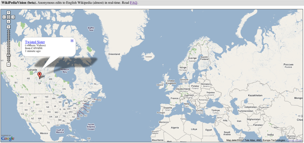
Wikipediavision: Visualizing anonymous edits to Wikipedia
Submitted by John Jones on Tue, 2007-10-30 10:31
László Kozma, a grad-student at the Helsinki University of Technology, has created Wikipediavision a mashup of Wikipedia edits and Google maps reminiscent of Twittervision and Flickrvision. Visualizing time
Submitted by John Jones on Wed, 2007-10-17 21:48
Here’s a great collection of freehand drawings where the artists were asked to visualize time. The individual images are usually witty statements about their authors’ views of time. Tags:
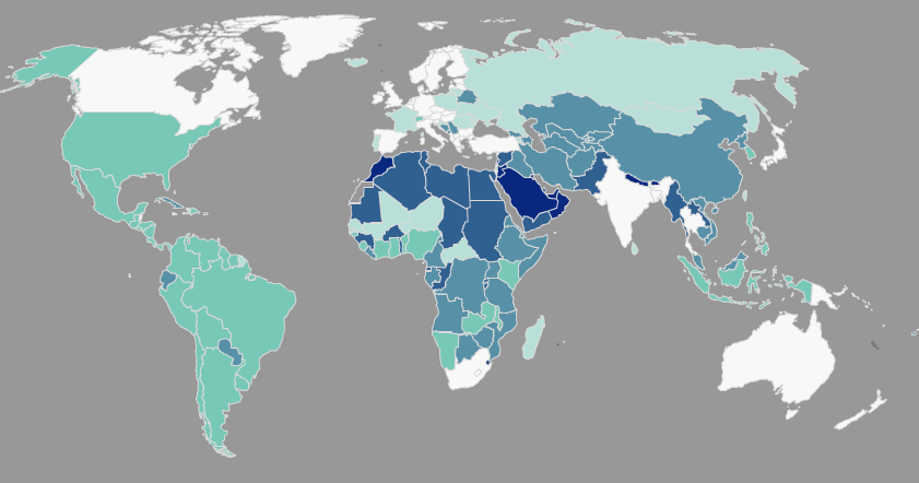
Wolrd Freedom Atlas
Submitted by John Jones on Wed, 2007-09-26 11:51
The World Freedom Atlas gathers a number of interesting datasets related to world politics and human rights and converts them into a dynamic map display. Interestingly, the visual display helps to foreground the rhetorical choices made by the authors of those datasets. For instance, the map below displays a country’s governmental structure, ranging from a parliamentary democracy (white) to monarchic dictatorship (dark blue) (Cheibub and Gandhi, 2004). Notice that the U.S., a presidential democracy, falls in the middle of the classification scheme, closer to the dictatorships than Canada and Australia, which are both white, as well as Russia, which is a light teal.
Tags:
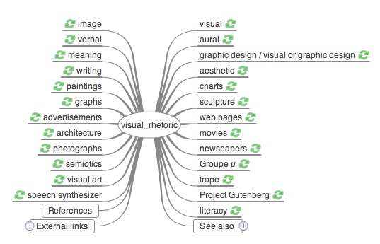
Visual Search for Wikipedia
Submitted by John Jones on Sun, 2007-07-22 16:32
The good folks over at Information Aesthetics recently posted a link to Wiki Mind Map. The site provides a mind-map-style outline of topics in Wikipedia.
Right now the site appears to be able to search the German, English, Spanish, French, Italian, Catalan, and Indonesian versions of the encyclopedia. It can also search www.self-qs.de, which appears to be some sort of German dictionary (perhaps a German-speaker can help out here). Visual literacy, meet information literacy
Submitted by John Jones on Fri, 2007-06-01 17:55
Libraries: They aren’t just for reading anymore |
|


Recent comments
2 years 29 weeks ago
2 years 44 weeks ago
2 years 44 weeks ago
2 years 50 weeks ago
3 years 4 weeks ago
3 years 4 weeks ago
3 years 4 weeks ago
3 years 6 weeks ago
3 years 6 weeks ago
3 years 6 weeks ago