viz.
Visual Rhetoric - Visual Culture - Pedagogy
Site informationRecent Blog Posts
|
Wolrd Freedom Atlas
Submitted by John Jones on Wed, 2007-09-26 11:51
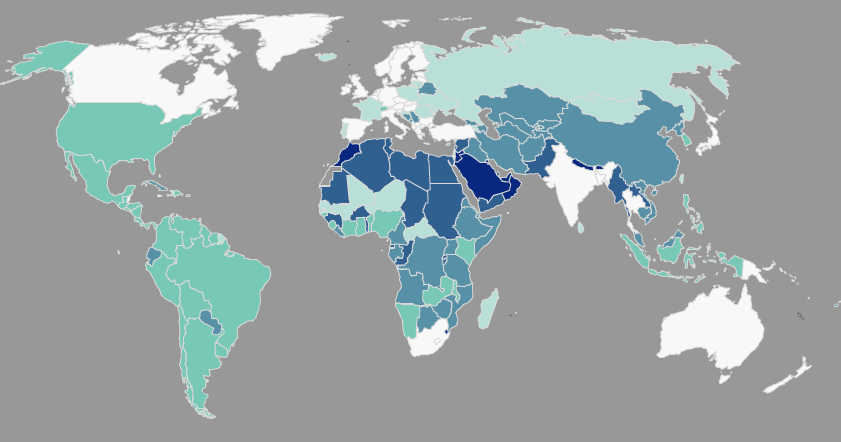
The World Freedom Atlas gathers a number of interesting datasets related to world politics and human rights and converts them into a dynamic map display. Interestingly, the visual display helps to foreground the rhetorical choices made by the authors of those datasets. For instance, the map below displays a country’s governmental structure, ranging from a parliamentary democracy (white) to monarchic dictatorship (dark blue) (Cheibub and Gandhi, 2004). Notice that the U.S., a presidential democracy, falls in the middle of the classification scheme, closer to the dictatorships than Canada and Australia, which are both white, as well as Russia, which is a light teal.
Tags:
|
|
Recent comments
2 years 29 weeks ago
2 years 44 weeks ago
2 years 44 weeks ago
2 years 50 weeks ago
3 years 4 weeks ago
3 years 4 weeks ago
3 years 4 weeks ago
3 years 6 weeks ago
3 years 6 weeks ago
3 years 6 weeks ago