Maps

"Maybe These Maps Are Legends": Ghost Signs and the Traces of the Past

Wrigley's Ghost Sign, Austin, TX

Austin, TX, Ghost Sign, image from Flickr

There is nothing in heaven above, in the earth beneath, in the water, or in the air we breathe but will be found in the universal Language of the Walls. ("The Language of the Walls," anonymous, 1855).

 Maps are propositions as well as indexes, making visual arguments about our orientation in this world--a good map (whether road or otherwise) gets us somewhere, forces us to reconsider the relationship between us and the world.  Advertising, that pernicious beasat, is also somewhere between sign and proposition.  A visual referent to a thing--a bottle of beer, a pack of gum, an insurance service--an advertisement also makes an argument or, at the very least, presents a fantasy of (self-)orientation.  But what happens when those relationships are obscured, when the fantasy becomes outdated?  What happens when the ad remains after the product is gone?

From Sea to Shining McDonald's, and Other Americas: Critical Cartography II

Map of distances to McDonald's

Image by Stephen von Worley

Last week, I wrote about the power of cold-war era maps when it comes to visualizing Western attitudes towards the Soviet bloc, and, in the work of William Bunge, visualizing themselves.  This week I want to continue my trip down critical cartography's rabbit-hole with an overview of maps that attempt to locate forms of the "American experience."  How can aspects of daily life in America be represented visually?  The following maps try to answer that question, in playful, political, and subversive ways.

The Octopus of Antwerp and Other Cold War Maps: Critical Cartographies I

Antwerp, Life Magazine map

Image: Life Magazine via Newberry Library

This is not the post I meant to write.  My graduate research has increasingly involved reference to Charles Booth's Life and Labour of the People in London, a magisterial attempt to combine statistical data and cartography into an analysis of late-nineteenth century urban London experience.  I had intended to post on Booth's groundbreaking "poverty maps", and the updated maps created by the London School of Economics (you can see their side-by-side comparison here).  In my research for the post, though, I came across John Krygier's Making Maps blog, and I've become fascinated (and sidetracked) by the surprising power of cartography.  Inspired to think about how maps and mapmaking critically constructs the world, what follows is a subjective and fairly non-rigorous tour of Western cartography during the Cold War era.

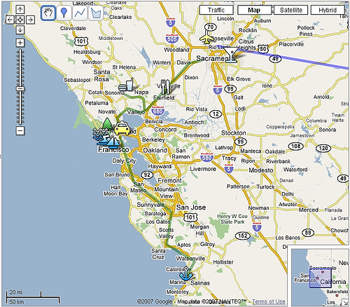
Google Maps Assignment by Sean McCarthy

Google Maps: San Francisco Area with Icons

Image Credit: billolen 

For a handout, download the PDF document outlining this assignment.

Objectives:

In this assignment, students are asked to create a GoogleMap to map a topic.

GoogleMaps allows students to create their own journeys and annotate place markers with text and multimedia content; they can upload their own photos to their map, link to YouTube clips, write text and link to blogs and other kinds of websites. This free service encourages them to build maps that tell stories in a visually interesting, geographically situated way, and all sorts of people, from news agencies to public transportation services, are now using maps to create new kinds of content (commonly called 'mashups'). GoogleMaps shows how fun and creative writing on the web can really be. With no experience and lots of imagination students can join the most creative people currently delivering content on the web.

In this assignment students will literally "map" a topic of their own choosing that relates to globalization. In other words, they are going to use the multimedia environment of GoogleMaps to tell their story and present their research to the rest of the class (and the rest of the world, if they wish!).

Materials/Equipment:

Internet access and a Google Account.

Preparation:

Students need to be taught how to navigate GoogleMaps. Fortunately, GoogleMaps are really easy to use. These introductory videos will show you the basics. Here’s the page that gives you step-by-step instructions on how to build your map. This YouTube video shows you how to create interactive place markers. Finally, Google Maps Mania is a great blog that shows how people are using GoogleMaps around the world. It provides links to hundreds of maps and is a great place to start thinking about your own map.

Procedure:

Midterm maps due: week 10/28

Final Map Due: 12/4

Accompanying Paper: due 12/4

Assignment Specifics:

The map will be evaluated as a Learning Record work sample. So, be sure to make observations about what you are learning as you are creating your map and use the work samples as a way of building your research. A draft of the map is due the week of 10/28, when we will spend the week on presentations of your maps. The final map is due the last day of class as a work sample in your LR. In addition, you need to produce a two-page, single-spaced explanation of your choices for the map. In this short paper you will explain the idea behind the map—the intended audience, the choice of sources, why you chose that particular layout. etc. 

My criteria for assessing your map are simple: how well do you use the map technology? How clear is the story you are trying to tell? How do you balance writing in the map with multimedia content? Will this map be useful and legible for your defined audience? Will they understand what this map is about without having been in this class?

There are a number of ways you can fill in your map. It must have at least 8 placemarkers that contain text, and some sort of reference to other multimedia resources (photos, hyperlinks, YouTube clips etc). The writing must by your own, though you obviously can use links to other text, audio and visual material to help tell your story. Part of the skill you will develop will be to decide what information to write into the placemarker and what you will leave to your hyperlinked sources. For example, how well can you tell the story within your map without forcing your audience to jump to other websites to fill in the gaps? These are the kinds of important choices you must make. The success of your map will depend on the clarity of your writing, what sources you use and how you incorporate them, and the overall coherence of the project (in other words, can the reader easily understand the whole idea behind the map?).

You will need to do some research, but that research could include your own photographs (or photos you find on the web); your own interview or  podcast (or one you find on the web), a really cool YouTube clip, or an informative website or blog. Remember, your GoogleMap and midterm paper can be on the same topic, so research for the map can count as an opportunity to develop your research for your midterm paper. The only real rules are that the map must in some way relate to the ideas we are talking about in class. It must be informative (in other words, it shows research) and there must be writing to assess. DON’T present me with just a bunch of photos or hyperlinks; it’s how you write about them that counts.

Presentations will be on the week of 10/28. The feedback you get from the class during these presentations you will be able to clarify your ideas and build a better map. After the presentations you will buddy with two other classmates. For the rest of the semester, you will be helping each other evaluate your maps using the map rating function built into GoogleMaps. 

Critical Cartography: Aram Bartholl's "Map"

Map: marker moved by tow truck

Image credit: Aram Bartholl's "Map"

Google Maps is a godsend—in our daily lives, we use the site to find a new place to live, track the settings of a public controversy, catch lawbreakers in the act, and claim land that’s been long-contested. Border scuffles and all, Google Maps is helping us reimagine the terrains, cities, and spaces of the real world. It was only a matter of time before we witnessed the melding of Google Maps virtual and Real World spatial. That time is now: Berlin-based artist Aram Bartholl has spent the last five years working on a project that brings Google Maps’ digital location markers into real city spaces. His installations in different cities in Europe and Asia—all entitled “Map”—ask us to question the lines between real and virtual, center and periphery.

The 12 States of America


(Image Credit:  The Atlantic)

I adore interactive maps, especially ones that come in sexy colors and with a wealth of demographic data.  The Atlantic has a new one up by Dante Chinni and James Gimpel, authors of Our Patchwork Nation, that juxtaposes demographic data for individual counties and the rise or fall in average incomes.  Chinni and Gimpel use these relationships to identify twelve "county types," each of which have some relationship to a demographic data point and a rise or fall in income.  Seven of the county types have seen a decrease in effective income (adjusted for inflation) between 1980 and 2010.

War Games - Isao Hashimoto

"1945-1998" by Isao Hashimoto

Originally created in 2003 by the Japanese artist Isao Hashimoto, "1945-1998" maps all 2053 nuclear explosions during that period.

Picturing "Severe Weather "

            Image Credit: "Hermine Heads Inland," the Weather Channel


Not only is it the beginning of the semester for us, but it’s hurricane season  and we, in central Texas, are feeling the effects of Tropical Depression Hermine. Today, I’d like to share a few visual representations of severe weather and begin an investigation of their effects on the viewing public.

Coming Close to Environmental Disaster

(Image Credit: Google Earth image of ash cloud in Iceland , produced with GeoEye satellite imagery)

My very dear friend Tes is stuck in Ireland this week, grounded by the great Iceland ash cloud and hoping to get back in time for her dissertation defense.  She’s been looking for a t-shirt that says, “Eyjafjallajokull 2010” for days, but evidently, no one’s selling.

Her steady stream of emails from Ireland made me think to go look for Google Earth volcanic imagery, and indeed, there are new satellite images from “GeoEye Featured Imagery” (Under “Layers,” click on “More,” then  “GeoEye.”)  The above picture allows us to see smoke coming out of a bright spot near the mid-left of the image and great clouds of ash floating down toward the bottom-right corner.

Tags:

Google Earth Pedagogies: Making the Most of Map Databases

(Image source: Library of Congress Map Collections)

The above map, created by George Washington in 1766, depicts “A plan of my farm on Little Huntg. Creek & Potomk.”  This map, which is publicly viewable at the Library of Congress Map Collections and downloadable as a high-resolution JPEG2000 file, is included in the Collections’ “Cultural Landscapes” section, which highlights the ongoing cultural construction of United States and World landscapes through the ways individuals, communities, and nations modify land.  This subsection of the online Collection places an array of cartographic materials into conversation: a set of local maps authored by George Washington, a series of maps of Liberia created by the American Colonization Society, and a store of historical U.S. atlases.

Recent comments