viz.
Visual Rhetoric - Visual Culture - Pedagogy
Site informationRecent Blog Posts
|
Picturing "Severe Weather "
Submitted by ebfrye on Wed, 2010-09-08 01:11
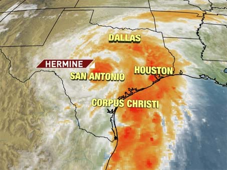
Image Credit: "Hermine Heads Inland," the Weather Channel
Not only is it the beginning of the semester for us, but it’s hurricane season and we, in central Texas, are feeling the effects of Tropical Depression Hermine. Today, I’d like to share a few visual representations of severe weather and begin an investigation of their effects on the viewing public.
Picturing “severe weather” also frequently implies a consideration of what its aftermath or indeed its “disaster” might look like, given that we often don’t devote a heightened attention to the weather until there is cause for concern. Most commonly, our visual conceptions of severe weather and their corresponding threats of disaster begin with a map. (See Laura T. Smith’s post on other mappings of "disasters" here.) The above image from the Weather Channel, like others we frequently encounter in other local and national news media, was produced through Doppler radar. Viewers who otherwise are unfamiliar with the workings of Doppler radar can recognize the significance of the color-coded screen imagery that indicates both a storm’s path and precipitation levels. Perhaps most importantly, these color codes for precipitation often correspond with the possible severity of a particular storm. For a viewing public that often switches between both cable and network channels for weather and national goings-on, such a system communicates its meaning quite easily. The color-coded representations of storm clusters tap into a shared sense of danger, and meteorologists, those persons of science who resemble newscasters, are tasked with emphasizing such warnings. Having grown up in the tornado-ridden South, these Doppler radar maps were the last media-produced images I saw before my mother hurried us to the basement, battery-powered radio in hand. Yet, what intrigues me is that, in our post-9/11 culture, I can’t help but be reminded of the Homeland Security advisory system whenever I look at one of these weather maps. Perhaps that is the intention? Indeed, the potential strength of weather-related phenomena is visually rendered as a “threat level,” and I have trouble divorcing it from my Bush-era conditioned response to airports and travel advisories. Each time I look at a map of my local area under threat of "severe weather," I am also, rather unconsciously, applying a color-coded, and therefore visual, metaphorics of “terror.” Consequently, if an awareness of “severe weather” also appears as a highly-charged awareness of “terror,” what other cache of images does that imply? |
TagsRecent comments
|
Comments
Hidden enemies
Your connection of "severe weather" and "terror" reminds me of the 9-11/Hurricane Katrina comparisons that some commentators made shortly after the storm, as well as President Obama's more recent comparison of the environmental disaster in the Gulf to 9/11. I think we might consider the need to visualize severe weather as connected with a broader need to see threat, a need that is particularly problematic in the War on Terror. The color-coded Doppler Radar images might serve the same purpose as the terror advisory system: making a distant threat visible and quantifiable. Of course, storms don't stay distant for long, but even in the experience of a storm it could be helpful to retain the perspective the Doppler gives you. In that way, both systems might serve as a strange form of reassurance--even if the threat level is high, at least it is knowable.