Site informationRecent Blog Posts
Blog Roll
|
unit length assignmentsNew Journalism Publications: A Multimedia Mash-Up by Nathan Kreuter
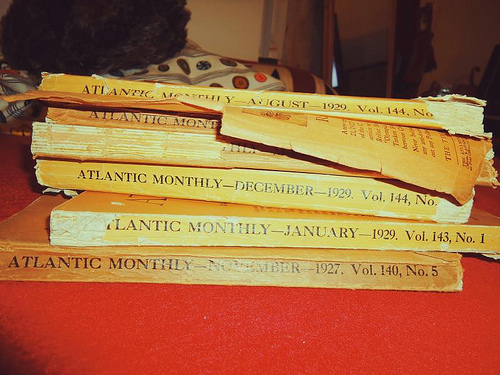
Image Credit: fidgetrainbowtree For a handout, download the PDF document outlining this assignment. For your second project you will be working in groups to create a 3-5 minute multimedia presentation. The content of the presentation should focus on one of the following publications: Rolling Stone, Esquire, Vanity Fair, Harper’s, The Atlantic, and New Yorker. Your task is to choose one of these publications and compare its print culture in two different decades. By “print culture” I mean everything printed in the magazine, from features and fiction to interviews and advertising. Your task is to argue in your multi-media presentation about what the publication in each of those two decades you choose tells us about American culture at that time, as well as to point out the changes between those two decades, and speculate as to what those changes might mean. All of the publications listed here are held in the PCL’s stacks. While UT does have some digital copies of more recent issues, you would be better served by going to the library and looking at the physical issues. And for older issues you won’t have a choice. So you’ll need to get into the library. The format of these projects is a multi-media presentation, which must be no less than three and no more than five minutes long. It also must be entirely selfcontained, which means that when you bring it to class you can simply press a play button and we can watch and hear the entire presentation. At the least interesting (and least likely to garner a high grade) end of the spectrum would be an automated PowerPoint presentation, and at the most interesting end of the spectrum would be some sort of video that incorporates images and words from the original publications, as well as music and some sort of narration to make your group’s observations and argument. In the coming days I will provide you with the rubric that I will use to grade the presentations. You also need to quickly decide which publication your group will cover. I would prefer that no two groups work on the same publication. As always, you should email if you have any questions. Important Dates: Wednesday, February 25th—Project Assigned Monday, March 2nd (Texas Independence Day)—Let me know which publication your group will cover, rubric provided to students Monday, April 13th—Final Projects Due in Class Creating a Common Class Publication: A Unit Plan by Nate Kreuter
Image Credit: nublue For a handout, download the PDF document outlining this assignment. For our second major writing assignment we will be producing a class publication. Everyone will contribute to the publication, albeit in some different ways (see below). I propose that we "write" a publication dealing, in the broadest sense, with "Austin." You all should choose subject to follow and write about that say something about what makes Austin different from other cities. The assignment is really that broad. And we will have a very boring publication if everyone writes an expose of a frat party. This will require you to get off campus and engage with our broader community. Keep in mind that the New Journalism often approached culture from the fringes—you might want to do the same, but whatever you do, stay safe. If you have a difficult time coming up with ideas, I'll happily help you brainstorm. Under no circumstance should you put yourself in a dangerous or even uncomfortable position to get your story. There are plenty of great stories available without having to take such risks. Also, your grade will be low indeed if you indulge in some form of reportage that is simply about, say, getting high with your friends. The New Journalism is hip and cool, but don't let that compel you to act or write in ways that you don't want to be recorded for posterity. This, despite the cool of the New Journalism, is still a formal assignment, and should be treated as such. We will talk about journalistic ethics and your responsibilities to yourselves, your subjects and your readers throughout this project, and I strongly suggest that you take notes when we have those conversations. In terms of composition, I want us to expand on the typical notion of writing. You could choose to write a traditional essay for this project, but I strongly encourage you to experiment with other forms of compositions: videos, radio essays (a la This American Life), multimedia presentations, flash presentations, and photo essays are all viable options for this project. If you would like to attempt a composition in a medium you have not worked in before, Nate will be happy to direct you to one of the many campus resources available, such as DMS, to help you with your project. Journalists—Journalists will write stories relevant to the topic of the publication. They will submit polished, well documented stories to the editors. Stories should be between 2000 and 5000 words. The editors may reduce the text as it appears in the final publication, or they may ask a journalist to add or flesh out parts of their story. Commentators—Once the journalists' stories have been selected the commentators will decide upon a strategy for making sense of what the stories mean. They will each "write" a critical essay commenting on one or more stories and the stories' significance. They will try to tell us what the reporting means. Editors—Three editors will be selected from applicants to review the stories submitted by the journalists. They will determine which stories to feature, as well as making constructive suggestions for how the stories might be improved before final publication. In consultation with the class as a whole, individual contributors and Nate, they will set deadlines for story submission and final publication. Editors will also "write" introductory and concluding material, as necessary. Designer—The designer will be responsible for the layout and final publication of our work. They will need to be familiar with web-based and traditional publishing techniques. They will be responsible for bringing all the various media together in one "location" and forming them into a coherent "publication." Grades—Everyone will get two grades for this assignment. Nate will grade the final publication, for which everyone will receive the same grade. This grade will count as 10% of students' final grades. Additionally, Nate will grade students' compositions and contributions to the final publication, grading the publication in their prior-to-editing state. This grade will count as 20% of students' final grades. Deadlines—by 10/10 you should email Nate with two things: your preferred position on the class publication (journalist, editor, commentator, designer) and your qualifications for that position. The "default" position will be journalist. Also, everyone, regardless of their preferred position, should email Nate a brief (no more than 300 words) description of what you *think* you would like to "write" about for the publication, assuming that you are a journalist. On 10/13 Nate will inform you of your position, at which point he will also discuss your story ideas with you individually. All additional deadlines for submissions and publication to be determined by the class as a whole. As always, email Nate if you have any questions about any component of this project. Flickr Visual Rhetoric Assignment by Eileen McGinnis
Image Credit: topgold For a handout, download the PDF document outlining this assignment. Overview: At the start of the semester, my students in “The Rhetoric of Science Writing” read an excerpt from Pale Blue Dot, Carl Sagan’s prose meditation on a grainy image of Earth taken from the Voyager One mission. Without the accompanying text, the photograph is pretty unimpressive. However, after reading Sagan’s words, it would be difficult for readers to question the value of that image, since at stake is nothing less than our definition of what it means to be a human occupant of Earth, an argument for our responsibilities toward each other and toward the planet. For their final short assignment, students themselves try on the role of “science writer”: they are asked to find a scientific image, contemporary or historical, and write a brief (500-600 word) argument that attempts to persuade a non-scientific audience of their image’s value. Their goal is to convince readers that their chosen image warrants a closer look and to leave them with a more informed appreciation of its contents. Rather than submitting the assignment and accompanying image to the instructor, they will post both the image and text to the photo-sharing site Flickr. Using Flickr to collect students’ work will then enable them to present and discuss their images on the following class day. In addition, the relative “publicness” of this assignment will hopefully foster a sense of community and shared purpose (students can use content-specific tags to make their visual arguments more easily searchable by a broader audience). Of course, this exercise doesn’t necessarily have to come attached to formal assessment. The broader idea here is to use Flickr to create a class “image gallery,” which will facilitate discussion about both individual images and trends across a group of images. Flickr would also work for a more informal homework assignment or even an in-class activity on visual rhetoric, in which students retrieve and analyze visual artifacts for class discussion. Pedagogical Goals:
Description: Rather than walking through the details of my particular assignment, I’ll provide a couple of logistical tips that are more broadly applicable to using Flickr in class:
Modifications: The “Groups” feature on Flickr might offer another way to organize your students’ posts versus having them tag the photos. If you were concerned about access, it would also allow you to control who gets to view the images and/or comment on them. Credit: Thanks to John Jones for helping me figure out the logistics. Google Maps Assignment by Sean McCarthy
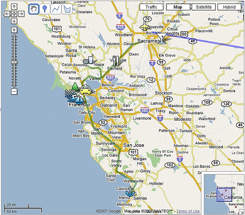
Image Credit: billolen For a handout, download the PDF document outlining this assignment. Objectives: In this assignment, students are asked to create a GoogleMap to map a topic. GoogleMaps allows students to create their own journeys and annotate place markers with text and multimedia content; they can upload their own photos to their map, link to YouTube clips, write text and link to blogs and other kinds of websites. This free service encourages them to build maps that tell stories in a visually interesting, geographically situated way, and all sorts of people, from news agencies to public transportation services, are now using maps to create new kinds of content (commonly called 'mashups'). GoogleMaps shows how fun and creative writing on the web can really be. With no experience and lots of imagination students can join the most creative people currently delivering content on the web. In this assignment students will literally "map" a topic of their own choosing that relates to globalization. In other words, they are going to use the multimedia environment of GoogleMaps to tell their story and present their research to the rest of the class (and the rest of the world, if they wish!). Materials/Equipment: Internet access and a Google Account. Preparation: Students need to be taught how to navigate GoogleMaps. Fortunately, GoogleMaps are really easy to use. These introductory videos will show you the basics. Here’s the page that gives you step-by-step instructions on how to build your map. This YouTube video shows you how to create interactive place markers. Finally, Google Maps Mania is a great blog that shows how people are using GoogleMaps around the world. It provides links to hundreds of maps and is a great place to start thinking about your own map. Procedure: Midterm maps due: week 10/28 Final Map Due: 12/4 Accompanying Paper: due 12/4 Assignment Specifics: The map will be evaluated as a Learning Record work sample. So, be sure to make observations about what you are learning as you are creating your map and use the work samples as a way of building your research. A draft of the map is due the week of 10/28, when we will spend the week on presentations of your maps. The final map is due the last day of class as a work sample in your LR. In addition, you need to produce a two-page, single-spaced explanation of your choices for the map. In this short paper you will explain the idea behind the map—the intended audience, the choice of sources, why you chose that particular layout. etc. My criteria for assessing your map are simple: how well do you use the map technology? How clear is the story you are trying to tell? How do you balance writing in the map with multimedia content? Will this map be useful and legible for your defined audience? Will they understand what this map is about without having been in this class? There are a number of ways you can fill in your map. It must have at least 8 placemarkers that contain text, and some sort of reference to other multimedia resources (photos, hyperlinks, YouTube clips etc). The writing must by your own, though you obviously can use links to other text, audio and visual material to help tell your story. Part of the skill you will develop will be to decide what information to write into the placemarker and what you will leave to your hyperlinked sources. For example, how well can you tell the story within your map without forcing your audience to jump to other websites to fill in the gaps? These are the kinds of important choices you must make. The success of your map will depend on the clarity of your writing, what sources you use and how you incorporate them, and the overall coherence of the project (in other words, can the reader easily understand the whole idea behind the map?). You will need to do some research, but that research could include your own photographs (or photos you find on the web); your own interview or podcast (or one you find on the web), a really cool YouTube clip, or an informative website or blog. Remember, your GoogleMap and midterm paper can be on the same topic, so research for the map can count as an opportunity to develop your research for your midterm paper. The only real rules are that the map must in some way relate to the ideas we are talking about in class. It must be informative (in other words, it shows research) and there must be writing to assess. DON’T present me with just a bunch of photos or hyperlinks; it’s how you write about them that counts. Presentations will be on the week of 10/28. The feedback you get from the class during these presentations you will be able to clarify your ideas and build a better map. After the presentations you will buddy with two other classmates. For the rest of the semester, you will be helping each other evaluate your maps using the map rating function built into GoogleMaps. Updates to Theory and Assignments
Submitted by micklethwait on Thu, 2009-05-07 12:37
There's a new page in our theory section on graphic design. It gives a brief overview of the history and elements of graphic design theory, which is basically a practical application of theories of visual rhetoric. Supplemental to this article is a new unit-length argumentative assignment that uses Adobe InDesign, a computer-based publishing tool, to create publishable proposal documents. |
viz.
Visual Rhetoric - Visual Culture - Pedagogy
Site informationRecent Blog Posts
|
unit length assignments |


Recent comments
2 years 29 weeks ago
2 years 44 weeks ago
2 years 44 weeks ago
2 years 50 weeks ago
3 years 4 weeks ago
3 years 4 weeks ago
3 years 4 weeks ago
3 years 6 weeks ago
3 years 6 weeks ago
3 years 6 weeks ago