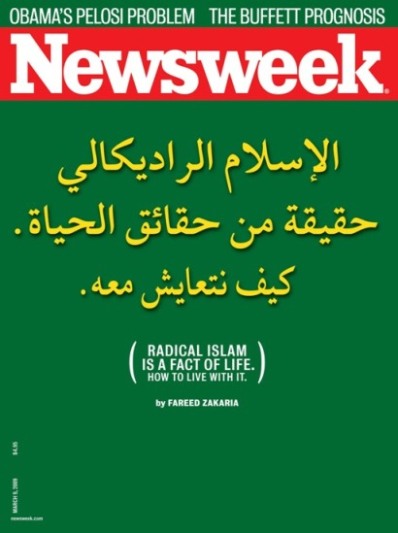
The March 9, 2009, issue of Newsweek Magazine inadvertently draws attention to a pathic characteristic of graphic design: the capacity of visual images to create emotional appeals.

The design of this magazine cover uses color--the pure green background--to evoke the political flags of nations like Libya and Saudi Arabia and political parties like Hamas. The surprising thing is the text itself. The Arabic script here, though meaningful in itself to those who can read it, is reduced to a simply visual signifier as its 'literal' meaning to the readers of Newsweek is made parenthetical. The Arabic text here seems geared solely toward evoking fear and apprehension in the non-Arabic speaking audience.
However, I would certainly praise Newsweek for their decision to avoid the stereotypical images that have become iconic of radical Islam in Western media (chanting crowds, burning flags and effigies, suicide bomb vests, 'Quranic' calligraphy, etc.) in favor of a simple textual presentation.
But why the seemingly gratuitous use of the Arabic script?
The article in question is available to read online.
Recent comments
2 years 29 weeks ago
2 years 44 weeks ago
2 years 44 weeks ago
2 years 50 weeks ago
3 years 4 weeks ago
3 years 4 weeks ago
3 years 4 weeks ago
3 years 6 weeks ago
3 years 6 weeks ago
3 years 6 weeks ago