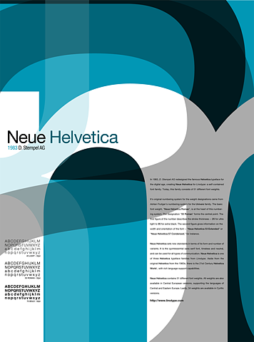
A few weeks ago I caught an episode of Independent Lens on PBS about the font Helvetica.
In the undisputed manifesto of modern graphic design, The New Typography, author Jan Tschichold argues in vaguely Heideggerian terms that modernity requires a typeface consistent with its worldview. In fact, typeface has always been consistent, in his opinion, with the worldview of the civilization that used it, insofar as he sees that worldview as an expression of the relationship between with individual, the whole of society, and the technae they employ to shape and frame the world around them.
Then over the last week I caught sight of this pair of advertisements for the typeface Helvetica font featured on Ffffound.com.
 http://viz.dwrl.utexas.edu/files/helvetica-ad.jpg alt="sexist helvetica ad" class="center" width="180">
Image from Ffffound.com.

Image from Ffffound.com.
Recent comments
2 years 29 weeks ago
2 years 44 weeks ago
2 years 44 weeks ago
2 years 50 weeks ago
3 years 4 weeks ago
3 years 4 weeks ago
3 years 4 weeks ago
3 years 6 weeks ago
3 years 6 weeks ago
3 years 6 weeks ago