viz.
Visual Rhetoric - Visual Culture - Pedagogy
Site informationRecent Blog Posts
|
Form, Function, and Fonts: Eric Gill’s Branding Type
Submitted by Rachel Schneider on Tue, 2012-04-10 01:03
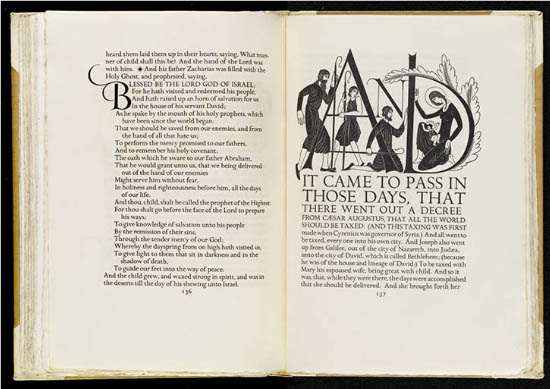
Image Credit: The Library of Congress Eric Gill’s illustrated 1931 The Four Gospels of the Lord Jesus Christ According to the Authorized Version of King James I may be the most beautiful text in the Harry Ransom Center’s King James Bible exhibition. Gill, who was a graphic designer, a sculptor, and a firm Catholic, melded his minimalist design aesthetics with Catholic art’s gilded tradition to make what the Library of Congress calls “a modern homage to the tradition of illuminated text.” Gill’s black and white figures, however, dance around the elegant typeface to create a Catholicism aesthetically rebranded for the twentieth century: sparse but still striking. (Slightly NSFW after the break.)
Image Credit: Wandering the Dream Space The rationale for Gill’s design choices can perhaps be understood in his Essay on Typography, which was first published the same year as the Four Gospels:
Reading this against the Gospels, what strikes me is Gill’s interest in form and function. He writes here that beauty comes not from ornament but from forms adapted best to function—thus, why “plain brick walls” may be beautiful, but perhaps not jewel-encrusted objet d’art. Typography, however, has different functions than a chimney. As Christopher Micklethwait has previously discussed on viz, graphic design concerns itself with typography, layout, and chromatics. The New Typography, represented by Jan Tschichold as well as Eric Gill, concerned itself with clarity instead of beauty. If text’s designed function is clarity and legibility, Gill’s designs do not get in the way of reading—in fact, they enhance and draw attention to text as his characters sometimes seem to perch over the letters. The iconographic figures resonate with a medieval religious tradition, but the design avoids being overly florid.
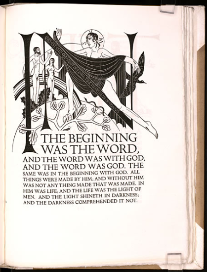
Image Credit: The Harry Ransom Center This illustration is particularly interesting as the major figure’s alignment with the downstroke of the N draws our attention to the word—both the one on the page and The Word of the Gospels. Also running parallel is the squiggly line of the snake, climbing towards the innocent Adam and Eve, who almost seem to greet the fall awaiting them. In this way, Gill’s design highlights the function of the text: to bring the reader to a greater appreciation of Christianity.
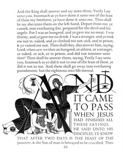
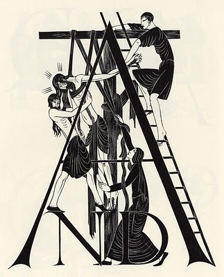
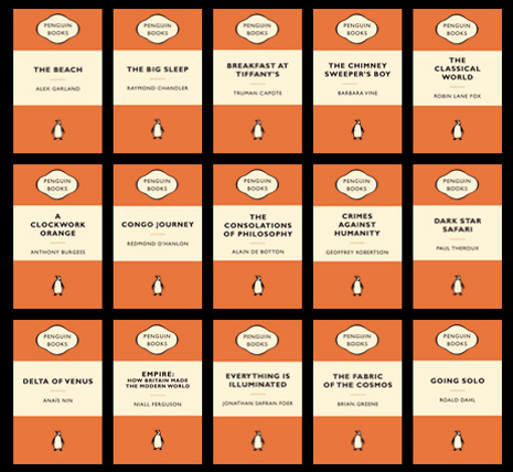
Image Credit: Wandering the Dream Space However, Gill’s designs are not without art. As a Catholic in the mode of Hilaire Belloc, Gill’s designs also provide an interpretive gloss. The starkness of Jesus being taken from the cross invokes not the Second Vatican Council but a much more medieval tradition. It also doesn’t seem coincidental that Gill’s famous Gill Sans typeface has effectively served to brand other organizations, like Penguin Books’ famous paperback designs.
Image Credit: William Wu Books Gill Sans also has power as a nationalistic British brand, as the BBC has used Gill Sans in its logo since 1997.
Image Credit: The BBC Martin Lambie-Nairn, the designer responsible for the new logo, redesigned the BBC logo not only because the slanted letters used previously did not transfer well to pixels, but because “by choosing a typeface that has stood the test of time, we avoid the trap of going down a modish route that might look outdated in several years’ time.” As a brand that attempts to be associated with solidity and seeks the trust of its viewers, it seems a good choice on the BBC’s part. However, it leaves me to wonder how the University of Texas at Austin's and the Harry Ransom Center’s type brands them.
Image Credit: The Harry Ransom Center The Harry Ransom Center’s classic logo not only conveys a certain stylish solidity but also includes its windows and its materials as a design element alongside the font. By putting Gill’s lettering not only in its exhibitions but also on their windows, the Harry Ransom Center nods to Gill’s design legacy and its value for research institutions today. The opinions expressed herein are solely those of viz. blog, and are not the product of the Harry Ransom Center. |
|
Recent comments
2 years 29 weeks ago
2 years 44 weeks ago
2 years 44 weeks ago
2 years 50 weeks ago
3 years 4 weeks ago
3 years 4 weeks ago
3 years 4 weeks ago
3 years 6 weeks ago
3 years 6 weeks ago
3 years 6 weeks ago