viz.
Visual Rhetoric - Visual Culture - Pedagogy
Site informationRecent Blog Posts
|
Reply to commentFrom Sea to Shining McDonald's, and Other Americas: Critical Cartography II
Submitted by Jake Ptacek on Tue, 2011-11-08 09:00
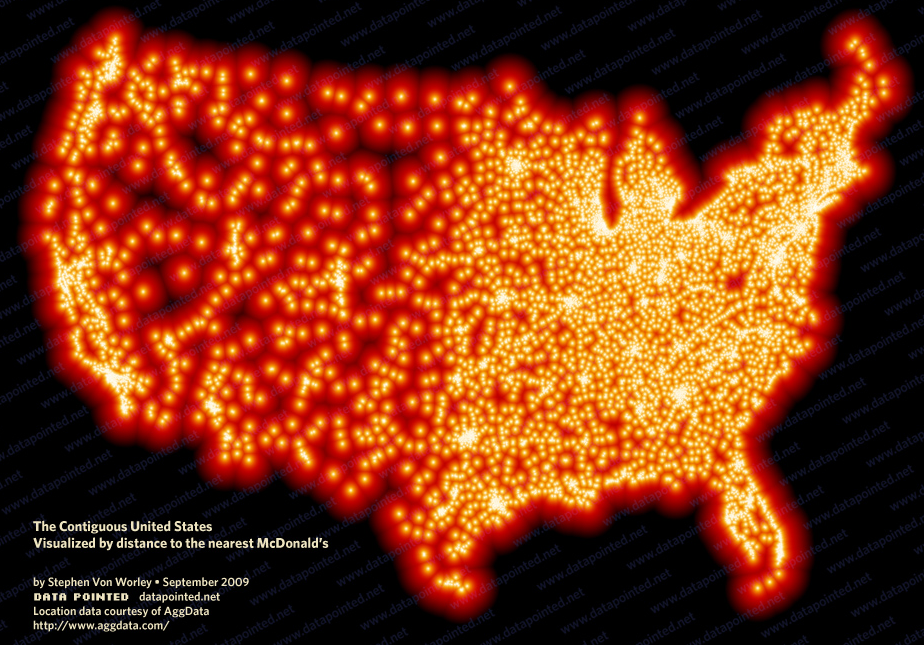
Image by Stephen von Worley Last week, I wrote about the power of cold-war era maps when it comes to visualizing Western attitudes towards the Soviet bloc, and, in the work of William Bunge, visualizing themselves. This week I want to continue my trip down critical cartography's rabbit-hole with an overview of maps that attempt to locate forms of the "American experience." How can aspects of daily life in America be represented visually? The following maps try to answer that question, in playful, political, and subversive ways. The image above, Stephen von Worley recounts on his website, is one attempt to answer the question, "How far away can you get from the world of generic convenience?" Transforming each McDonald's in the contiguous 48 states into one dot, von Worley redraws the US as an enormous network of lights. (The answer to the question, by the way, is 145 miles, by car, in southwestern South Dakota.) The map makes a compelling, if simple, statement about the prevalence of corporate experience throughout America.
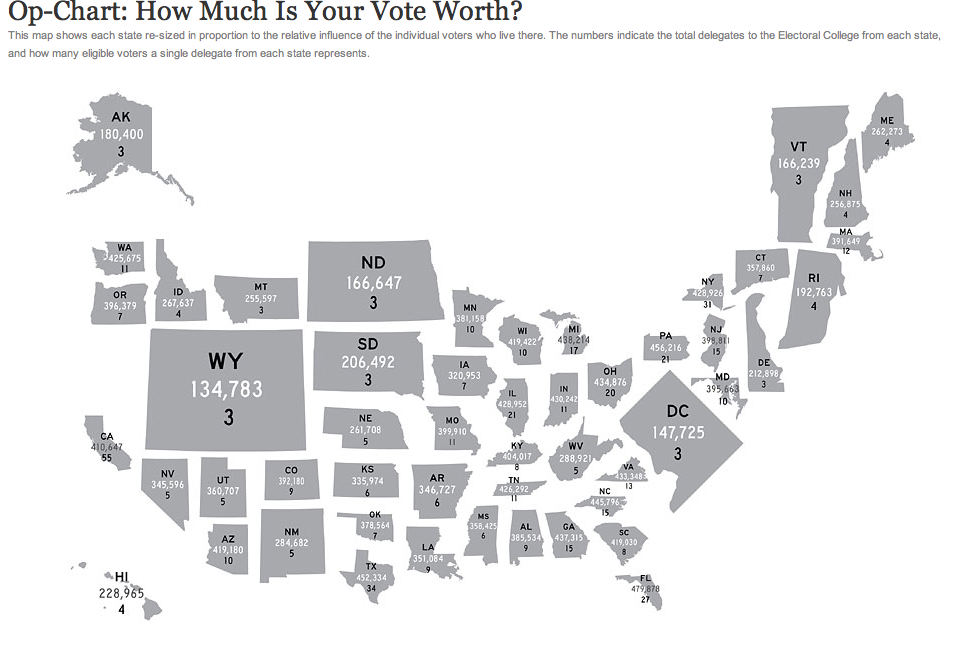
Image: New York Times Jumping from the corporate to the political, this 2008 map from the New York Times charts a single voter's relative political influence in the US. States have been resized based on a comparison of state population with the number of electoral votes allotted (it should be noted that the state population does not accurately reflect the number of acutal voters). The larger the state, the larger the influence. The size of Wyoming and the Dakotas should come as no surprise to anyone, but one thing the map handily reveals is the relative power of voters in Washington, D.C., Vermont, and Rhode Island. As the commentary that accompanies the map suggests, visuals like these help reveal the "one-person one-vote" myth that's prevalently held on both sides of the ideological divide; the truth, as always, is much more complicated.
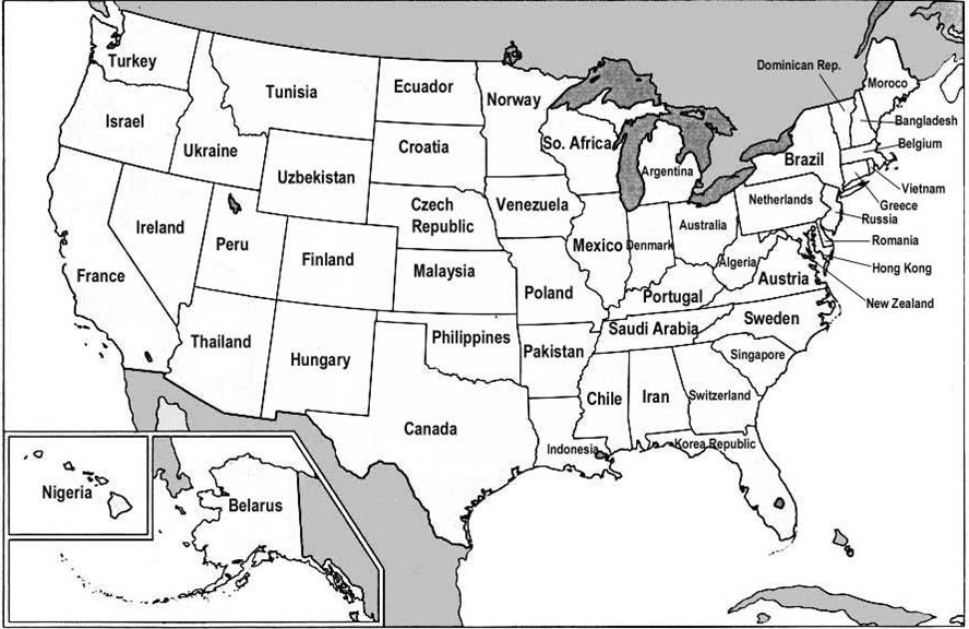
Image: The Big Picture The map above comes from Frank Jacobs's Strange Maps blog, an excellent web resource for all maps non-traditional (you'll note several maps from this post there). It breaks down the American Gross Domestic Product (GDP) into the GDPs of each individual state, and then renames each state with the name of a country with a similar GDP. The result is a fascinating international picture. This map is rough, of course, and doesn't take into account a per capita GDP, but, as Jacobs explains it, "this map does serve two interesting purposes: it shows the size of US states' economies relative to each other (California is the biggest, Wyoming the smallest), and it links those sizes with foreign economies (which are therefore also ranked: Mexico's and Russia's economies are about equal size, Ireland's is twice as big as New Zealand's)." What emerges is a truly unique view of the American economy (check his website for a more detailed account of the map).
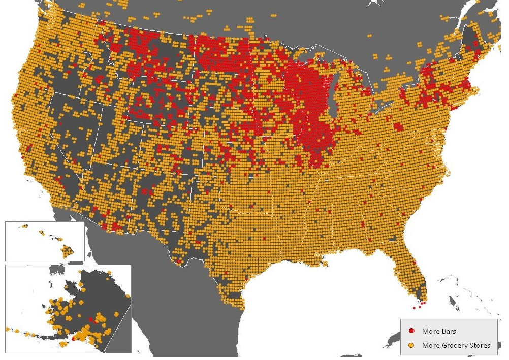
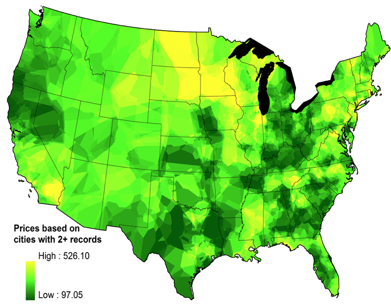
Image by Matthew Zook By contrast, the maps above and below, created by the folks over at FloatingSheep, reveal a very different American experience. According to their website, the cartographers at Floating Sheep are "dedicated to mapping and analyzing user generated Google Map placemarks." While this can sound drily academic, the maps they generate are often anything but. As they note, Google Maps documents users "memories, feelings, biases, and reactions to places," and though the site is powered by serious analytic and academic work, the maps capture the "collective intelligence"--or maybe better yet the collective unconscious--of internet users. Above, the group has mapped Google Map references to bars versus Google Map references to grocery stores. More references to bars generates a red dot. More grocery stores, a yellow. Who knew that Wisconsin, Illinois, Iowa, and Minnesota would be bar central? (Actually, as someone who grew up smack dab in one patch of red and went to college in another, I did...) In the map below, data from the PriceofWeed website (sorry, it's an academic post, no link; I imagine you can find it if you want) is mapped onto the US, creating an interesting picture of high-productivity growing and import areas.
Image: FloatingSheep
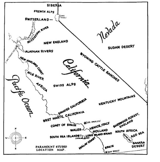
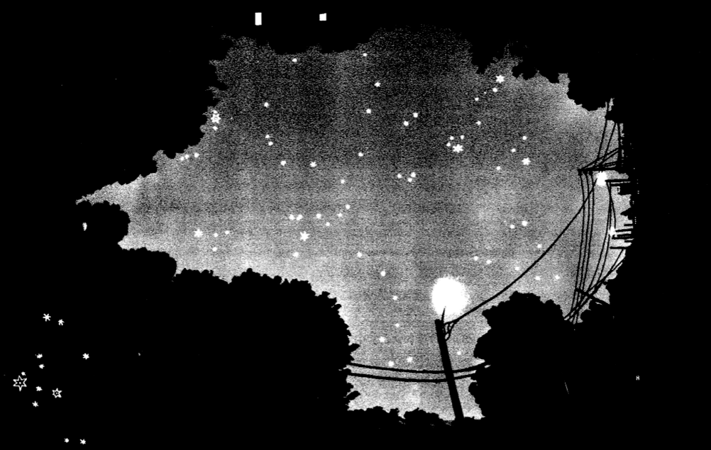
Image: Strange Maps To conclude, two maps that zoom in geographically, taking a closer look at America. The first map, above, was produced by Paramount in the late 1930's (several different dates are floating around on the internet) by a seemingly unknown cartographer. It's a map of studio locations and where they've stood in for--a geography of fantasy, or good ol' Hollywood wish fulfillment. It's sort of boggling to see Spain next to San Diego, or Sherwood Forest just north of the Red Sea. I find it a charming representation of global geography, and perhaps more proof that--as my Northern Californian friends would say--SoCal residents think they're at the center of the world. I've saved my favorite map for last, a particularly evocative image from Denis Wood's ongoing Narrative Atlas of Boylan Heights. Long a kind of mythic cartographic project, Wood has been making creative, non-traditional maps of the Boylan Heights neighborhood in Raleigh, NC for over four decades. Parts of that project were recently published as Everything Sings: Maps for a Narrative Atlas, which is well worth looking into if maps interest you in the slightest. Wood, whose work has been featured on This American Life, makes maps of jack-o-lanterns, locations referenced in local papers, graffiti, and other non-standard ways of visualizing space. At their best, his maps challenge you to reconceptualize the world around you. The map below, simply entitled "Stars Map", is an attempt to situate Boylan Heights "in everything, that is, in the universe" according to Wood. I think there's something simple and evocative captured in the image, something I won't spoil with continued analysis. You can get a taste of some of Wood's other work here, and (as mentioned above) many of these maps have now been published.
Image by Denis Wood ReplyYour contribution to the blog: Please Read Before PostingThe viz. blog is a forum for exploring the visual through identifying the connections between theory, rhetorical practice, popular culture, and the classroom. Keeping with this mission, comments on the blog should further discussion in the viz. community by extending (or critiquing) existing analysis, adding new analysis, providing interesting and relevant examples, or by making connections between that topic and theory, rhetoric, culture, or pedagogy. Trolling, spam, and any other messages not related to this purpose will be deleted immediately. Comments by anonymous users will be added to a moderation queue and examined for their relevance before publication. Authenticated users may post comments without moderation, but if those comments do not fit the above description they may be deleted. |
|
Recent comments
2 years 29 weeks ago
2 years 44 weeks ago
2 years 44 weeks ago
2 years 50 weeks ago
3 years 4 weeks ago
3 years 4 weeks ago
3 years 4 weeks ago
3 years 6 weeks ago
3 years 6 weeks ago
3 years 6 weeks ago