viz.
Visual Rhetoric - Visual Culture - Pedagogy
Site informationRecent Blog Posts
|
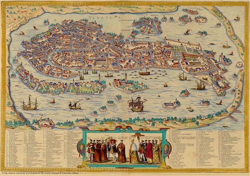
cartographyCheck Out this Imaginative Map of Renaissance Venice
Submitted by Jay Voss on Wed, 2013-02-27 10:00
(Image credit: The Hebrew University of Jerusalem) I was reading Galileo the other day when I became interested in Renaissance Venice (the place had sublime music, visual arts, and all the culture that comes with the great flowerings of these things), and a few Google searches later I found myself staring at the map above for about 20 minutes. (Click here for a larger copy.) The map was drawn by Bolognino Zaltieri in 1565. Now, it’s already allergy season here in central Texas and I admit that I feel as though I’m on allergy meds without having even taken any, so my fascination with the map could be due to various things beyond my own intellect, however, you’ve got to admit – this map is awesome. It’s just crazy to imagine living amongst one of those waterways several hundred years ago. How about all the bridges? And do you notice that a pedestrian going from one mini-island to another might have to plan their trip in advance, as not every mini-island is connected to its peers? And then, of course, you wonder how it was all built without the aid of gasoline-powered construction tools. I thought I’d share it all with you. It’s just mesmerizing how a city built upon a marsh contains so many things, and how a mapmaker was able to portray segmented happenings and city life.
What would Proust do with Google Maps?
Submitted by Jake Ptacek on Tue, 2011-11-15 09:00
Screenshot from Google Maps via Jon Rafman In David Sasake's blog post, "How to read Google Earth like Proust," he notes that Marcel Proust liked to read train timetables before bed. According to Alain de Botton, "[T]he mere names of provincial train stations provided Proust's imagination with enough material to elaborate entire worlds, to picture domestic dramas in rural villages, shenanigans in local government, and life out in the fields." Place names can float up in our subconsciousness, rekindling memories long forgotten like rabbits pulled out of a magician's hat. So what would Proust make of Google Maps, and especially Google's massive, ongoing "Street View" function, where an ever-expanding swath of the globe is mapped, photographed, and instantly accessible? What happens when you can view almost anyplace, anytime? From Sea to Shining McDonald's, and Other Americas: Critical Cartography II
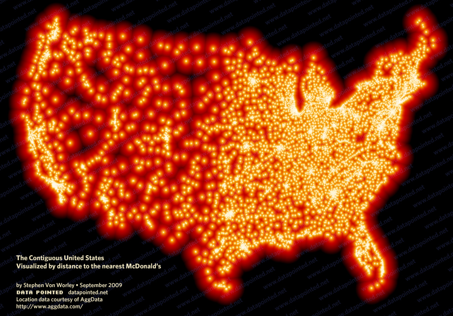
Submitted by Jake Ptacek on Tue, 2011-11-08 09:00
Image by Stephen von Worley Last week, I wrote about the power of cold-war era maps when it comes to visualizing Western attitudes towards the Soviet bloc, and, in the work of William Bunge, visualizing themselves. This week I want to continue my trip down critical cartography's rabbit-hole with an overview of maps that attempt to locate forms of the "American experience." How can aspects of daily life in America be represented visually? The following maps try to answer that question, in playful, political, and subversive ways. The Octopus of Antwerp and Other Cold War Maps: Critical Cartographies I
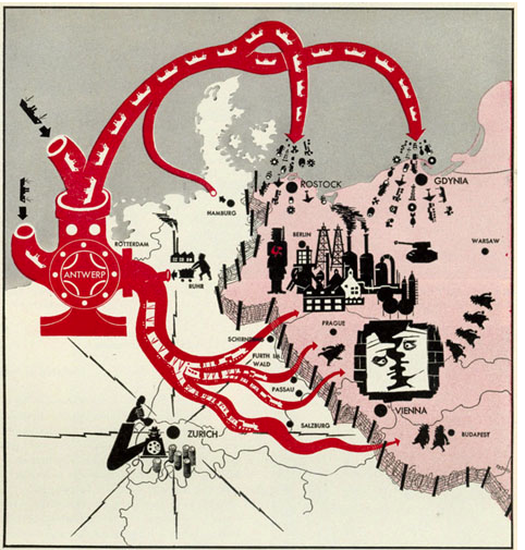
Submitted by Jake Ptacek on Tue, 2011-11-01 08:00
Image: Life Magazine via Newberry Library This is not the post I meant to write. My graduate research has increasingly involved reference to Charles Booth's Life and Labour of the People in London, a magisterial attempt to combine statistical data and cartography into an analysis of late-nineteenth century urban London experience. I had intended to post on Booth's groundbreaking "poverty maps", and the updated maps created by the London School of Economics (you can see their side-by-side comparison here). In my research for the post, though, I came across John Krygier's Making Maps blog, and I've become fascinated (and sidetracked) by the surprising power of cartography. Inspired to think about how maps and mapmaking critically constructs the world, what follows is a subjective and fairly non-rigorous tour of Western cartography during the Cold War era. Critical Cartography: Aram Bartholl's "Map"
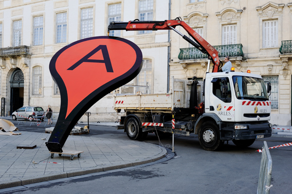
Submitted by Lisa Gulesserian on Thu, 2011-09-22 08:00
Image credit: Aram Bartholl's "Map" Google Maps is a godsend—in our daily lives, we use the site to find a new place to live, track the settings of a public controversy, catch lawbreakers in the act, and claim land that’s been long-contested. Border scuffles and all, Google Maps is helping us reimagine the terrains, cities, and spaces of the real world. It was only a matter of time before we witnessed the melding of Google Maps virtual and Real World spatial. That time is now: Berlin-based artist Aram Bartholl has spent the last five years working on a project that brings Google Maps’ digital location markers into real city spaces. His installations in different cities in Europe and Asia—all entitled “Map”—ask us to question the lines between real and virtual, center and periphery.
Tags:
|
|
Recent comments
2 years 29 weeks ago
2 years 44 weeks ago
2 years 44 weeks ago
2 years 50 weeks ago
3 years 4 weeks ago
3 years 4 weeks ago
3 years 4 weeks ago
3 years 6 weeks ago
3 years 6 weeks ago
3 years 6 weeks ago