viz.
Visual Rhetoric - Visual Culture - Pedagogy
Site informationRecent Blog Posts
|
MapsFood Insecurity and the Food Environment Atlas
Submitted by fc on Fri, 2010-02-19 11:27
Image Credit: screen shot of http://www.ers.usda.gov/FoodAtlas/ Last week, First Lady Michelle Obama introduced Let's Move, a new government initiative aimed at ending the childhood obesity epidemic within one generation. After attending the signing of a Presidential memorandum forming a special task force on childhood obesity, Mrs. Obama officially launched the Let's Move campaign at a press conference with reporters, cabinet-level secretaries and local school children. During the press conference, the First Lady introduced the Food Environment Atlas, a new website for locating "food deserts" and otherwise visualizing the availability of healthy food to households around the country. More about the Food Atlas after the jump.
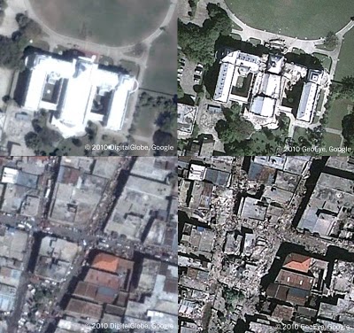
Google Earth Pedagogies: From Haiti to RHE 306
Submitted by Laura T. Smith on Mon, 2010-02-08 13:41
Image Credit: Google Lat Long Blog If were you watching the news in mid-January, you likely saw images like those above flashing repeatedly across your television or computer screen. Unlike the photojournalistic, street-level portraits that tend to document disasters, these aerial shots, produced through a collaboration between Google Earth and GeoEye (a satellite imaging company), have been prominent in the visual coverage of the earthquake that hit Haiti on January 12, 2010. The above images show pre- and post-quake views of the Presidential Palace (top left; top right) and downtown Port au Prince (bottom left; bottom right), and were created using the timeline tool in Google Earth. Mapping the Eighteenth Century: A Report from CSECS
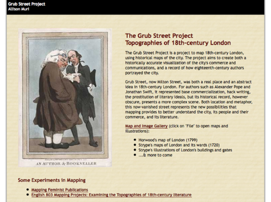
Submitted by Rachel Schneider on Mon, 2009-11-09 19:03
Image Credit: Screenshot from The Grub Street Project While I wrote in my last blog here that I would use this week’s blog to discuss my upcoming conference paper for MMLA, I was led astray this weekend by an excellent panel I attended at CSECS that I thought the viz. audience might enjoy. (Sorry, Gossip Girl fans. Tune in next week!) After deciding to attend the panel entitled “Mapping Culture: Topographies of London,” I was delighted to discover it featured not only a paper on Boswell’s enchanting London Journal, but also an excellent discussion about using mapping strategies to teach and research eighteenth-century texts. What united the various papers on the panel, which discussed such disparate texts as John Gay’s “Trivia,” the Mohock Club, Boswell’s aforementioned Journal, and Thomas De Quincey’s Confessions of an English Opium-Eater, was that each paper was based on material provided by The Grub Street Project, a website that unites topographical data with literary texts like Pope’s Dunciad. The United states of Nations: a juxtapositional reading
Submitted by Nate Kreuter on Wed, 2009-06-24 16:15
Image credit: James Richards, via Strange Maps The dark corners of the intertubes are populated by weirdly animated detritus. In one particular corner I found Strange Maps, an intellectual terra incognita. Here is one map from the site, in which map-author and vexillologist James Richards has filled in United States states with the flags of other nations with populations equal to that of the correlate United States state. What is the point of such a map? It takes us nowhere. It is trivia, contrived comparison, meaningless. Indeed. This *is* an odd land, and there is perhaps no better way to understand, as a stranger in a strange land, the strangeness than that quintessentially American experience and myth, the road trip. "Buy the ticket, take the ride," someone screams in Jack's ear as he discreetly tries to fill in his fantasy baseball roster. In the Lonestar People's Republic of North Texorea . . . imagine it . . . The high plains meth labs have been bulldozed. Justice remains swift. And decisive. The governor's call to secession has been fulfilled. President Rick Perry, in his paramilitary uniform of high commander, sings along to the Lonestar Republic's national anthem and reviews the People's Army, parading forth from Camp Mabry and into the Austin city streets. "Keep Austin Weird," the buzz-cut forces shout in unison as they pass the review stand. The death penalty endures, but the process has been expedited. The workaday Texicans have traded in their Pearl for Pulrosul (an alcoholic concoction bottled with a dead adder inside), and good ol' boys, no longer satisfied with whiskey and rye, swill the juice of the alcohol addled adders, and later bite their heads off. The mezcal worm has turned, into a snake. Our trip begins just out of reach of the center of State power in Austin, on Interstate 35. We drive north. "Keep the Weird in Austin." Tags:
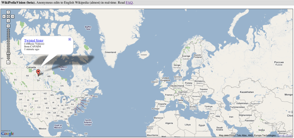
Wikipediavision: Visualizing anonymous edits to Wikipedia
Submitted by John Jones on Tue, 2007-10-30 10:31
László Kozma, a grad-student at the Helsinki University of Technology, has created Wikipediavision a mashup of Wikipedia edits and Google maps reminiscent of Twittervision and Flickrvision. Wolrd Freedom Atlas
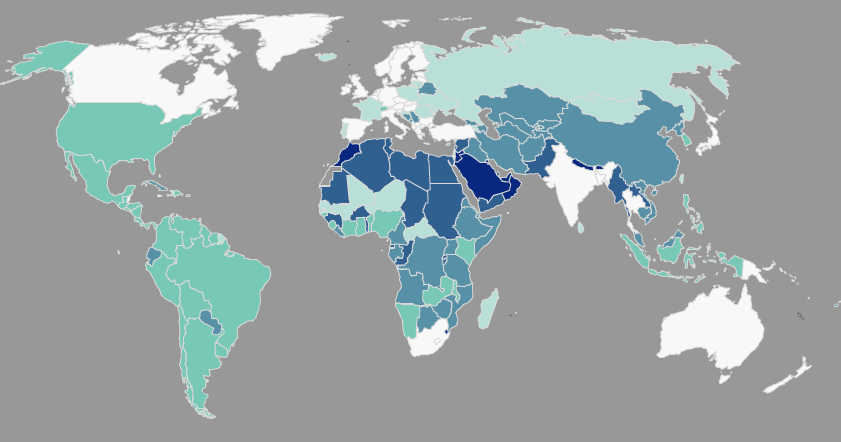
Submitted by John Jones on Wed, 2007-09-26 11:51
The World Freedom Atlas gathers a number of interesting datasets related to world politics and human rights and converts them into a dynamic map display. Interestingly, the visual display helps to foreground the rhetorical choices made by the authors of those datasets. For instance, the map below displays a country’s governmental structure, ranging from a parliamentary democracy (white) to monarchic dictatorship (dark blue) (Cheibub and Gandhi, 2004). Notice that the U.S., a presidential democracy, falls in the middle of the classification scheme, closer to the dictatorships than Canada and Australia, which are both white, as well as Russia, which is a light teal.
Tags:
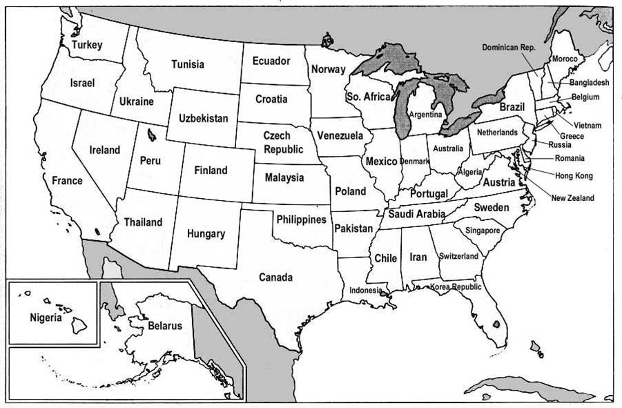
Visualizing GDP
Submitted by Nate Kreuter on Thu, 2007-06-28 11:47
I found an interesting post on Reason magazine's Hit & Run blog in which the Gross Domestic Products (GDPs) of various nations are correlated with the GDPs of US states. The map is a fascinating comment on global economics, and more info on its background is available through the original Hit & Run post.
Tags:
|
|


Recent comments
2 years 29 weeks ago
2 years 44 weeks ago
2 years 44 weeks ago
2 years 50 weeks ago
3 years 4 weeks ago
3 years 4 weeks ago
3 years 4 weeks ago
3 years 6 weeks ago
3 years 6 weeks ago
3 years 6 weeks ago