viz.
Visual Rhetoric - Visual Culture - Pedagogy
Site informationRecent Blog Posts
|
Laura T. Smith's blogComing Close to Environmental Disaster
Submitted by Laura T. Smith on Wed, 2010-04-21 00:47
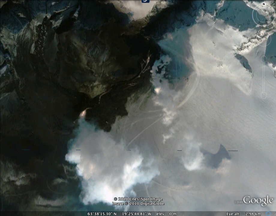
(Image Credit: Google Earth image of ash cloud in Iceland , produced with GeoEye satellite imagery) My very dear friend Tes is stuck in Ireland this week,
grounded by the great Iceland ash cloud and hoping to get back in time for her
dissertation defense. She’s been
looking for a t-shirt that says, “Eyjafjallajokull 2010” for days, but
evidently, no one’s selling. Tags:
Report from the Classroom, Part 2
Submitted by Laura T. Smith on Mon, 2010-04-12 22:48
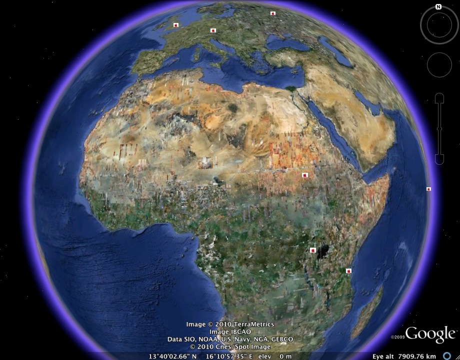
(Image credit: Google Earth map created by Smith's RHE 306) Caroline and I completed our Food Geographies Collaborative Writing Workshop last week. My students decided to keep their class map broad, not restricting it to Austin, to Texas, or to the United States. As a result, the geographies they trace are provocative, but also somewhat diffuse. That is, we might have gotten better results by densely mapping a limited area, but patterns emerge on our worldwide map that would not otherwise have been visible. While many students chose to map sites in the Austin area or the United States, the above map shows the efforts of two students who worked on mapping some non-U.S. sites, including major World Food Program sites, fast food locations in developing counties, and key sugar-producing sites. More detail on these sites and others, after the jump. Google Earth Collaboration in Action!
Submitted by Laura T. Smith on Tue, 2010-04-06 13:00
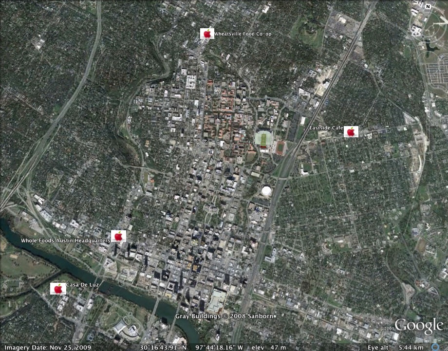
(Image credit: Image capture from Google Earth; data created by Laura) Caroline and I are doing our Google Earth collaborative writing workshop this week. We put the finishing touches on the assignment a couple weeks ago. The above image provides a sample of how our students will map their controversies. (I've chosen some local Austin sites that are relevant to food politics for my sample map: the corporate headquarters of Whole Foods; Casa de Luz, a macrobiotic restaurant, community center, and preschool; Wheatsville Food Co-op; Eastside Cafe, which grows its own ingredients; and Kerbey Lane Cafe, a local 24 hour diner that offers seasonal menus based on locally-grown ingredients.) Taco Geography
Submitted by Laura T. Smith on Mon, 2010-03-29 20:03
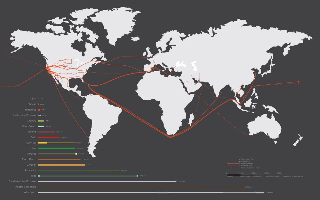
The folks over at Good Blog have published early results from a California College of the Arts assignment that took place in a landscape architecture class. Like a lot of classes here at UT, this class was asked to analyze the “tacoshed” for a single taco bought in San Francisco’s Mission District, from Juan’s Taco Truck. “Tacoshed” refers to the “geographical boundaries of a taco’s origins.” Because the project was a conducted by landscape architecture as well as art and design students, the presentation of results was a crucial part of the analysis, and in this case, the researchers collaboratively constructed the above map, visually charting the provenance a single taco. Many Ways to Map: The David Rumsey Map Collection Database
Submitted by Laura T. Smith on Mon, 2010-03-22 23:08
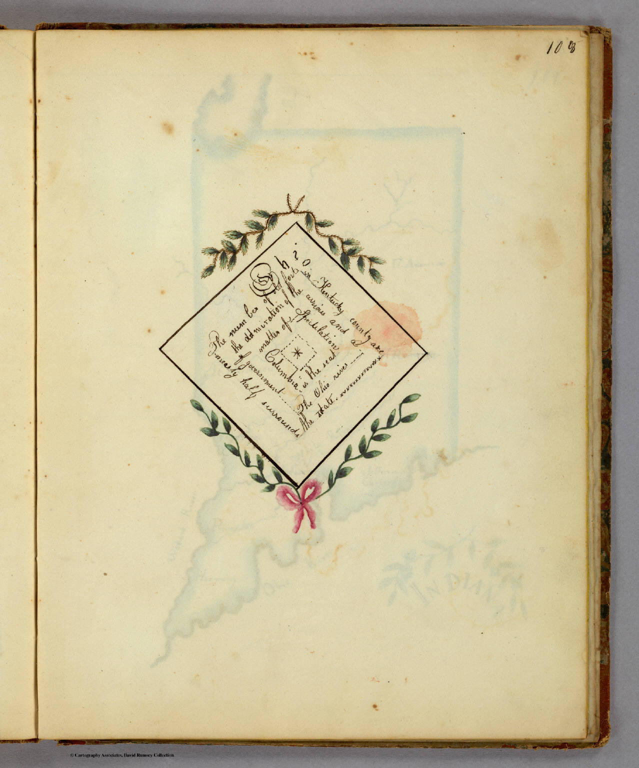
(Image Credit: David Rumsey Map Collection) Frances A. Henshaw, a student at the Middlebury Female Academy, created geographical diagrams like the one above to accompany her hand-drawn maps in her Book of Penmanship Executed at the Middlebury Female Academy April 29, 1828. According to the David Rumsey Map Collection Database, Henshaw’s Book of Penmanship went far beyond penmanship, including not only maps of 19 U.S. States with accompanying original diagrams (like the above), but also astronomical maps, charts of Coperican and Ptolemaic celestial systems, as well as maps of other prominent cartographic features such as equator, meridian, polar circles, latitude and longitude. Henshaw’s geographical diagrams seem to serve to illustrate or amplify the geographical data conveyed through her maps: reading in a diamond pattern (from the left and right upper diagonals, inward, then from the right and left lower diagonals, outward), the diagram reads:
Tags:
Google Earth Pedagogies: Making the Most of Map Databases
Submitted by Laura T. Smith on Mon, 2010-03-08 14:10
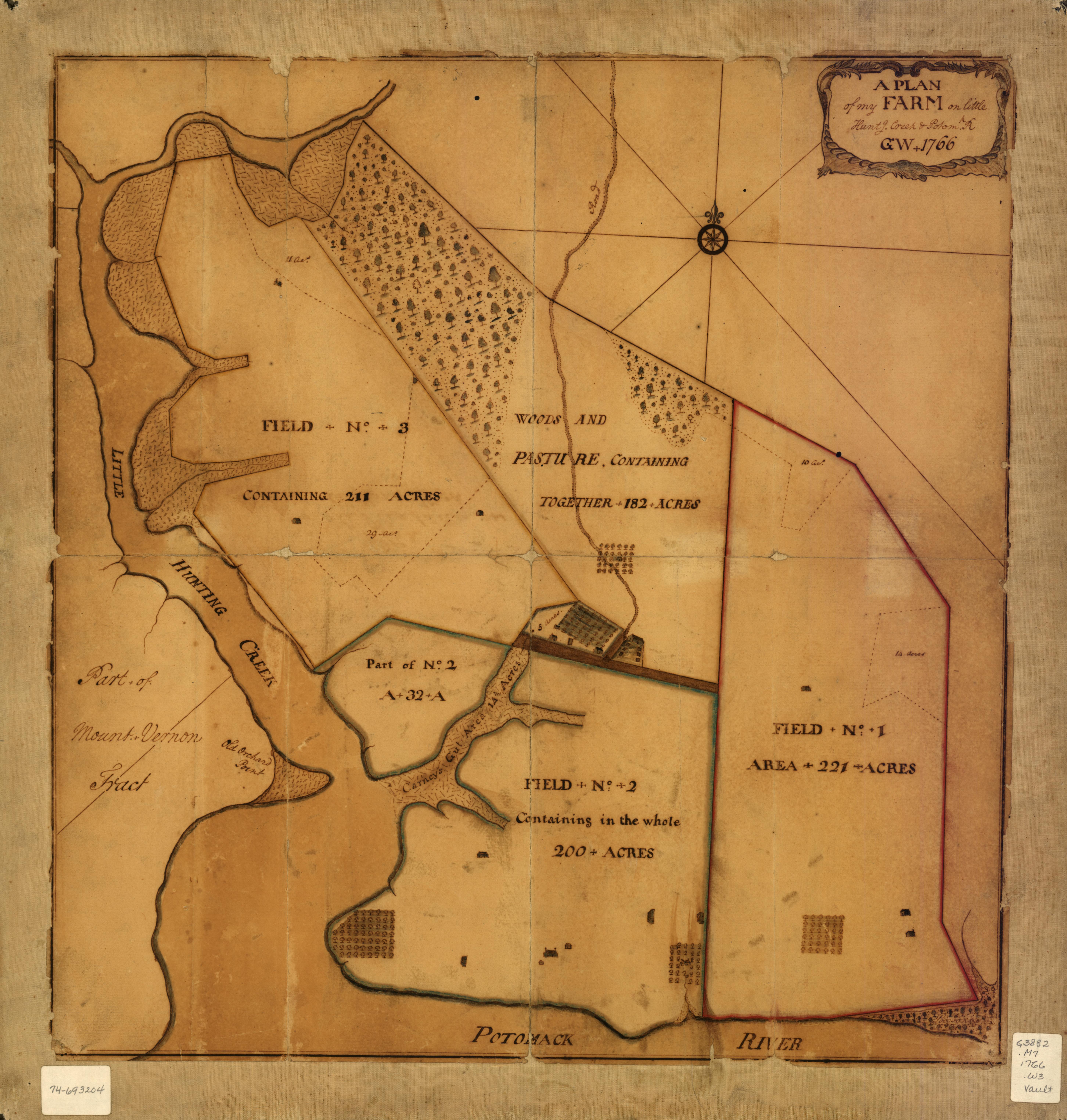
(Image source: Library of Congress Map Collections) The above map, created by George Washington in 1766, depicts “A plan of my farm on Little Huntg. Creek & Potomk.” This map, which is publicly viewable at the Library of Congress Map Collections and downloadable as a high-resolution JPEG2000 file, is included in the Collections’ “Cultural Landscapes” section, which highlights the ongoing cultural construction of United States and World landscapes through the ways individuals, communities, and nations modify land. This subsection of the online Collection places an array of cartographic materials into conversation: a set of local maps authored by George Washington, a series of maps of Liberia created by the American Colonization Society, and a store of historical U.S. atlases. Tags:
Google Earth Pedagogies: Building My Assignment
Submitted by Laura T. Smith on Mon, 2010-03-01 15:06
(Image Credit: Aijaz Rahi from guardian.co.uk) As I’ve been considering assignments for my students’ Google Earth “Food Geographies” exercise, I had expected to assign a classwide map topic—such as “Map Austin CSAs,” “Map Austin grocery stores,” or “Map a meal.” Now that I’ve previewed a number of Google Maps assignments, gotten some ideas about the pedagogical possibilities of Google Earth, and—most importantly—read my students’ first papers, I’m angling more toward letting their maps be self-driven. Indeed, I was struck by the food geographies already implicit in my students’ arguments. Google Earth Pedagogies: Beyond “That’s So Cool”
Submitted by Laura T. Smith on Mon, 2010-02-22 13:54
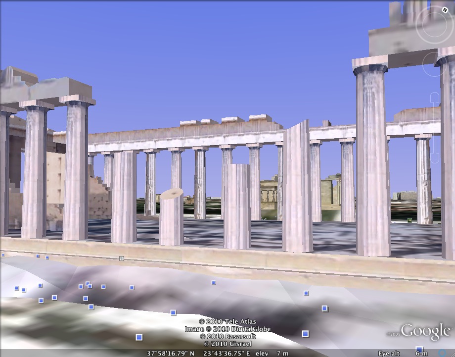
(Image credit: Image capture of the Parthenon in Athens, Greece from Google Earth) A fellow graduate student recently mentioned to me that his
rhetoric professor had used Google Maps to show classical Athens to the class. He told me, “I kept thinking how much
cooler it would have been if we were looking at it in Google Earth, walking
around down there in street view.” Google Earth Pedagogies: A Survey of Pedagogical Applications
Submitted by Laura T. Smith on Mon, 2010-02-15 11:33
(Image Credit: Google LitTrips) As I’ve been previewing Google Earth educational applications on the web, I’ve noticed that while many disciplines (science, geography, history) are using Google Earth to engage students and invite them to create within the software, applications for the English classroom (at least those that are featured and discussed on the web) overwhelmingly take the form of teacher-made presentations. I imagine that this tendency speaks to an ongoing conservatism about the design of writing assignments, a desire to retain the five-page paper as the product of the literature and writing classroom.
Tags:
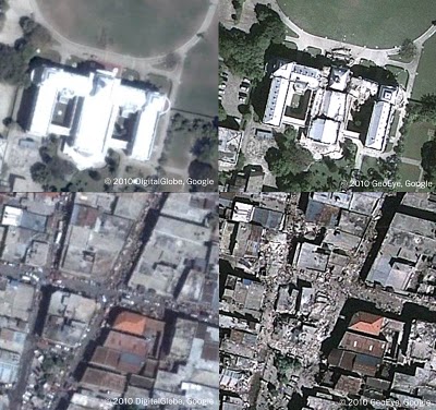
Google Earth Pedagogies: From Haiti to RHE 306
Submitted by Laura T. Smith on Mon, 2010-02-08 13:41
Image Credit: Google Lat Long Blog If were you watching the news in mid-January, you likely saw images like those above flashing repeatedly across your television or computer screen. Unlike the photojournalistic, street-level portraits that tend to document disasters, these aerial shots, produced through a collaboration between Google Earth and GeoEye (a satellite imaging company), have been prominent in the visual coverage of the earthquake that hit Haiti on January 12, 2010. The above images show pre- and post-quake views of the Presidential Palace (top left; top right) and downtown Port au Prince (bottom left; bottom right), and were created using the timeline tool in Google Earth. |
|

Recent comments
2 years 29 weeks ago
2 years 44 weeks ago
2 years 44 weeks ago
2 years 50 weeks ago
3 years 4 weeks ago
3 years 4 weeks ago
3 years 4 weeks ago
3 years 6 weeks ago
3 years 6 weeks ago
3 years 6 weeks ago