viz.
Visual Rhetoric - Visual Culture - Pedagogy
Site informationRecent Blog Posts
|
newsMitt Romney and the (Mormon?) Rhetoric of Philanthropy
Submitted by Laura Thain on Thu, 2012-09-13 04:16
Image Credit: Huffington Post At issue from the moment Romney stuck his neck out as a Presidential hopeful, his extraordinary personal wealth has become one of the primary issues covered by various news media as we march closer to the November election. Epitomized best, perhaps, by a cleverly Photoshopped image that initially made rounds as a campaign gaff, “RMoney” has anything but hip associations—rather, it has inspired vast discussion about the rhetoric of prosperity and philanthropy in the midst of economic recession, both real and imagined.
Tags:
The Power of Sympathy: Perspective Shifting, Visual Argumentation, and the Gay Marriage Debate
Submitted by Rachel Schneider on Fri, 2012-02-03 14:16
Image Credit: Screenshot from YouTube I was delighted to hear that the Washington State Senate passed a bill Wednesday legalizing same-sex marriage in the state. The Seattle alt-weekly The Stranger has been closely following the bill’s progress for several weeks, not only liveblogging the debate but also posting numerous excellent speeches on behalf of the bill. Eli Sanders highlighted Republican Senator Cheryl Pflug’s speech as the best of the night, which she ended with the following words:
Media Sensationalism and the Crisis in Japan
Submitted by ladysquires on Thu, 2011-03-24 09:00
(Image Credit: Time Magazine) Following on the heels of Megan, Cate, and Elizabeth, I've been monitoring media coverage of the disaster in Japan and coming across some interesting points for debate. I found this Time cover shortly after reading an anonymous letter to Talking Points Memo by a Japanese scholar critiquing Western media coverage of the Fukushima nuclear power plant: Visual Budget
Submitted by ebfrye on Wed, 2011-03-16 11:31
Image Credit: screenshot of Visual Budget, kickstarter.com Visualizations are a necessary part of the way the media interprets government spending for the average viewer. Those of us who are not math whizzes, who may have trouble keeping our own accounts, find a simple graph or pie chart to be a useful aid. However, those representations often present an oversimplified view. Enter Visual Budget, a "cutting-edge data-visualization web site" that attempts to explain the nuances of government spending to the common citizen. Google Earth Pedagogies: From Haiti to RHE 306
Submitted by Laura T. Smith on Mon, 2010-02-08 13:41
Image Credit: Google Lat Long Blog If were you watching the news in mid-January, you likely saw images like those above flashing repeatedly across your television or computer screen. Unlike the photojournalistic, street-level portraits that tend to document disasters, these aerial shots, produced through a collaboration between Google Earth and GeoEye (a satellite imaging company), have been prominent in the visual coverage of the earthquake that hit Haiti on January 12, 2010. The above images show pre- and post-quake views of the Presidential Palace (top left; top right) and downtown Port au Prince (bottom left; bottom right), and were created using the timeline tool in Google Earth. Shakespeare Portrait Unveiled
Submitted by timturner on Mon, 2009-03-09 12:48
There is a lot of noise in the press today about the unveiling of a portrait that is now believed to be of William Shakespeare (see here, here, here, here, or here). The painting is believed to be the original source for the only two surviving likenesses of Shakespeare from his era, both of which were produced in the decade after his death. This painting, inherited by the descendants of the playwright's patron, is believed to have been painted in Shakespeare's lifetime. There is no definitive proof to show that the painting is unquestionably of Shakespeare. The evidence includes its association with the family of Shakespeare's patron, its supposed resemblance to existing portraits, and the results of "scientific testing" and the nebulous testimony of "experts" who are quoted as being "90% certain" that this is a portrait of Shakespeare. The articles also rely heavily on the ethos of Stanley Wells, noted Shakespearean scholar and chair of the Shakespeare Birthplace Trust. (But as one of the commentators on the NYT blog entry notes, Wells is responsible for the inclusion of Edward III in the Oxford Shakespeare, a decision that has been met with considerable skepticism among Shakespeare scholars.) I wouldn't exactly say that I'm skeptical of the claim that this is a portrait of Shakespeare. But I am interested in the extent to which the reception of the portrait is shaped by everyone's apparent desire for this to be a portrait of Shakespeare. In the absence of definitive proof either way, everyone seems to have decided that it's simply more exciting to assume that it is than to be circumspect about whether it could be. Further, it's interesting to consider how the particular details of this story brings to life many of the fantasies of Shakespeare biography and criticism. The longstanding desire to discover Shakespeare's "lost" works--an event that would establish the critic as a celebrity of some standing among Shakespeareans--is often imagined as peeling an old playtext off the back of an abandoned painting in a dusty antique shop. In this case, life imitates art (or fantasy). UPDATE: Today there is a wonderful little item on the painting in the NYT, with the following question: We somehow want the young Shakespeare to look like Joseph Fiennes, fiery and slashing. But what if he looked like Ricky Gervais? Would the plays mean less to us? “And yet, every photograph cries out for an interpretation …”
Submitted by John Jones on Wed, 2009-01-28 00:32
At his New York Times blog, documentary filmmaker Errol Morris has posted interviews with the head photo editors of the AP, Reuters, and AFP on the photographic record of the Bush administration. Morris asked each interviewee “to pick the photographs of the president that they believe captured the character of the man and of his administration” and then discussed the photos with them along with the reasons each chose the photos they did. With Standard Operating Procedure Morris has shown an acute interest in understanding the different ways in which the image is used to create reality, along with the ways in which that reality can be interrogated. In these interviews, Morris and each interviewee seem to share a different approach to how these images should be interpreted and what they mean. Although the discussions can sometimes be repetitive, they were a reminder to me of how much my judgments about our last president were based on these photo-ops.
via Word Presser Elections and Visual Conventions
Submitted by Brett Ommen on Sat, 2008-01-05 16:23
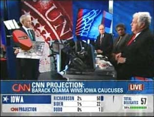
The Iowa Caucuses have come and gone, and as we prepare for New Hampshire and the remainder, we have some time to reflect on the visual dynamics of television news coverage of elections. Red and Blue states once had their debut to a national audience, and perhaps we’re on the threshold of a new visual convention.
BEHOLD ANDERSON COOPER’S MAGICAL FLOATING PIE CHART! Tags:
|
|
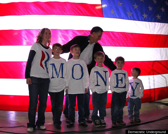

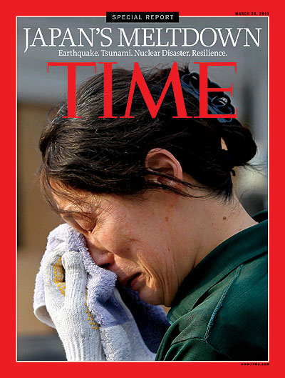
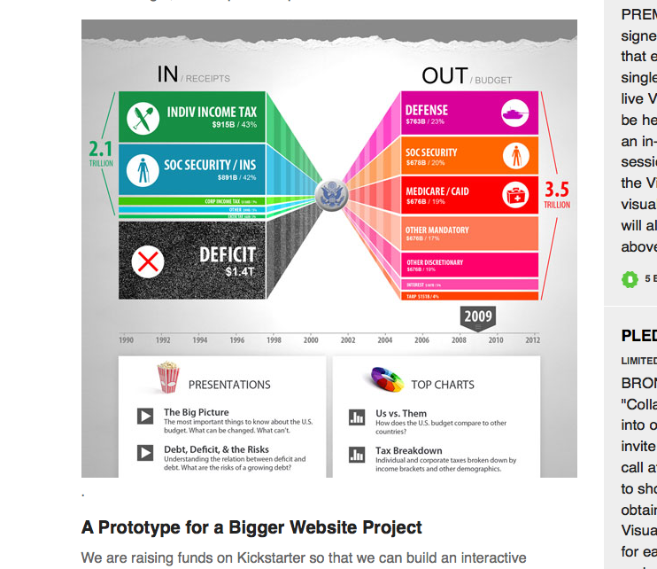
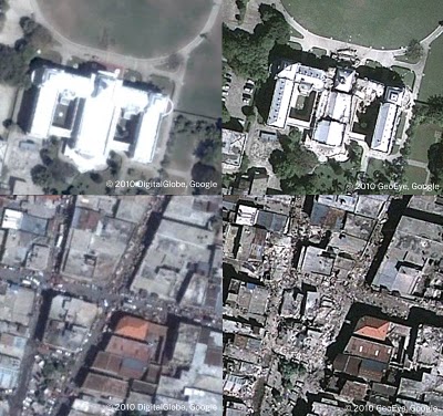
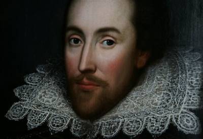 Image credit: AP Photo/Lefteris Pitarakis
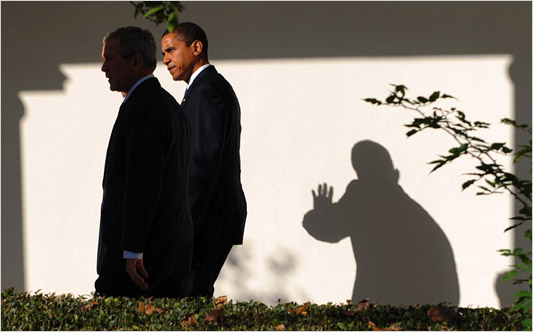

Recent comments
2 years 29 weeks ago
2 years 44 weeks ago
2 years 44 weeks ago
2 years 50 weeks ago
3 years 4 weeks ago
3 years 4 weeks ago
3 years 4 weeks ago
3 years 6 weeks ago
3 years 6 weeks ago
3 years 6 weeks ago