viz.
Visual Rhetoric - Visual Culture - Pedagogy
Site informationRecent Blog Posts
|
Reply to commentElections and Visual Conventions
Submitted by Brett Ommen on Sat, 2008-01-05 16:23
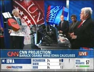
The Iowa Caucuses have come and gone, and as we prepare for New Hampshire and the remainder, we have some time to reflect on the visual dynamics of television news coverage of elections. Red and Blue states once had their debut to a national audience, and perhaps we’re on the threshold of a new visual convention.
BEHOLD ANDERSON COOPER’S MAGICAL FLOATING PIE CHART! Cooper was terribly excited about his 3-D pie chart prior to the coverage, as evidenced by his blog earlier that day . But his excitement was certainly tempered after he gave the chart a whirl. The technology relies on Cooper holding a board flat so that the pie chart can be inserted above it. When Cooper failed to keep the board flat or attempted to move around, the pie chart would dip and bob wildly on screen, obscuring talking heads and causing a general threat to CNN’s punditry. I never saw Cooper pick it up again, and had to chase down a screen grab from the fine folks at Inside Cable. One could use this as a nice illustration of the problematic of new media. Does rendering a pie chart in 3-D so that Cooper can carry it around the set make it something more than a pie chart? And what does it do to CNN’s other pie charts? In the end, it was difficult to read and wholly deficient to its old media counterpart. Even if Cooper perfects his pie chart toting skills, it’s still just a pie chart. From what I saw, CNN was really pushing the visual information envelope Thursday night, much more than Fox or MSNBC. In addition to rogue pie charts, CNN added a little battery-charger like image below the number for percentage of precincts reporting. Fox and MSNBC, luddites that they are, relied merely on the number. CNN was also coming under fire in the blogosphere for leaving Ron Paul off their Republican pie chart. On both blue and red pie charts, CNN placed the top 4 candidates. CNN had room for Bill Richardson’s scant 2% on the Democratic chart, but no room for Ron Paul’s 10% or Giuliani’s 4%. I didn’t see how the other news networks excluded or included candidates, but that’s just because I was hoping to catch Anderson Cooper wield his pie chart once more. Tags:
ReplyYour contribution to the blog: Please Read Before PostingThe viz. blog is a forum for exploring the visual through identifying the connections between theory, rhetorical practice, popular culture, and the classroom. Keeping with this mission, comments on the blog should further discussion in the viz. community by extending (or critiquing) existing analysis, adding new analysis, providing interesting and relevant examples, or by making connections between that topic and theory, rhetoric, culture, or pedagogy. Trolling, spam, and any other messages not related to this purpose will be deleted immediately. Comments by anonymous users will be added to a moderation queue and examined for their relevance before publication. Authenticated users may post comments without moderation, but if those comments do not fit the above description they may be deleted. |
|
Recent comments
2 years 29 weeks ago
2 years 44 weeks ago
2 years 44 weeks ago
2 years 50 weeks ago
3 years 4 weeks ago
3 years 4 weeks ago
3 years 4 weeks ago
3 years 6 weeks ago
3 years 6 weeks ago
3 years 6 weeks ago