viz.
Visual Rhetoric - Visual Culture - Pedagogy
Site informationRecent Blog Posts
|
Visualizing GDP
Submitted by Nate Kreuter on Thu, 2007-06-28 11:47
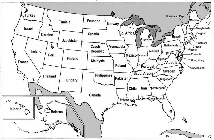
I found an interesting post on Reason magazine's Hit & Run blog in which the Gross Domestic Products (GDPs) of various nations are correlated with the GDPs of US states. The map is a fascinating comment on global economics, and more info on its background is available through the original Hit & Run post.
The Hit & Run blog, incidentally, is a product of the libertarian publication Reason, which, regardless of what you think of its politics, is a good place to troll for stories pertaining to visual culture. I also like to use to site to dig for news stories to use in rhetoric classes, because they are frequently argumentative and also because they tangle the typical left vs. right allegiances many of my students follow blindly, which I find allows me to open up controversies like immigration in productive ways. Again, this isn't an endorsement of the blog's specific politics, but definitely is an endorsement of its detail-oriented, non-mainstream news coverage. Tags:
|
|
Recent comments
2 years 29 weeks ago
2 years 44 weeks ago
2 years 44 weeks ago
2 years 50 weeks ago
3 years 4 weeks ago
3 years 4 weeks ago
3 years 4 weeks ago
3 years 6 weeks ago
3 years 6 weeks ago
3 years 6 weeks ago