viz.
Visual Rhetoric - Visual Culture - Pedagogy
Site informationRecent Blog Posts
|
In Your (Type)Face: Part I
Submitted by Jenn Shapland on Wed, 2014-04-09 14:16
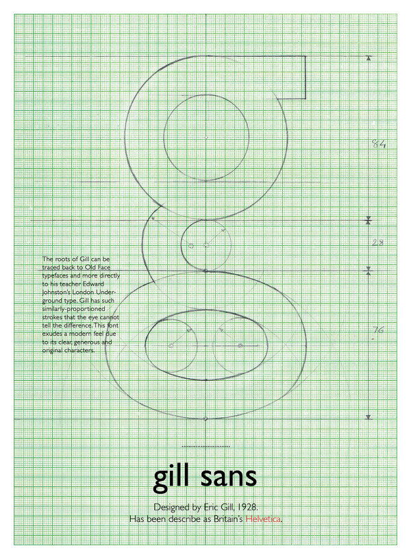
Image via Parimal Parmar, Bēhance.net I'm in the midst of the (long) process of building a digital magazine called Covered with Fur for Austin small press A Strange Object. This week I'm choosing typefaces, which, as one editor puts it, is a "vertigo-inducing" prospect, especially on the web. As I research and test various webfonts, I'm struck by a) how many exist, b) how many ugly and/or illegible fonts there are, and c) how little I know about type design and type designers in the digital age. I mean, I watched Helvetica, just like everyone else, but I don't put nearly enough thought into the people who design the typefaces I use regularly (which include, of late, Times, Helvetica Neue, occationally Didot, if I'm feeling fancy; I used to be strictly Garamond, but I grew out of that, thank God). My first question: what typefaces, if any—old or new—are designed by women?
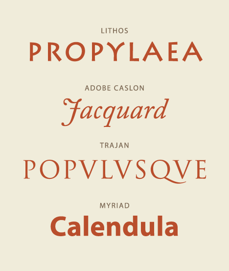
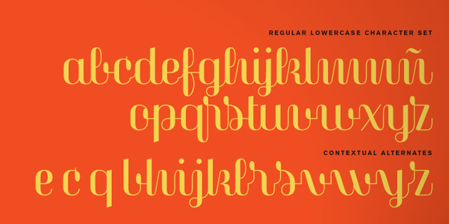
Image via Wikimedia Commons Here's what I've found out. Several of the fonts in your word processor were likely designed in the 1990s by Carol Twombly, who created Trajan, Myriad, and Adobe Calson while working for Adobe Systems. The omnipresent Mrs Eaves, a "sensitive revival" of Baskerville for the screen, and Filosofia, a web version of Bodoni, were designed by Zuzana Licko in 1996. And perhaps most recognizably, Kris Holmes co-designed the Lucida system with Charles Bigelow. Today there are some extremely awesome lady type designers working on new fonts that often have a vintage appeal, like Veronika Burian and Laura Meseguer (whose kickass Magasin is pictured below). If you're interested, you can read a great interview in which Yale School of Art's Director of Graphic Design (and first tenured female professor o_0) offers an answer to the question at the heart of my inquiry: "What does it mean to be a female designer in a mostly male institutional history and culture?" This question (plus my follow-up: "What does it mean that most typefaces, print and digital, that we read and type have been created by male type designers?") will guide my viz. series on contemporary typography.
Image via Laura Meseguer's artist portfolio Though typography might seem fairly innocuous, the overlap between the age of advertising and the rise of digital media—plus the increasing amount of time spent in front of screens covered in type—means that how words and numbers look has huge implications. As Walter Ong has it, "Typography...made the word into a commodity." Making language visual and standardized (for most of print history, this process involved casting the letters themselves in lead, i.e. movable type, though today it means drawing them on graphic design software) makes it concrete—or concrete-seeming—and makes it harder to think of language as a fluid, dynamic, creative process wrought by use.
If you're like me and you're just diving into the wide world of typeface design, here's an animated video primer that may be of use. *Shoutout to Jake Cowan for having Ong ready to hand. Tags:
|
|
Recent comments
2 years 29 weeks ago
2 years 44 weeks ago
2 years 44 weeks ago
2 years 50 weeks ago
3 years 4 weeks ago
3 years 4 weeks ago
3 years 4 weeks ago
3 years 6 weeks ago
3 years 6 weeks ago
3 years 6 weeks ago