viz.
Visual Rhetoric - Visual Culture - Pedagogy
Site informationRecent Blog Posts
|
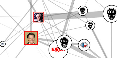
Track oil donations to presidential candidates
Submitted by John Jones on Thu, 2008-01-31 10:27
PriceofOil.org has posted a dynamic information graphic showing contributions from the oil industry to U.S. presidential candidates.
|
TagsRecent comments
|
Comments
Neato, but I'm not sure I'm
Neato, but I'm not sure I'm convinced. While I appreciate the underlying issue here, and I definitely realize it is important to keep an eye on these things, I wonder about this representation. Corporate campaign contributions can just as easily be read as a barometer of expectations: expectations of which nominee a party will choose, but also of which party will win the election (see this article for one example of this argument). So, one glance at this graph suggests that Giuliani (who, as everyone knows by now, just left the race) is most beholden to oil money. But couldn't it just as easily reflect the fact that for a long time he was the Republican frontrunner? And ditto for Hillary Clinton? It looks nice, but the underlying data has to be more complex than this.
Donation does not equal causation
I’ll give you that: certainly donation does not equal causation. However, I do think that this is a great tool to make these donations visible. It made me think of the scene in Sicko where he displays the donations from the healthcare industry that politicians have received (it’s in the trailer below).
Or the graphic linked to this New York Times article. In each of these cases, while the graphics do make arguments, they shouldn’t be decontextualized and those arguments shouldn’t be the only arguments. Ideally, the graphics would make the data visible in a way that is as objective as possible so that that data can serve as part of a larger argument.