Image Credit: posted by "Hellen Killer" on Regresty, originating from PeachyProfiles.com
H/T to Megan Eatman for sending me the blog
As recent Twilight films have demonstrated, sparkling is one of the few
things that doesn't translate well into new media. It also makes it
hard to take anything seriously - regardless of authorial intention or gravity of subject matter.
In the wake of the September 11th attacks nine years ago, comedians across the country were faced with the question of how soon would be "too soon" to joke about the tragedy. The question of timing has arisen over and over again, recently in conversations about Clear Blue Tuesday, a movie musical with 9/11 as its narrative foundation that premiered in New York last week. The subject is inherently a sensitive one, and though the blog post I pulled these images from used them as a source for ridicule, this will be a conversation more about glitter than the ethics of humor.

Image Credit: posted by "Hellen Killer" on Regresty, originating from HitUpMySpot.com
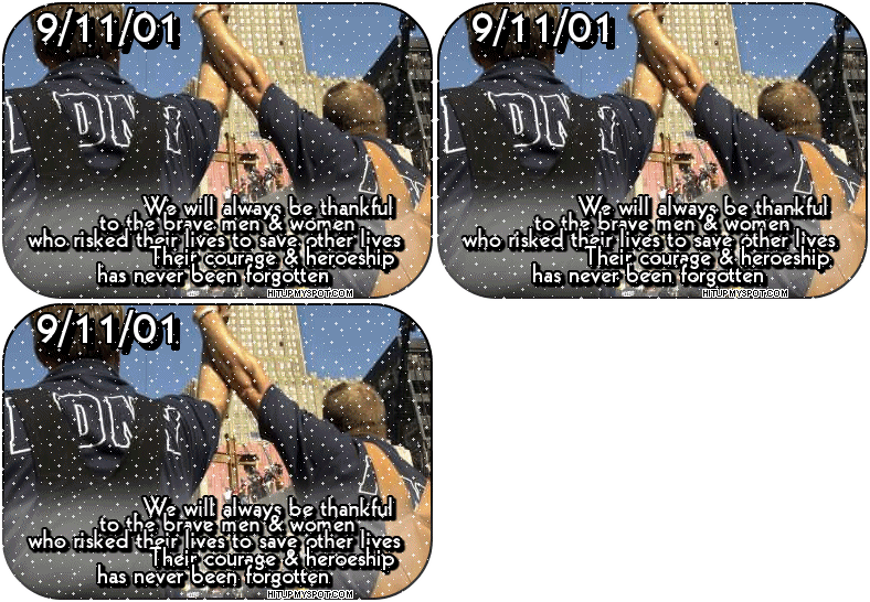
Though these images were (presumably) created as hearfelt monuments to one of America's most significant tragedies, the use of a "glitter" effect fundamentally undermines any sense of solemnity that they were intended to invoke. The underlying photographic image of two New York City firefighters with hands clasped and arms raised, signifies a brotherhood and sense of community that infuses our collective memory of the 9/11 attacks. Yet the sparkling overlay, though it certainly draws our attention, also obscures the sincerity expressed in the caption. Sparkles are tied to feelings of festivity and celebration that seem utterly inappropriate for the content, and the juxtaposition verges on laughable (depending on your sense of humor) or downright tragic.
While these images are bound to stir up an unpedictable mix of feelings,
they might serve as a useful tool for talking about context, content,
and ethos. They seem to come from websites that specialize in icons for use on
MySpace, and this could be used to fuel conversation about social
networking and the "image" students present to the world. Or, an equally interesting converstation might arise regarding marketing strategies and pathos - to what lengths will advertisers go to grab our attention?
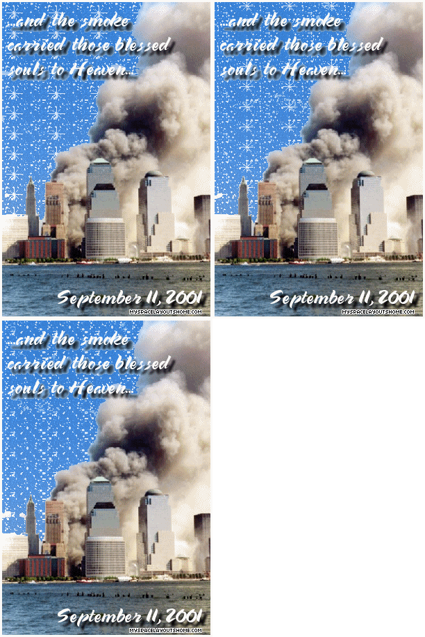
I'm not including a link to the url listed at the bottom of this last image
as it seems to be a spam site that traps you into answering survey
questions before you can navigate away from the page. Perhaps that's
fitting given this is probably the most tasteless of all the images
"Killer" collected. The cartoonish sparkling sky set against the
reality of the smoking buildings completely negates the seemingly
reverant message.

Image Credit: posted by "Hellen Killer" on Regresty, originating on MySpaceLayoutsHome.com
Recent comments
2 years 29 weeks ago
2 years 44 weeks ago
2 years 44 weeks ago
2 years 50 weeks ago
3 years 4 weeks ago
3 years 4 weeks ago
3 years 4 weeks ago
3 years 6 weeks ago
3 years 6 weeks ago
3 years 6 weeks ago