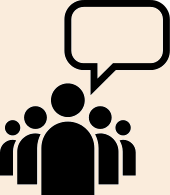
Image Credit: UNOCHA
How can you quickly communicate concrete concepts to an audience that includes speakers of many languages and those who can't read? The Noun Project sees an answer in symbols, and it offers a platform for people to submit icon designs that others can download and use. On its "About" page, the Noun Project describes itself as:
a platform empowering the community to build a global visual language that everyone can understand. Visual communication is incredibly powerful. Symbols have the ability to transcend cultural and language barriers and deliver concise information effortlessly and instantaneously. For the first time, this image-based system of communication is being combined with technology to create a social language that unites the world.
But do symbols "have the ability to transcend cultural and language barriers" as they suggest? In looking at the symbols on the site, I wonder whether these icons rely just as much on enculturation for understanding as any written language does. The benefits of speed of comprehension and intelligibility across languages and cultures seem to depend on a similar learning process to that any literate person goes through if, perhaps, abbreviated.
For instance, what does the icon at the top of this post, with several people standing in a V formation with a speech bubble coming out of the front-most person, represent? Take a guess and scroll down to the bottom of the post for the answer. That icon and the others I discuss here are drawn from a set submitted by the United Nations Office for the Coordination of Humanitarian Affairs. As The Noun Project says in its blog post introducing the set:
Symbols are some of the best communication tools we have to overcome many language and cultural barriers. When a disaster strikes, it is vital that the humanitarian community can gather reliable data on the locations and needs of affected people and who is best placed to assist them. This often involves the need to present complex information in a way that everyone can understand.
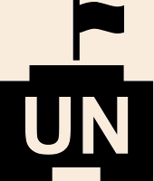
Image Credit: UNOCHA
There's an implicit tension in this blog post and in The Noun Project's overall mission that any effort to create universally understood symbols has to confront. The Project's "About" page talks of "transcend[ing] cultural and language barriers," but in describing the UNOCHA icons the Project discusses a narrower audience: "the humanitarian community." The humanitarian community is, of course, not a static and finite audience, as it continually changes as crises break out in different regions of the globe. However, there is more coherence within the "humanitarian community" as an audience than there is in an audience of any potential person who could come across a symbol, providing the opportunity for icons to be learned by that audience while people encountering the symbols for the first time would not have a similar opporunity.
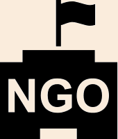
Image Credit: UNOCHA
Even icons can't seem to get away from words entirely, as the symbol above designating a building associated with non-governmental organizations demonstrates. While English may be one of a few languages commonly used by many humanitarian organizations working with the UN, the promise of iconography is that it does not depend on knowing any one language to be understood. While professionals working within organizations may know English, it stands to reason that those working for local organizations with which the humanitarian groups are interacting may not. As seen in the screen shots below from the Wiktionary, the concept of an NGO is translated in a variety of ways, several not using the Latin alphabet.
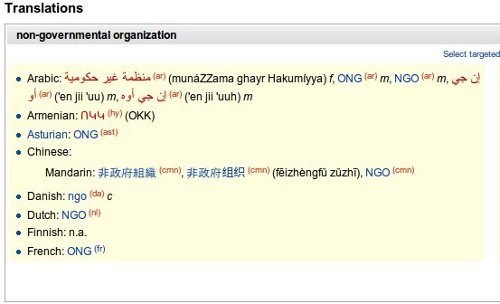
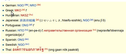
Image Credit: Wiktionary screenshot
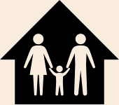
Image Credit: UNOCHA
Icons without letters do not necessarily communicate any more clearly to an undefined audience. Above we see a man, woman, and child holding hands standing in a house (at least a Western version of the house symbol: two walls with gable roof). The meaning of this symbol, according to the UNOCHA is "community building." I assume they mean a literal building (a structure) for community use (as opposed to the abstract concept of community building), because the Noun Project focuses on concrete concepts. Without the caption, I would think the icon represented something more along the lines of "family shelter" than "community building" because of the family image.
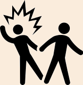
Image Credit: UNOCHA
The icon as a genre poses its own limitations. I'm not sure how I would represent "community," other than a dozen or more people of different ages, but a designer would be hard pressed to draw that many figures in a small building. These limitations, however, also result in some inventive use of visual design, especially in terms of conveying action. Above we see the icon for "forced recruitment," as one person pulls violently at another's arm who resists by leaning back and away from his assailant. The violence is conveyed through the use of a sharp-edged and angled bubble around the head of the person being conscripted, describing, it seems, the sharp movements associated with a struggle and/or the sudden shock of an assault.
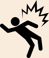
Image Credit: UNOCHA
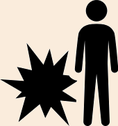
Image Credit: UNOCHA
The nature of the violence in the "murder" and "assault" icons above is more difficult to interpret. The murder victim falls backward, their body presumably dead, but one could also be thrown backward by a non-fatal blow. Oddly, the icon for assault shows a persons standing straight up, not moving in any way, while the sharp-edged violence bubble stands at his/her side.
Given the need for audience participation in both learning to read the icons and creating icons that can be widely understood, the crowd-sourced nature of The Noun Project, such as seen in its iconathons and open submissions, seems vital to successfully designing symbols that are widely comprehended if not universal.
Concept for the first icon: "advocacy."


Recent comments
2 years 29 weeks ago
2 years 44 weeks ago
2 years 44 weeks ago
2 years 50 weeks ago
3 years 4 weeks ago
3 years 4 weeks ago
3 years 4 weeks ago
3 years 6 weeks ago
3 years 6 weeks ago
3 years 6 weeks ago