viz.
Visual Rhetoric - Visual Culture - Pedagogy
Site informationRecent Blog Posts
|
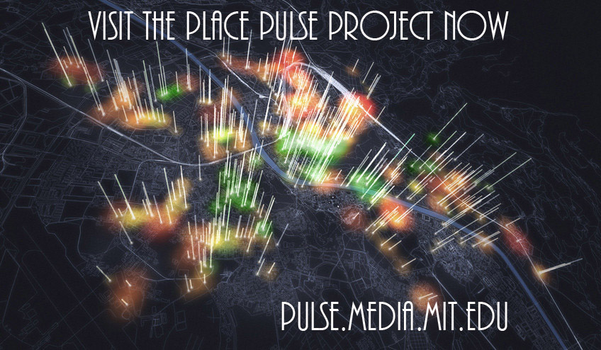
data collectionThe Image of the City, Revisited: MIT’s Place Pulse Project
Submitted by Lisa Gulesserian on Sun, 2012-05-06 09:00
Image Credit: MIT's Macro Connections Group Last week, as my students in my Rhetoric of Suburbs & Slums class presented their final movie projects, I was reminded of how we often judge a place after only a cursory glance. One group project especially got me thinking: “The Divide,” a student-made film that explored the differences between East and West Austin, included many images from East and West Austin along with candid interviews of residents from both sides of the divide. My students’ video reminded me of MIT’s Place Pulse project, which in turn reminded me of Kevin Lynch’s seminal urban planning book from 1960, The Image of the City. As a culmination of my time blogging about cities the last few months on viz., I’m going to talk about “imageability” and intimacy in Austin (and beyond).
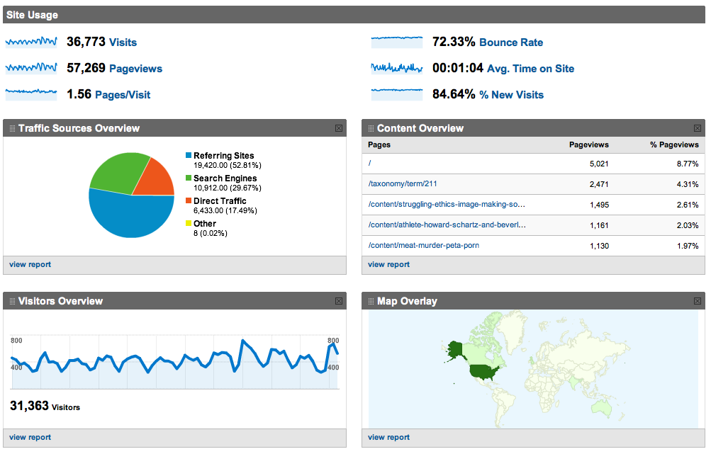
We're Watching You - Google Analytics and viz. Readership
Submitted by Cate Blouke on Thu, 2011-05-05 18:34
Screen Shot of Google Analytics dashboard view for viz. Earlier this semester, we here at viz. decided it might be nice to get a better sense of who we were talking to. As good rhetoricians, we felt it might be pertinent to know more about our audience. So we installed the handy-dandy (free) Google Analytics tool for tracking all sorts of information about our readership. The results have been surprising at times, reassuring on the whole, and ultimately quite useful for thinking about how better to serve you, our readers. The following is a discussion of both Google Analytics itself and the trends we've noticed on our site over the past few months. |
|
Recent comments
2 years 29 weeks ago
2 years 44 weeks ago
2 years 44 weeks ago
2 years 50 weeks ago
3 years 4 weeks ago
3 years 4 weeks ago
3 years 4 weeks ago
3 years 6 weeks ago
3 years 6 weeks ago
3 years 6 weeks ago