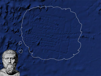
Derek Mueller over at Earth Wide Moth posted an interesting meditation on Google's recent mapping of the famously lost city of Atlantis.

Google's spokesperson addressed interest in the image by clarifying the lines, taken for ruins, that mark the ocean floor. S/he said in an email: "What users are seeing is an artifact of the data collection process...The fact that there are blank spots between each of these lines is a sign of how little we really know about the world's oceans."
Derek's post (found here) focuses on this very issue of method, of the discovery of the trace even if it is not the trace of a lost civilization. Instead, on the map, we are left with signs or remnants of the mapper. Derek says:
"The conspiracy doesn't interest me all that much. Instead, I'm struck by the impression: the stamp left by the "systematic" tracing, the residue of the surface-to-sea-floor method (a term others have smartly untangled it into meta-hodos or something like 'beyond ways', even 'ways beyond'; this etymological dig lingers with me). The deep blue grid of "bathymetric data" elicits questions: why don't we see these in the adjacent areas? What was it about this boat, this collection process, this translation from sound to image, that left behind the vivid trails?"
Recent comments
2 years 29 weeks ago
2 years 44 weeks ago
2 years 44 weeks ago
2 years 50 weeks ago
3 years 4 weeks ago
3 years 4 weeks ago
3 years 4 weeks ago
3 years 6 weeks ago
3 years 6 weeks ago
3 years 6 weeks ago