viz.
Visual Rhetoric - Visual Culture - Pedagogy
Site informationRecent Blog Posts
|
changeHow USA Really Voted on November 6
Submitted by Chris Ortiz y P... on Sat, 2012-11-17 10:10
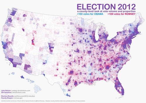
Image Credit: IDV Solutions What a wonderful map! This IS the popular vote on November 6, 2012. John Nelson gave us this map, and we thank him for it. It's called a "pointillist map:" one blue dot for every 100 votes for President Obama, randomly distributed in the county in which the votes were cast. One red dot for every 100 votes for Mr. Romney. You've heard of purple states? Well here's our purple country. Click the link on the image credit to find a large and hi-def version of this map. Then meet me back here, won't you?
|
|
Recent comments
2 years 29 weeks ago
2 years 44 weeks ago
2 years 44 weeks ago
2 years 50 weeks ago
3 years 4 weeks ago
3 years 4 weeks ago
3 years 4 weeks ago
3 years 6 weeks ago
3 years 6 weeks ago
3 years 6 weeks ago