viz.
Visual Rhetoric - Visual Culture - Pedagogy
Site informationRecent Blog Posts
|
MappingMapping Relations
Submitted by EmilyBloom on Tue, 2009-10-13 16:54
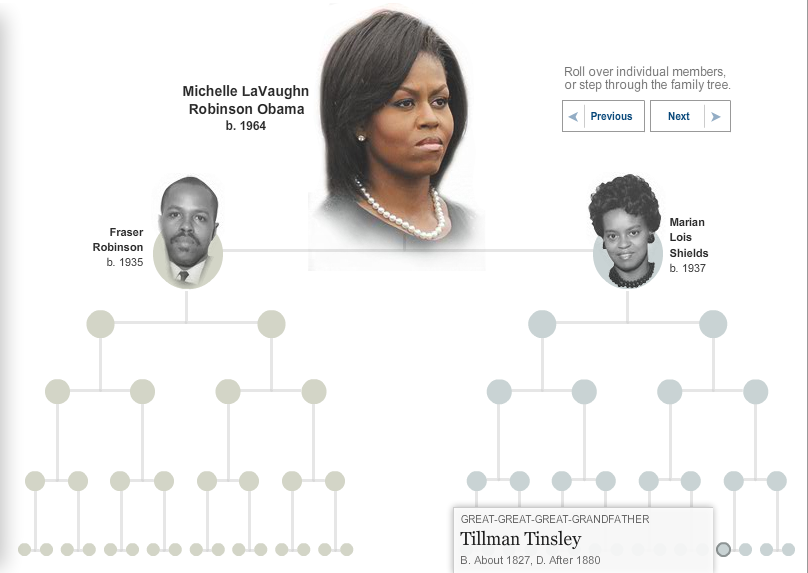
Image Credit: New York Times
Family trees are distinctively antiquated visual representations, yet they remain ubiquitous. In the past week alone, The Boston Herald published a family tree by the New England Historic Genealogical Society showing that Ben Affleck and Matt Damon are related and New York Times ran an interactive tree based on the research of genealogist Megan Smolenyak documenting Michelle Obama’s family history. Both maps include the very familiar hierarchical arrangement of lines and circles or squares. The Damon-Affleck map cuts right to the chase, foregoing all other strands, and directly linking the actors to William Knowlton Jr. (1615-1655). The First Lady’s genealogy is much more interested in the journey than the destination; each node of the tree has a short description of the family member and links to their genealogical record. Looking at these two maps, I was led to consider why the family tree endures despite the wealth of technologies available for re-mapping relationships? Why does the old visual arrangement of radiating lines still seem to capture our attention? And finally, what are we really mapping when we map kinship on a family tree?
Tags:
Witness the artifact of the process
Submitted by Jillian Sayre on Sat, 2009-02-21 11:56
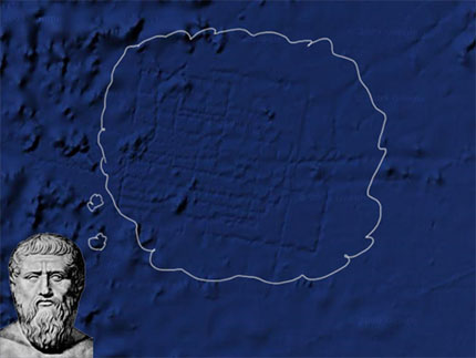
Derek Mueller over at Earth Wide Moth posted an interesting meditation on Google's recent mapping of the famously lost city of Atlantis. "The conspiracy doesn't interest me all that much. Instead, I'm struck by the impression: the stamp left by the "systematic" tracing, the residue of the surface-to-sea-floor method (a term others have smartly untangled it into meta-hodos or something like 'beyond ways', even 'ways beyond'; this etymological dig lingers with me). The deep blue grid of "bathymetric data" elicits questions: why don't we see these in the adjacent areas? What was it about this boat, this collection process, this translation from sound to image, that left behind the vivid trails?" Tags:
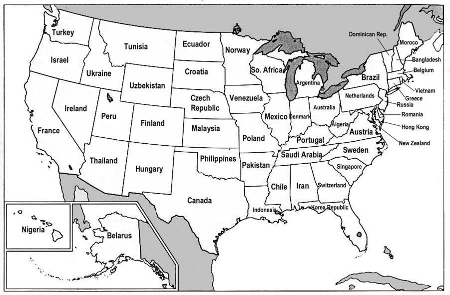
Visualizing GDP
Submitted by Nate Kreuter on Thu, 2007-06-28 11:47
I found an interesting post on Reason magazine's Hit & Run blog in which the Gross Domestic Products (GDPs) of various nations are correlated with the GDPs of US states. The map is a fascinating comment on global economics, and more info on its background is available through the original Hit & Run post.
Tags:
|
|
Recent comments
2 years 29 weeks ago
2 years 44 weeks ago
2 years 44 weeks ago
2 years 50 weeks ago
3 years 4 weeks ago
3 years 4 weeks ago
3 years 4 weeks ago
3 years 6 weeks ago
3 years 6 weeks ago
3 years 6 weeks ago