viz.
Visual Rhetoric - Visual Culture - Pedagogy
Site informationRecent Blog Posts
|
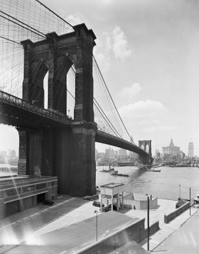
Image Database Review: New York City Department of Records Online Image Gallery
Submitted by Todd Battistelli on Sun, 2012-11-11 10:49
Image Credit: Joseph Shelderfer During November and December I'll be devoting some blog posts to reviews of image archives recently added to the viz. "Images" resource page. First up is the gallery from the New York City Department of Records released in April 2012. The archive "provides free and open research access to over 800,000 items digitized from the Municipal Archives’ collections, including photographs, maps, motion-pictures and audio recordings." It is from the research perspective that I approach this review. Alan Taylor, at The Atlantic's photography blog In Focus, included some highlights he found while browsing the archive (warning: images include evidence photography from homicide crime scenes). Browsing through the images is certainly a good way to spend some time (perhaps too much time), but the archive is also organized through a series of collections that can help the viewer sift through the nearly one million images from the Big Apple.
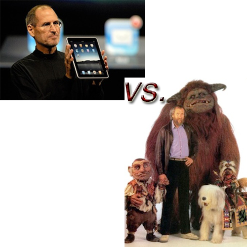
If Our Greatest Toy Maker Had Lived Ten More Years..
Submitted by Chris Ortiz y P... on Fri, 2012-11-09 21:22
Image Credits: Newscom and Jim Henson Tribute Forum Novelist Bruce Sterling, who gave a very hip keynote address on designer Norman Bel Geddes (1893-1958) at this year’s Flair Symposium "Visions of the Future," concluded his remarks with a challenge: Which of us has the courage to imagine the future like Bel Geddes did? Larger than life, impracticable, earnest, utopian, democratic, dazzling: can we still dream like that? In this post, I give it a go with a foray into the sci-fi genre of Alternate History: What if Jim Henson (1936-1990) had lived a further ten years and had gotten involved in the Silicon Valley scene? How might computing have developed differently?
The Pedagogical and Aesthetic Possibilities of Crowdsourced Films
Submitted by Calliope on Thu, 2012-11-08 19:26
Image Credit: RoseVallentine I teach a class about the new rhetoric of internet commerce. I have my students write a standard rhetorical analysis paper around the middle of the term, and for their primary texts I ask them to use the digital marketing materials of dotcoms. Of all the paper genres I assign (expository, persuasive, etc.) rhetorical analysis is generally my favorite. I prefer these papers because I'm a literary critic, and rhetorical analyses are essentially close readings that use a standard rhetorical methodology. But there's another reason I especially enjoyed reading my students' analysis papers this semester: they introduced me to several fantastic websites that I didn't know about before. I feel compelled to share one of these sites with viz. readers because of its novel interventions in visual culture. (And I want to thank my student, who I will refrain from naming, for the great find!). The company is called hitRECord, an open, online platform for collaborative filmmaking and other artistic expression. Bob Dylan's Thoughts on the Election
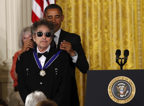
Submitted by Jay Voss on Wed, 2012-11-07 10:00
(Image credit: Star Tribune) Hard to know what to write about here. The regular 9 AM postings of this blog necessitate that I write a full day in advance, and I have nothing to say about the election returns, about which I’m sure is only what you wish to be reading on the morning after a general election. Sorry. But it seems like some discussion of Bob Dylan’s election predictions are worth your while, however. Two nights ago in Madison, Wisconsin, Dylan was wrapping up yet another gig on his current tour with Mark Knopfler. He’d just taken an encore break and was coming back on stage for the night’s final number. Before continuing on with the music he said, “We tried to play good tonight since the president was here today.” (Obama had earlier wrapped up a rally in Madison.) Not only this, but Dylan went on to say, “Don’t believe the media. I think it’s going to be a landslide.” Now, the obvious response is: “What does Bob Dylan know about election polls, much less the Electoral College? How could he possibly be calling this thing so early? There’s no way.” Well, I wonder if he might indeed be on to something.
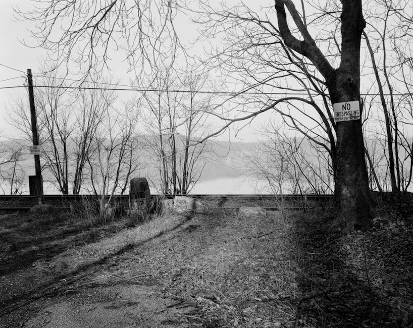
The Secret History of Lines
Submitted by Laura Thain on Mon, 2012-11-05 13:53
Image Credit: Colin Stearns With 24 hours to go, media outlets projecting the outcome of election day are covered in geographical maps of states and counties painted starkly in red and blue. I’ve enjoyed the responses of armchair intellectuals like Randall Munroe, who playfully reinterprets the red/blue divide to create a complex and comprehensive visual history of the Republican and Democratic parties. The proliferation of regional and ideological divides across multiple media this week urged me to explore two important questions in visual rhetoric: What does it mean to visualize a geographical boundary? And what does it mean to visualize an invisible line? (I would be remiss not to mention the enormous amount of border studies that exist in postcolonial and Anglophone literature and criticism—but today on viz I will try to confine myself to a discussion of the visualization of intranational borders.) Here to help me is the photography of Colin Stearns, Assistant Professor of Photography at Parsons. Stearns' current project is photographing the Mason-Dixon line in order to capture "this border of cultural distinction at the places of its occurence." Each of his photographs contain the invisible interstate line somewhere within their composition. I'll also put Stearns in dialogue with William Byrd II, the 18th century commissioner of the colonial line between North Carolina and Virginia.
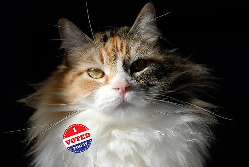
Secret Ballot, Public Voting: The Subtle and Not-So-Subtle Persuasion of the "I Voted" Sticker
Submitted by Todd Battistelli on Sun, 2012-11-04 11:37
Image Credit: Kevin Lau The image above of feline Lefty sporting an "I Voted" sticker is not, as some activists might worry, evidence of voter fraud. Rest assured, cats and other domestic animals are not posing as voters. Lefty's message is much less nefarious if vehement: "YES, I am talking to YOU! GO VOTE TODAY!" I already wore my "I Voted Early" sticker last week, thanks to the early voting available in Travis County, Texas. And I look forward to seeing fellow citizens from across the nation sporting "I Voted" stickers tomorrow regardless of their choices inside the voting booth.
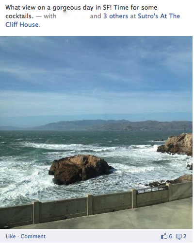
For the Love of SF
Submitted by Calliope on Fri, 2012-11-02 13:41
Image Credit: Facebook.com About half of my Facebook friends live in the SF Bay Area, and out of everyone they are by far the most active posters. They're constantly touting political views, promoting their startups, recommending good reads, and most of all reminding everyone through pictures and status updates that they live in the "best" city in the country (Businessweek made it official with their city rankings for 2012). As a former resident of SF who once drank the Kool-Aid, it's hard not to sound bitter and hypocritical about the locals' enthusiasm. Who knows, maybe instead of Kool-aid, now I'm just sucking on sour grapes. Let me be clear: there's no reason why San Franciscans shouldn't love there city. It is indisputably one of the most beautiful urban centers in the country. Pastel-colored buildings decorate its famous hills, which look out over the Pacific ocean and the wrap-around bay. And it boasts world-class universities, progressive politics, and vibrant international communities, all of which attract a distinctly intellectual, liberal, and enterprising kind of person. Like I said, it makes perfect sense that SF residents love their city, and that they would want to share this pride through social media. Most of the time I’m grateful for their posts because they offer me a way to vicariously experience the beautiful and eclectic place where I came of age. But the pictures also consistently make me laugh, and I confess they increasingly make me groan. This post will explore why that is. Tags:
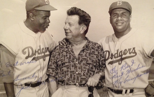
Bel Geddes' "All-Weather, All-Purpose Stadium"
Submitted by Jay Voss on Thu, 2012-11-01 13:11
(Image credit: Harry Ransom Center) The other day I was walking through the ongoing Norman Bel Geddes exhibition over at the Harry Ransom Center, and I spotted a photo of the designer with Jackie Robinson and Roy Campanella. You wouldn’t believe my surprise. What in the world were Robinson and Campanella doing with Bel Geddes? Up until that point in the gallery, I’d seen absolutely nothing having to do with baseball. And I didn’t think I would. Bel Geddes aesthetic preoccupation with what on the surface appears to be simply aerodynamics suggests a version of the future that we’re still trying to attain, like Ahab and his whale. Whether our cities will ever look like his remains to be seen. Perhaps I’m missing the point a bit, and maybe much of Bel Geddes’ work represents aesthetic advertisements rather than specific blueprints. But one can’t deny that Bel Geddes’ designs intently seek the immediate, the sleek, and the fashionable. These are all preoccupations inherently at odds with the boredom of baseball.
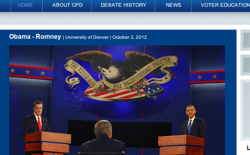
Selling Beer and Selling Democracy: American Bald Eagle Logos Today and Yesterday
Submitted by Todd Battistelli on Sun, 2012-10-28 11:13
Image Credit: Commission on Presidential Debates Despite its vaguely governmental-sounding name, the Commission on Presidential Debates is a private, non-profit corporation funded by a handful of businesses, as described by George Farah. The Commission serves to accommodate the Republican and Democratic Parties' desire for a relatively controlled event—control which drove the League of Women Voters to withdraw from hosting the debates in 1987. One of the long-standing contributors to the Commission is the Anheuser-Busch corporation (owned since 2008 by the Brazilian and Belgian conglomerate InBev). While watching the debates, I couldn't help but notice the similarity between the eagle that hangs above the heads of the candidates and the Anheuser-Busch eagle, both of which draw on deeply set US political imagery.
Commodity Conrad
Submitted by Chris Ortiz y P... on Sat, 2012-10-27 10:03
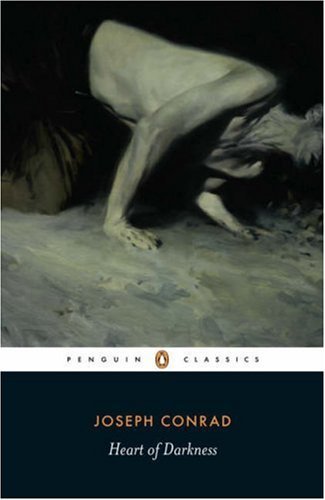
Image Credit: Phil Hale As an avid and generous reader of Joseph Conrad, I don't like Phil Hale's cover art for the most recent Penguin Classic releases. It's not the artist either. Hale can credit to his name some wonderful portraits and figures. No, the problem is that Hale took too much for his own that ubiquitous but injurious reading of Conrad, which became prevalent pretty much from day one: namely that Conrad is a DIFFICULT author (woe to the author who wins that terrible epithet!), and this predominantly because Conrad's prose, like Hale's writhing, headless corpse-like figures, is TORTURED. A few of the more famous modernists said some very dismissive things along these lines about Conrad, and it is our misfortune to have inherited their anxiety of influence as authoritative judgment. But Conrad's prose is compelling, immediate and alive! Yes, it's true and I state it with certainty. Conrad is not difficult, he is rewarding. Kipling said reading him is like reading a great author in a first-rate translation: that is to say, you get two arts for the price of one. But Hale's covers can turn off even me from reading one of my favorite authors, such a forbidding, cold, and painful experience do they promise. Cold War Conrad fared much better than his postmodern iteration, so far as book covers are concerned. And the original editions achieved an attractiveness which has never been matched. I'll show you. Come along.
|
|

Recent comments
2 years 29 weeks ago
2 years 44 weeks ago
2 years 44 weeks ago
2 years 50 weeks ago
3 years 4 weeks ago
3 years 4 weeks ago
3 years 4 weeks ago
3 years 6 weeks ago
3 years 6 weeks ago
3 years 6 weeks ago