viz.
Visual Rhetoric - Visual Culture - Pedagogy
Site informationRecent Blog Posts
|
This Week's New Yorker Cover and Frank Lloyd Wright
Submitted by Jay Voss on Wed, 2013-03-20 09:00
(Image credit: The New Yorker) This week’s New Yorker cover features a rendering of Frank Lloyd Wright’s Guggenheim Museum, and I thought the occasion merited some meditation on what the museum means to us today. It’s an odd shaped building, and I can’t think of one that’s been built like it sense. Snøhetta’s Oslo Opera House, pictured below and opened in April 2008, is a great example of how contemporary architects are still designing buildings for the arts in brave new ways. (That fantastic structure mimics a Norwegian glacier melting into the sea, and many of its smart features work to invite all of Oslo, not just the operatic elite, to inhabit within and without.) But no structure for the arts built since 1960 has been as original as Frank Lloyd Wright’s Guggenheim Museum. Opened on 21 October 1959, the Guggenheim Museum is Frank Lloyd Wright’s last masterpiece. It was (more or less) commissioned in 1943, but the project took Wright 15 years and over 700 sketches to complete. Such revision is unusual for a Wright project, of course – most of his designs were completed in a matter of hours. (I suspect he was always thinking about his projects, and thus when the time came to get his ideas down on paper for clients there wasn’t much work to do.) What’s so unique about the Guggenheim Museum is that it’s a descending spiral. This design has two benefits: visitors can effortlessly enjoy the museum’s exhibit as they casually descend a ramp and, more importantly, the changing diameter of the spiral always allows for natural lighting at the art. Form follows function.
Handwriting: What's it good for?
Submitted by Calliope on Thu, 2013-03-07 19:20
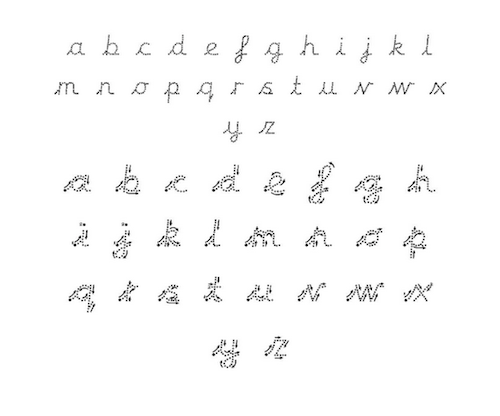
Image Credit: Birdsedge First School Remember these things? It's hard to believe that kids are still learning to shape their letters according to handwriting diagrams like this one. In the first world where type is the dominant mode of textual presentation, one has to wonder how often kids will encounter a squiggly 'f' as it's drawn above or a lower case 'k' that looks like a capital R? The chart looks to us like an anachronism, especially next the digital text of this blog post. We're prompted to ask whether kids should be taught to write a script that is rapidly fading from the textual universe? Is handwriting a skill that is worth acquiring in an era when written communication mainly occurs through digital media, without the assistance of pen or paper? The Mid-2000 Nike Watch and the 2014 Apple iWatch
Submitted by Jay Voss on Wed, 2013-03-06 14:00
(Image credit: Macrumors.com) A few weeks ago I wrote about the breaking news that there might be an Apple iWatch on the horizon. For those of you who missed the post, I surmised that the device would be a useless accessory. We got the iPad for those moments between our iPhones and our iMacs (as Steve Jobs famously put it during the latter product’s initial announcement). Presumably we got the iPad Mini for those moments between our iPad and our iPhone, whatever those moments might be. And now we’ll have an iWatch for the moments between our iPhones and our….wait, what?! The idea of the possibility of this much interactivity strikes me as bizarre. The internet’s great and it makes my life easier, etc., but I’m the kind of guy who uses his iPhone as an alarm clock but waits to read emails from students until after a cup of coffee. Know what I mean? The idea of spending the first ten minutes of my waking day getting caught up on what happened in my work life while I was sleeping strikes me as a terrible way to live. And wouldn’t you get an iWatch to do just this? Wouldn’t you get an iWatch to get caught up on work when you should really be doing something else? All these new Apple products are starting to remind me of a lesson I learned in middle school: just because you can, doesn’t mean you should. Just because you can cram an iOS onto your wrist doesn’t mean you should.
Tags:
The Hype Cycle Is A Red Herring...Just Ask Tolstoy
Submitted by james.wiedner on Mon, 2013-03-04 18:53
Credit for Eedited Image of Leo Tolstoy: Sean Ludwig Educators and everyday people alike have spent (at least) the last half of a decade in a state of ever-increasing turgidity as they speculate as to all of the amazing feats the e-reader (usually, “e-reader” means “iPad” in the popular discourse, so I might use both terms below) will achieve in the context of public education. It is almost assumed that replacing every student’s bulky, quickly-dated paper textbooks with sleek, capability-rich e-readers is an unequivocally good, nay, downright imperative educational initiative. However...
Reading Django Unchained as Camp
Submitted by Laura Thain on Sat, 2013-03-02 03:13
Image Credit: Vanity Fair Although it’s been two months since its initial release, the internet is still abuzz with social critique of Tarantino’s newest film Django Unchained. Roxane Gay, a staff writer for Buzzfeed, argues that rather than encouraging a national discourse on slavery, slavery is instead “the movie’s easily exploited backdrop.” The movie functions instead as “a white man’s slavery revenge fantasy, and one in which white people figure heavily and where black people are, largely, incidental.” Finally, she concludes, “Django Unchained isn’t about a black man reclaiming his freedom. It’s about a white man working through his own racial demons and white guilt.” Many of Django’s critics couch their arguments in similar terms—that is, that while Tarantino claims to reignite a discourse on slavery in Django Unchained, he in fact privileges genre over content in a way that dangerously decontextualizes our most central national trauma. I have argued in an early post that privileging medium over content can function as a form of censorship. Here, I want to discuss how the same aesthetice practice can simultaneously suggest and defer engagement with tragedy and trauma.
Photographs of the Willard Suitcases
Submitted by Calliope on Wed, 2013-02-27 18:59
Image Credit: Jon Crispin Beaten up, bulging, and with one latch ajar, this old suitcase beckons to be opened. It was closed for a long time, deposited with its owner in 1953 at the Willard Asylum for the Insane near Seneca Lake, NY. This and around 400 other suitcases that belonged to the asylum's patients sat for many years, forgotten in the attic of the defunct facility until discovered in the mid-1990s. After being exhibited publically for the first time in 2004, many of the suitcases are now temporarily in the care of Jon Crispin who has undertaken to photograph the collection. The images in this post are from Crispin's blog which chronicles his experience inspecting and documenting the personal effects of the Willard patients. Check Out this Imaginative Map of Renaissance Venice
Submitted by Jay Voss on Wed, 2013-02-27 10:00
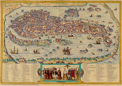
(Image credit: The Hebrew University of Jerusalem) I was reading Galileo the other day when I became interested in Renaissance Venice (the place had sublime music, visual arts, and all the culture that comes with the great flowerings of these things), and a few Google searches later I found myself staring at the map above for about 20 minutes. (Click here for a larger copy.) The map was drawn by Bolognino Zaltieri in 1565. Now, it’s already allergy season here in central Texas and I admit that I feel as though I’m on allergy meds without having even taken any, so my fascination with the map could be due to various things beyond my own intellect, however, you’ve got to admit – this map is awesome. It’s just crazy to imagine living amongst one of those waterways several hundred years ago. How about all the bridges? And do you notice that a pedestrian going from one mini-island to another might have to plan their trip in advance, as not every mini-island is connected to its peers? And then, of course, you wonder how it was all built without the aid of gasoline-powered construction tools. I thought I’d share it all with you. It’s just mesmerizing how a city built upon a marsh contains so many things, and how a mapmaker was able to portray segmented happenings and city life.
What do start-ups look like?
Submitted by Calliope on Thu, 2013-02-21 15:43
Image Credit: Screenshot capture from insidestartups.org In a recovering service economy like ours, young job seekers face a different set of choices than they might have a decade or two ago. The prohibitively high cost of obtaining a traditional college degree--along with a lot of other economic factors--are changing not only the kinds of educational models available to young people, but also the career paths they are taking. One of the more common entry points to the workforce these days are Internet start-ups. Relative to their size they are better job creators than established companies and offer attractrive employment for all kinds of talent, from Ivy League grads to self-taught computer programmers. If these sorts of trends interests you, there are plenty of ways to keep tabs on the start-up sector; TechCrunch, Venture Beat, and the New York Times Bits Blog aren't bad places to start. The coverage you'll see in these publications is focused on companies' products and business strategies. If you're interested in the culture of start-ups--the selling point for so many employees--then the visual database insidestartups.org is the place to look. This searchable gallery of start-ups, designed to connect companies and employees, is the best way to visualize the industry from a macro point of view, but also from the inside out. I recently used the site to teach rhetorical analysis, but its content strikes me as valuable in other ways. The website's prominent montage of profile pictures gives viewers a macro sense of the new startup "cohort," and individually, the images suggest possible values and directions for the new American workplace.
Finding Ossian: Fun in an Eighteenth-Century Pleasure Garden
Submitted by Jay Voss on Wed, 2013-02-20 13:58
(Image credit: Jay Voss) About a month ago I was fortunate enough to find myself outside of Ossian’s hall. I was on the banks of the River Braan in Craigvinean Forest, just to the west of Dunkeld, Scotland. Crazier still, though I’m writing a dissertation concerning the Scottish Enlightenment, I hadn’t set out that morning to find where Ossian came from. I was just in the area doing a bit of hiking (or “hill walking,” rather), and on the last day I set out for something I’d been told by a local that I just had to see. He called it “The Hermitage”. What I was to discover that morning was a pleasure garden designed in the later half of the eighteenth century for the Dukes of Atholl. So I set out from Dunkeld on a mulch path next to the strong River Tay, and about a mile and a half from town where the River Braan enters the River Tay I headed up into the hills and entered the Craigvinean Forest, which is a beautiful old-growth swath of Douglas firs. As I was soon to discover, what was crazy about the pleasure garden, and thus why I think it might be fun to present it here, was that it is a visual representation of the immediate fanfare that surrounded James Macpherson’s eighteenth-century cycle of epic poems.
Reading Crowdsourced Justice: The Case of Fitness SF
Submitted by Laura Thain on Mon, 2013-02-18 17:46
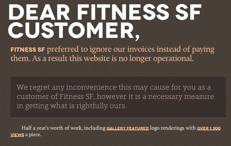
Image Credit: Passive Aggressive Notes Last Friday, the DWRL hosted an RSA webinar featuring Dr. Rita Raley, Associate Professor of English and the University of California Santa Barbara. The webinar, which was broadcast over Google Hangouts thanks to our audio/visual team here in the DWRL, encouraged interactivity via social media and generated a lively discussion. I wanted to follow up on Dr. Raley’s talk about tactical media as speculative practice with an example from this week’s headlines: the “hacking” of a San Francisco based gym’s website by the site designer himself. Fitness SF contracted Frank Jonen, an independent web developer, to design their website in May of 2012. On February 15, after nine months of non-payment, Jonen took action by re-claiming the website he designed as a means to “out” Fitness SF for non-payment.
|
|


Recent comments
2 years 29 weeks ago
2 years 44 weeks ago
2 years 44 weeks ago
2 years 50 weeks ago
3 years 4 weeks ago
3 years 4 weeks ago
3 years 4 weeks ago
3 years 6 weeks ago
3 years 6 weeks ago
3 years 6 weeks ago