viz.
Visual Rhetoric - Visual Culture - Pedagogy
Site informationRecent Blog Posts
|
art historyCommodity Conrad
Submitted by Chris Ortiz y P... on Sat, 2012-10-27 10:03
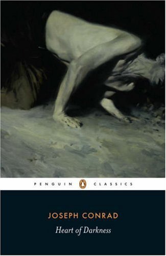
Image Credit: Phil Hale As an avid and generous reader of Joseph Conrad, I don't like Phil Hale's cover art for the most recent Penguin Classic releases. It's not the artist either. Hale can credit to his name some wonderful portraits and figures. No, the problem is that Hale took too much for his own that ubiquitous but injurious reading of Conrad, which became prevalent pretty much from day one: namely that Conrad is a DIFFICULT author (woe to the author who wins that terrible epithet!), and this predominantly because Conrad's prose, like Hale's writhing, headless corpse-like figures, is TORTURED. A few of the more famous modernists said some very dismissive things along these lines about Conrad, and it is our misfortune to have inherited their anxiety of influence as authoritative judgment. But Conrad's prose is compelling, immediate and alive! Yes, it's true and I state it with certainty. Conrad is not difficult, he is rewarding. Kipling said reading him is like reading a great author in a first-rate translation: that is to say, you get two arts for the price of one. But Hale's covers can turn off even me from reading one of my favorite authors, such a forbidding, cold, and painful experience do they promise. Cold War Conrad fared much better than his postmodern iteration, so far as book covers are concerned. And the original editions achieved an attractiveness which has never been matched. I'll show you. Come along.
“Colorizing” the Black-and-White Past
Submitted by Chris Ortiz y P... on Sat, 2012-09-29 10:06
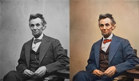
Image Credit: Sanna Dullaway Abraham Lincoln has been colored in by means of computer software. There are more color photographs of the past today than there have ever been before: and that is because people, like artist Sanna Dullaway, are using Photoshop to colorize black and white ones. In this post, I wonder why.
The Fate of Arcimboldo; The Fate of the Book
Submitted by Laura Thain on Thu, 2012-09-27 16:21
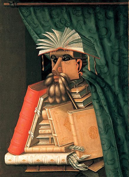
Image credit: Wikipedia I'll test my art history chops today (no promises) as I explore the work of Giuseppe Arcimboldo (1527-1593), late Renaissance Mannerist and an artist of interest to everyone from the critic Barthes to the stadium rock band Kansas to the surrealist Salvador Dali. The designer(s) of this year’s TILTS symposium flier chose an engraving after Arcimboldo’s The Librarian (1566). In investigating some context for the painting, I couldn’t help but notice the aptness of the image—not only, of course, because of TILTS’ ever-present commitment to textual studies, but because of the particular place Arcimboldo holds in literary and popular imagination in the Post-Renaissance world.
|
|
Recent comments
2 years 29 weeks ago
2 years 44 weeks ago
2 years 44 weeks ago
2 years 50 weeks ago
3 years 4 weeks ago
3 years 4 weeks ago
3 years 4 weeks ago
3 years 6 weeks ago
3 years 6 weeks ago
3 years 6 weeks ago