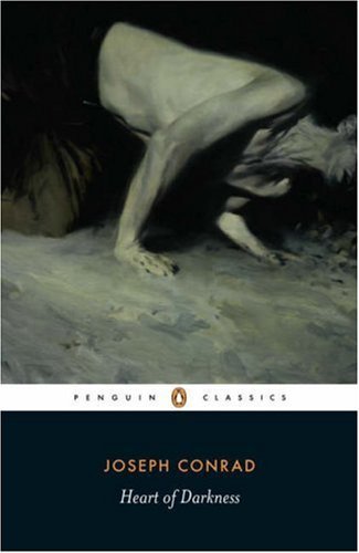
Image Credit: Phil Hale
As an avid and generous reader of Joseph Conrad, I don't like Phil Hale's cover art for the most recent Penguin Classic releases. It's not the artist either. Hale can credit to his name some wonderful portraits and figures. No, the problem is that Hale took too much for his own that ubiquitous but injurious reading of Conrad, which became prevalent pretty much from day one: namely that Conrad is a DIFFICULT author (woe to the author who wins that terrible epithet!), and this predominantly because Conrad's prose, like Hale's writhing, headless corpse-like figures, is TORTURED. A few of the more famous modernists said some very dismissive things along these lines about Conrad, and it is our misfortune to have inherited their anxiety of influence as authoritative judgment. But Conrad's prose is compelling, immediate and alive! Yes, it's true and I state it with certainty. Conrad is not difficult, he is rewarding. Kipling said reading him is like reading a great author in a first-rate translation: that is to say, you get two arts for the price of one. But Hale's covers can turn off even me from reading one of my favorite authors, such a forbidding, cold, and painful experience do they promise. Cold War Conrad fared much better than his postmodern iteration, so far as book covers are concerned. And the original editions achieved an attractiveness which has never been matched. I'll show you. Come along.
Contrast, first, a few of Phil Hale's other figures with his covers for the new Penguin Conrads.
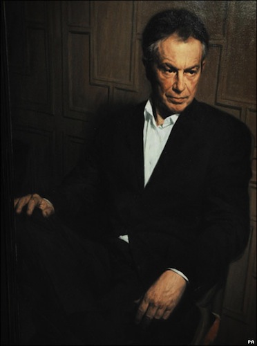
Image Credit: Phil Hale
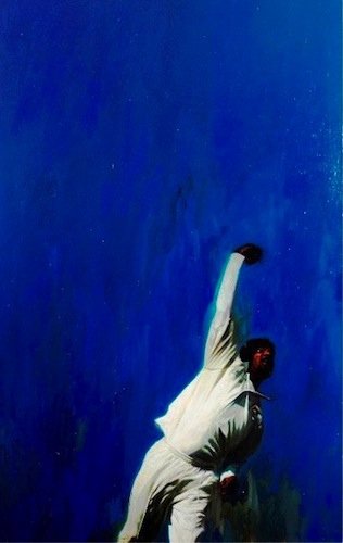
Image Credit: Phil Hale
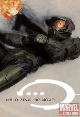
Image Credit: Phil Hale
Hale's officially commissioned portrait of former Prime Minister Tony Blair is ennobling, understated, and modern, qualities few portraits of state share. Hale's painting of the great Sri Lankan cricketer Muttiah Muralitharan is exhilarating and alive. It shows much of what cricket fans find so enchanting about that game. And then Hale's cover for the graphic novel Halo shows a light hand with violence, very well suited to the adventure series. All of these qualities suggest what the editors of the new Penguin must have recognized: Hale is a good choice for fresh editions of Conrad. All the more lamentable, then, that Hale didn't bring them to bear on Conrad!
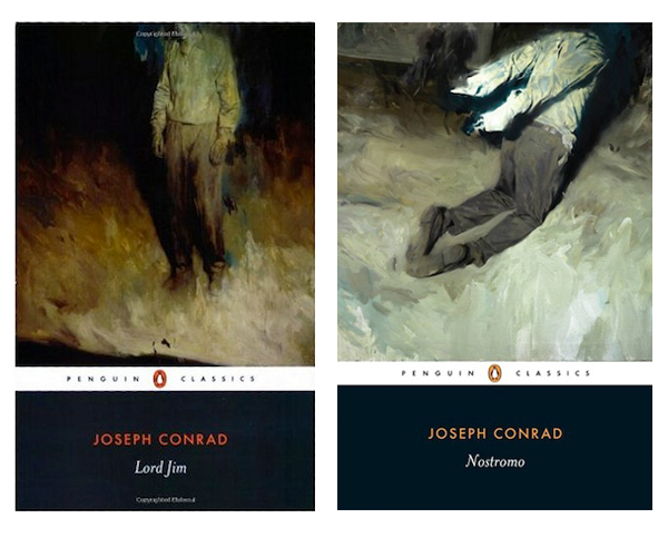
Image Credit: Phil Hale
These Munchian nightmare figures take all the fun, all the consolation, out of Conrad. I think I see some of what Hale might have meant. The faces are obscured just as, in Conrad, the sheer amount of information about a character tends to obscure rather than clarify our understanding of them. And of course there is pain in Conrad's books. But, as I suggested, I think these figures are not tortured on that account but on the theory that Conrad's prose is famously convoluted. In either case, Hale's painful, contorted Conrad cruelly ignores the Conrad who, he insisted, so loved humanity:
For my own part, from a short and cursory acquaintance with my kind, I am inclined to think that the last utterance will formulate, strange as it may appear, some hope now to us utterly inconceivable. For mankind is delightful in its pride, its assurance, and its indomitable tenacity. It will sleep on the battlefield among its own dead, in the manner of an army having won a barren victory. It will not know when it is beaten. And perhaps it is right in that quality. The victories are not, perhaps, so barren as it may appear from a purely strategical, utilitarian point of view. (Conrad in 1905)
I don't find this sentiment nor the prose in which it is expressed painfully convoluted. But who will ever find their way to this consoling Conrad when there are covers out there like this one by Dan Eldon?
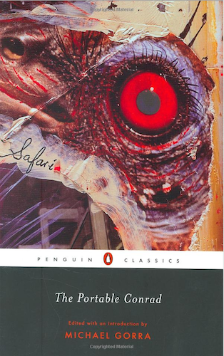
Image Credit: Dan Eldon (2007)
It's not that there is no pain or blood or even torture in Conrad. Of course there are because these exist in the world and Conrad was a realist. But there is also love and life in Conrad. The Penguin Modern Classics took more to heart Conrad's warmth for people. The covers from this era are troubled but certainly not corpse-like:
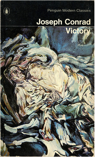
Image Credit: A detail of 'Die Windsbraut' by Oskar Kokoschka
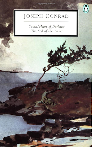
Image Credit: Detail from The Coming Storm by Winslow Homer
Oxford World's Classics Conrad is also less blinkered by Conrad's depictions of pain:
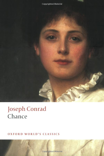
Image Credit: Detail from Margaret by Philip Hermogenes Calderon (1833-98)
These are beautiful and complex paintings that allow for a layered emotional response. And there are good reasons to further complicate already intricate novels with paintings. As Geoff Dyer recently observed in The New York Times, classic paintings, such as those used by Penguin Modern Classics, served as "visual essays on the books they adorned," and a "side effect was that books I was reading for an education in literature doubled as an introduction to art history."
Very well; either let us return to classic paintings for covers or let us paint Conrad more generously. This shall suffice for paperback school copies.
Believe it or not, though, Conrad was not always read just for school. People read him because they found him worth reading. The original editions reveal a Conrad wrapped up and presented for leisured enjoyment.
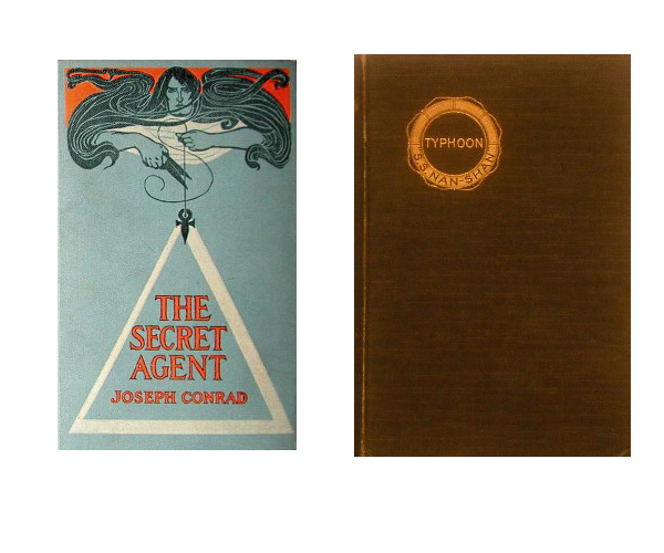
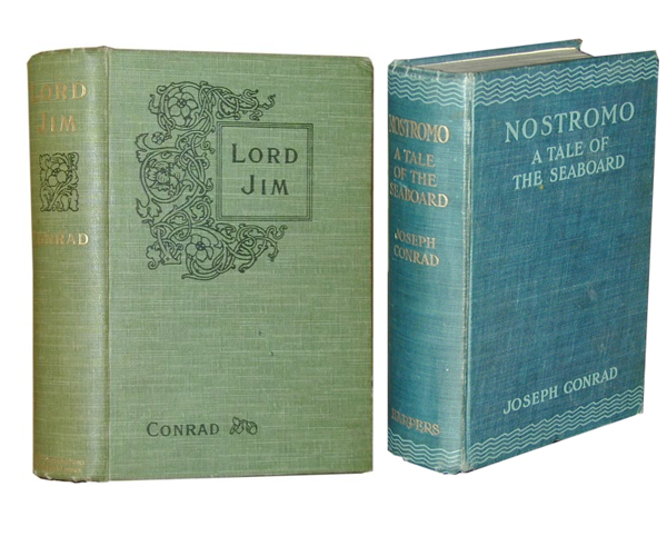
Image Credit: wikipedia
I'm not one for commodification, but a commodified Conrad might not be the worse thing if it gave him, at last, that kind of reader he always wanted more than any other. Let us name this reader by everything she or he is not, or not only: conceited, elitist, conspicuous and fashionable.
Recent comments
2 years 29 weeks ago
2 years 44 weeks ago
2 years 44 weeks ago
2 years 50 weeks ago
3 years 4 weeks ago
3 years 4 weeks ago
3 years 4 weeks ago
3 years 6 weeks ago
3 years 6 weeks ago
3 years 6 weeks ago