viz.
Visual Rhetoric - Visual Culture - Pedagogy
Site informationRecent Blog Posts
|
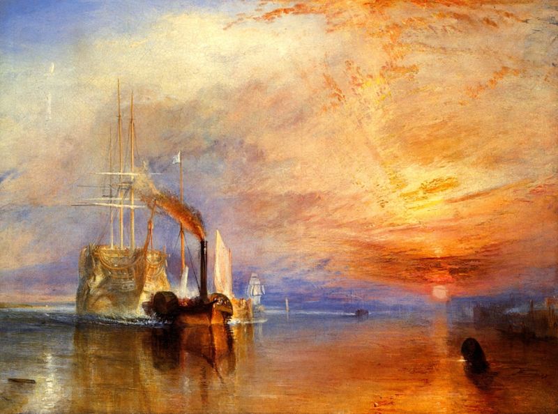
Visual RhetoricDigital forensics
Submitted by John Jones on Mon, 2007-10-01 23:09
The New York Times has posted an interview with Dartmouth’s Hany Farid, the creator of “digital forensics.” Here’s how Dr. Farid describes the field:
Dr. Farid makes some other interesting claims as well. Since 1990, the percentage of fraud cases involving photos has risen from 3 percent to 44.1 percent. While the majority of the interview focuses on digital manipulation in scientific research, clearly photographic forgery is becoming a significant problem in all areas of society. Scientists investigate paintings for clues about volcano eruptions
Submitted by John Jones on Mon, 2007-10-01 12:05
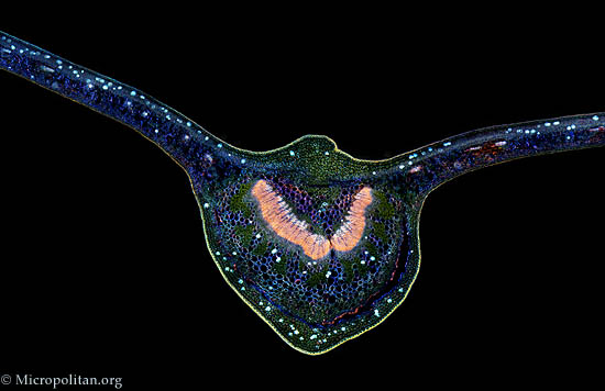
via Boing Boing Microscopic photography at the Micropolitan Museum
Submitted by John Jones on Sun, 2007-09-30 16:44
Those of you interested in the rhetoric of science should enjoy The Micropolitan Museum of Microscopic Art Forms, which is supported by the fantastically-named Institute for the Promotion of the Less than One Millimeter. The site boasts some beautiful imagery which, along with the accompanying text, should be able to spark some fantastic discussions about the relationship of visuals and scientific knowledge. About viz.The award-winning digital publication viz. is committed to the intersections of Rhetoric and visual culture. In keeping with its mission to promote visual literacy, the viz. blog presents a daily community forum for discussing images in the digital age. The website attracts a steady, significant following with an international audience made up of users from 144 countries and territories.
The website is maintained by the Digital Writing and Research Lab at the University of Texas at Austin by members of the Visual Rhetoric Project Group. The viz. blog is the winner of the Jon Lovas Memorial Weblog Award. For instructors, a number of resources are available, such as Teaching, a static page with resources for pedagogy, and the Visual Theory page, hosting content in photography theory, new media theory, and design. The feature Views includes interviews with prominent Visual Rhetoric and Communications scholars. Scholars, instructors, artists, photographers, and anyone with an interest in the diversity of Visual Rhetoric and culture are welcome to contribute to the blog or other portions of the website. First time users may contact the editors to set up collaborations or accounts for contributions. For a recent review of viz., see Kairos 13. Tags:
Visual resources for teaching Latin American and Border Studies
Submitted by John Jones on Wed, 2007-08-22 11:43
UT’s First-Year Forum text for 2007–2008 will be Luis Alberto Urrea’s The Devil’s Highway. Yesterday I sat in on a seminar hosted by the DRW where Domino Perez discussed some of the background and context of the issues that the book engages. One theme of the discussion was the influence of film on the Urrea’s prose, as well as how images of Latinos can both support and trouble Urrea’s arguments. In the wake of that discussion, I thought I would post links to some Latin-American and Border Studies visual resources for use by DRW instructors and anyone else who is teaching a class that deals with these fields. |
|


Recent comments
2 years 29 weeks ago
2 years 44 weeks ago
2 years 44 weeks ago
2 years 50 weeks ago
3 years 4 weeks ago
3 years 4 weeks ago
3 years 4 weeks ago
3 years 6 weeks ago
3 years 6 weeks ago
3 years 6 weeks ago