Site informationRecent Blog Posts
Blog Roll
|
Visual RhetoricSome Enchanted Image
Submitted by Rachel Schneider on Mon, 2009-10-19 17:23
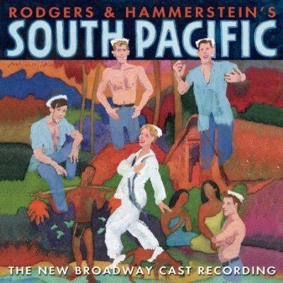
Right now in my class we’re preparing to turn in the first draft of the second paper assignment, which is a comparative rhetorical analysis between two productions of the same musical where I’d like my students to talk about the different rhetorical arguments made by each production using sets, costumes, and performance, as well as changed scripts. In order to alleviate student concerns, I’ve set myself the task to write a sample paper for them. It’s been an interesting experience for me, and a somewhat difficult one. For my texts, I’ve chose to compare the original 1949 Broadway production of South Pacific with the 2008 revival.
Image Credit: CastRecordings.com Images of an American Soldier
Submitted by Andi on Fri, 2009-10-02 22:18
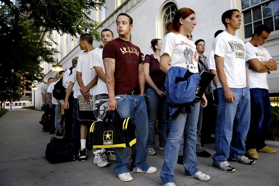
Image Credit: Craig F. Walker, The Denver Post H/T: The New York Times Noel’s comments this past week about the circulation of iconic images of violence and the role of affect in our reception of these images left me wondering about contemporary photojournalism and its treatment of war. In their text and blog, No Caption Needed, John Louis Lucaites and Robert Hariman have written extensively about the way iconic images, such as the photograph of General Loan executing a suspected member of the Viet Cong, circulate in public culture but what should we make of images that are less well known or that focus on the more mundane aspects of war?
New Pedagogy Resource: Guide to Teaching Visual Rhetoric
Submitted by timturner on Tue, 2009-09-29 13:45
A new page has been posted to the Assignments section of Viz., a Guide to Teaching Visual Rhetoric that provides a brief overview of the theory and practice of visual rhetoric and offers some ideas for incorporating instruction in visual rhetoric into composition classrooms, as well as a number of resources. The intoductory guide is designed to complement the sample assignments and theory pages. If you are interested in including visual rhetoric into your classroom but aren't sure how, we hope this page will provide you with a useful resource for getting started. Guide to Teaching Visual Rhetoricby Tim Turner What is Visual Rhetoric? As a discipline of rhetorical study, visual rhetoric can refer to a wide variety of analytical and pedagogical practices. Essentially, however, it refers to the practice of analyzing and/or describing how images communicate meaning or advance arguments. It may be thought of as the rhetorical analysis of images using the familiar vocabulary of rhetorical theory (such as ethos, pathos, and logos), but with a supplementary vocabulary unique to the analysis of the visual (e.g., with reference to color, graphic design, iconography, etc.) Although the object of visual rhetorical inquiry can be virtually limitless as long as images of some kind are involved, in rhetoric courses these subjects frequently include advertising, iconic or contemporary photography, film, maps, and web design. Additionally, in a recent review article on the current state of visual rhetoric, Paul Messaris articulates four key questions for establishing the broadest framework of such study:
Each question aims to unsettle conventional wisdom about the difference between images and words, thus complicating the supposed "differentiation of the verbal and the visual" that David Blakesly has also challenged. Aims of Visual Pedagogy The basic paradigm for teaching composition (exemplified in the "controversy model" often employed introductory rhetoric courses) involves leading students first to describe and analyze the components of persuasive written arguments by others (rhetorical analysis) before leading them to write such persuasive arguments themselves (advocacy). The aims of visual pedagogy are similarly twofold: by including instruction in visual rhetoric in the curriculum, instructors can help students
Analysis as visual literacy: Today, digital technology, social media, YouTube, and the omnipresence of cell-phone cameras (among other developments) have made images a ubiquitous part of everyday communication networks. As citizens-and as consumers-all of us are confronted with visual presentations of information and argumentation on a near-constant basis. For this reason, instructors are encouraged to think of visual rhetoric not as a supplement to the curriculum, but as a vital component in the process of helping students become more literate participants in these networks. Creation as visual competency: In addition to helping students become more literate and active interpreters of visual communication, visual pedagogy can also play a part in helping students become active participants in these exchanges by fostering visual competency. Here, the goal is to help students successfully deploy visual arguments of their own, either in support of mostly written arguments (e.g., using images or graphically presented statistical information to support the arguments of an advocacy paper) or in place of mostly written arguments (e.g., substituting a short film, slidecast, web site, or brochure designed using professional software in place of an advocacy paper). Incorporating Visual Rhetoric in the Composition Curriculum There are many ways to incorporate visual rhetoric and visual pedagogy into the curriculum for composition or literature courses. The following breakdown distinguishes between short- and long-form projects. Short-form projects (1 - 2 class meetings)
Long-form projects (from several class meetings to semester-length projects)
Available Technologies and Applications Flickr - Massive database of images, many of which are licensed using Creative Commons. Google Maps - Using "My Maps" or Google Earth, the creative possibilities here are almost limitless. InDesign - This professional Adobe software is used for desktop publishing of items like pamphlets (how-to guide). iMovie - Software for editing and creating films (how-to guide).
MindMapping - This software enables students to brainstorm by creating visual representations of the thought-process (how-to guide). Viz. - This web site, maintained by the visual rhetoric project in the CWRL, includes an ongoing blog on visual culture, a visual rhetoric assignments database, and introductory pages on theories of visual rhetoric. YouTube - This ubiquitous site doubtless needs no introduction. A virtually endless resource for video content.
Additional Resources Viz.: A web site for visual rhetoric, visual culture, and pedagogy, maintained by the DWRL Viz. collection of visual rhetoric assignments Viz. bibliography of resources on visual rhetoric No Caption Needed: Iconic Photographs, Public Culture, and Liberal Democracy Sociological Images: Inspiring Sociological Imaginations Everywhere Information Aesthetics: Where form follows data "Visual Rhetoric" (Wikipedia) "Visual Rhetoric" (Wikibooks) "What is Visual Rhetoric, and What is its Tradition?" by David Blakesly "What's Visual about Visual Rhetoric?" by Paul Messaris // Quarterly Journal of Speech 95.2 (This review article is available as a full-text PDF through JSTOR) Tags:
Visual Rhetoric of Crisis?
Submitted by timturner on Mon, 2009-07-27 16:36
All good things must come to an end, and so it is with summer; and I know it's the end of summer, because people are sending me urgent messages requesting a description of the course I plan on teaching this fall. What I've come up with so far is a course on "Crisis Rhetoric". One of the primary questions the course will seek to answer is whether there is such a thing as a legitimately, discretely definable "crisis rhetoric." How does the art of persuasion change in situations of crisis, and how can the art of persuasion be used to create a sense of crisis in any given public sphere? Tags:
Recommended Reads on Blogging, Visual Rhetoric
Submitted by timturner on Tue, 2009-07-07 11:56
For this week, instead of a visual analysis, I offer a pair of reading recommendations . This is in keeping with the spirit, if not the explicit aim, of viz., to analyze visual culture and serve as a forum for anyone interested in same. While thinking ahead about what is in store for this site and what directions it might take in the coming year, both articles offer useful reflections. Tags:
NEW: Creative Commons Visual Rhetoric Introduction
Submitted by Nate Kreuter on Thu, 2009-05-07 13:32
Check our new Creative Commons Introduction to Visual Rhetoric in the "assignments" section. Visual Rhetoric Introduction PowerPoint PresentationIntroduction to Visual Rhetoric ~About the Presentation~ Any introductory presentation like this one is going to have its limitations. This document, in addition to providing a teaching guide to accompany the PowerPoint slide show, seeks to make explicit some of those limitations, so that you as an instructor can consider them and decide how best to deal with them in your own classroom. DOWNLOAD THE POWERPOINT PRESENTATION HERE The introduction to visual rhetoric available for you to download here has been created under a Creative Commons license. We have assigned a license that allows you to share, remix, edit, and change the work, under the following conditions: 1) attribution--you must attribute credit to respective authors, both to the original author of this presentation and to the individual authors of photos in the presentation, who have already been credited where appropriate; 2) noncommercial use only--you made not use this presentation, explanatory document, parts thereof, or derivative works for commercial gain- noncommercial use only; 3) share alike--you must license your own derivative works based on this presentation under a similar share alike license. For all the legal boilerplate, click here. For a quick explanation from the good folks at Creative Commons, click here. The version of the presentation available for download here is composed entirely of images in the public domain or licensed under similar Creative Commons licenses. Unfortunately, not much advertising is licensed through Creative Commons, for obvious reasons. However, adding advertising images to this presentation for use in your own classroom clearly falls under the purview of fair use, and we encourage you to do so. But we also recommend that you do not freely distribute versions of the presentation containing any copyrighted images. We’re not lawyers, and you shouldn’t take ours as legal advice, but you risk making your life significantly more complicated if you agitate the wrong copyright holder. Use your own discretion. We hope you will also feel free to modify this presentation in ways appropriate to your own rhetoric or composition class. Some images simply lend themselves to different modes of analysis, and so if, for example, your class is particularly focused on issues of gender and sexuality, the presentation could be tweaked to focus exclusively on those sorts of issues. The presentation goes out of its way to bring current political figures, as well as issues of race, gender, sexuality, and commercial consumption into the presentation. You will quickly notice that much of the content of this presentation could be construed as quite political. That’s because it is. What it isn’t though is a political soapbox. We feel our students are smart enough to decide their own politics, but that doesn’t mean that it’s wrong to be political, or bring up political issues in the classroom. We live in a politically divided world, and so it seems one of the responsibilities of this presentation not to shy from such realities. And again, whatever you see here that you don’t like, you can change, thanks to our nifty Creative Commons licensing. The purpose of this presentation is to get students thinking about how to read images rhetorically. Really, all we’re hoping is to show students that the rhetorical concepts they’ve already learned to apply to written texts are similarly applicable to visual texts. The presentation is designed to elicit student responses, not to be lectured from. The following notes for each slide are intended to help show you what we hoped to accomplish with each side. The comments offered here for each slide are sample readings, as much as anything else, and ideally you might ask students to generate their own, collective readings of the images in the presentation and what those reading might signify for broader American (rhetorical?) culture. You may see something different, either in the content of the slide, or in terms of a teachable moment or point that the slide brings up. In the future we hope to post a video of one of our instructors giving the presentation in a rhetoric class and interacting with students, so that you can see how at least one other teacher combines prompts and very brief periods of lecturing with elicitations of student responses. We’ll post that video here once we have it. Thanks, and use, modify, remix, remake however you like. And if you do, we would love to hear about it. ~Slide 1~ ~Slide 2~ ~Slide 3~ ~Slide 4~ ~Slide 5~ ~Slide 6~ ~Slide 7~ ~Slide 8~ ~Slide 9~ ~Slide 10~ ~Slide 11~ ~Slide 12~ ~Slide 13~ ~Slide 14~ ~Slide 15~ ~Slide 16~ ~Slide 17~ ~Slide 18~ ~Slide 19~ ~Slide 20~ ~Slide 21~ ~Slide 22~ ~Slide 23~ Torture and Legos
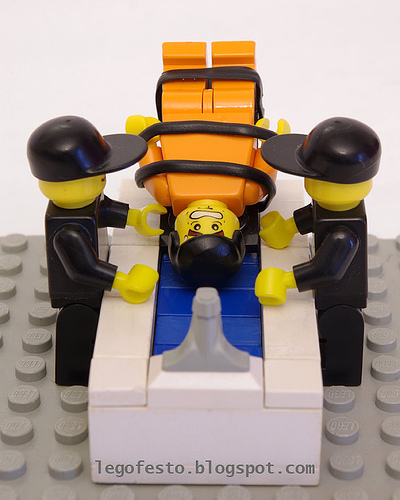
Submitted by timturner on Wed, 2009-04-22 12:19
John Jones sent along a link to this image, from the work of a photographer who documents events in the "war on terror" with Lego dioramas. (I have an earlier post on viz. on a somewhat similar subject, an artist who used Legos to create depictions of the Holocaust.) |
|
viz.
Visual Rhetoric - Visual Culture - Pedagogy
Site informationRecent Blog Posts
|
Visual RhetoricSome Enchanted Image
Submitted by Rachel Schneider on Mon, 2009-10-19 17:23
Right now in my class we’re preparing to turn in the first draft of the second paper assignment, which is a comparative rhetorical analysis between two productions of the same musical where I’d like my students to talk about the different rhetorical arguments made by each production using sets, costumes, and performance, as well as changed scripts. In order to alleviate student concerns, I’ve set myself the task to write a sample paper for them. It’s been an interesting experience for me, and a somewhat difficult one. For my texts, I’ve chose to compare the original 1949 Broadway production of South Pacific with the 2008 revival.
Image Credit: CastRecordings.com Images of an American Soldier
Submitted by Andi on Fri, 2009-10-02 22:18
Image Credit: Craig F. Walker, The Denver Post H/T: The New York Times Noel’s comments this past week about the circulation of iconic images of violence and the role of affect in our reception of these images left me wondering about contemporary photojournalism and its treatment of war. In their text and blog, No Caption Needed, John Louis Lucaites and Robert Hariman have written extensively about the way iconic images, such as the photograph of General Loan executing a suspected member of the Viet Cong, circulate in public culture but what should we make of images that are less well known or that focus on the more mundane aspects of war?
Torture and Legos
Submitted by timturner on Wed, 2009-04-22 12:19
John Jones sent along a link to this image, from the work of a photographer who documents events in the "war on terror" with Lego dioramas. (I have an earlier post on viz. on a somewhat similar subject, an artist who used Legos to create depictions of the Holocaust.) |
|
Recent comments
2 years 29 weeks ago
2 years 44 weeks ago
2 years 44 weeks ago
2 years 50 weeks ago
3 years 4 weeks ago
3 years 4 weeks ago
3 years 4 weeks ago
3 years 6 weeks ago
3 years 6 weeks ago
3 years 6 weeks ago