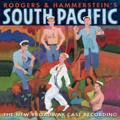
Right now in my class we’re preparing to turn in the first draft of the second paper assignment, which is a comparative rhetorical analysis between two productions of the same musical where I’d like my students to talk about the different rhetorical arguments made by each production using sets, costumes, and performance, as well as changed scripts. In order to alleviate student concerns, I’ve set myself the task to write a sample paper for them. It’s been an interesting experience for me, and a somewhat difficult one. For my texts, I’ve chose to compare the original 1949 Broadway production of South Pacific with the 2008 revival.

Image Credit: CastRecordings.com
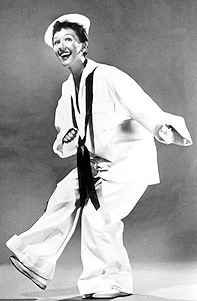
What I wanted the students to really do in this assignment is to analyze the visual rhetoric of each production and compare their different strategies each uses to make their argument to their audience. One of the striking issues with the 2008 production is that it was designed to look visually similar to the original 1949 production. Clive Barnes noted that the actress who plays the play’s heroine Nellie Forbush gives “an uncannily precise re-creation of [Mary Martin, the actress who originated the role on Broadway]’s ‘Honey Bun’” in his review. You can see below how the costume O’Hara wears for that number in 2008 deliberately invokes the original worn by Mary Martin:
Image Credit: Playbill.com
This may be in part because this is the first official Broadway revival of the piece, and so is thus more bound to the visual heritage of this popular musical, but I’m also interested in how maybe this intertextual visual creates a rhetoric of nostalgia. Ben Brantley’s review for the Times describes the production “as if a vintage photograph had been restored not with fuzzy, hand-colored prettiness but with you-are-there clarity.” There’s an interesting argument going on here: South Pacific thus allows us to access a pure American past without mediation, while being itself part of a highly mediated genre. Nostalgia thus isn’t about accessing something lost or absent, but is rather a real history that we can actual replay over and over again. (Look again at the Cast Recording cover at the top here, too: the visual is strangely faded and impressionistic, and in particularly interesting place. How does this visual rhetoric work against what Brantley observes?)
While I quite like this argument (which follows my recent fascination with Colonial Williamsburg as “history come to life”), my concern at this point is whether or not I can expect my students to do this sort of subtle distinguishing, or if I should just warn them that the more different the presentations, the easier it will be for them to discuss the differences. Hopefully my paper-production can serve as inspiration for theirs.


Recent comments
2 years 29 weeks ago
2 years 44 weeks ago
2 years 44 weeks ago
2 years 50 weeks ago
3 years 4 weeks ago
3 years 4 weeks ago
3 years 4 weeks ago
3 years 6 weeks ago
3 years 6 weeks ago
3 years 6 weeks ago