viz.
Visual Rhetoric - Visual Culture - Pedagogy
Site informationRecent Blog Posts
|
infographicsMilitant (Feminist) Grammarians
Submitted by Jenn Shapland on Wed, 2014-03-05 15:49
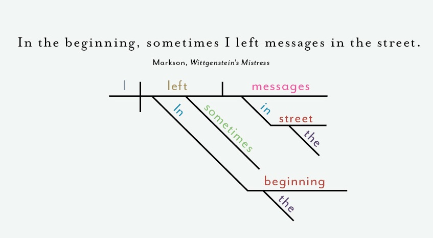
Cropped from image below You know you’re a huge nerd when multiple people from various corners of your life all forward you the same link, and that link is a bunch of diagrammed sentences. This snazzy, minimalist new print from "renowned" infographic artists Pop Chart Lab satisfies the demands of everyone's favorite niche demographic (all those grammar-fiends/”classic-literature”-snobs/data-visualization-enthusiasts/fans-of-quality-design in your life) to a T. But before you place your order, let’s take a closer look at what this “Diagrammatical Dissertation” actually visualizes. SOPA and PIPA; Or, If It Weren't For The Internet, We Would Have No Idea What Was Going On
Submitted by Marjorie Foley on Sun, 2012-01-22 15:31
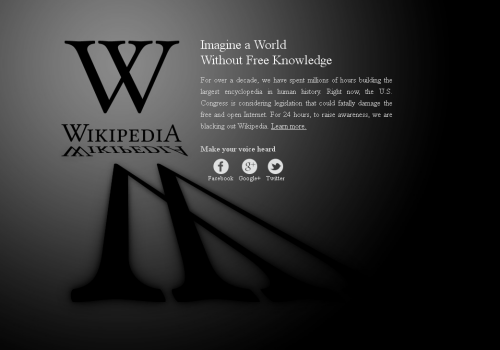
Image Credit: Wikipedia If you didn't see this image last week, you may have been hiding under a rock. Wikipedia reports that 162 million people viewed this image on January 18 as a result of their protest of the Stop Online Piracy Act and the Protect IP Act, which involved blocking all English-language content on the website. As a result of the blackout, 8 million people looked up their representatives in Congress, and a unknown number of people tweeted amusing and seeemingly illiterate things. (Mildly NSFW content in full post.) The Changing Face of Media Consumption
Submitted by Steven J LeMieux on Fri, 2011-09-23 09:00
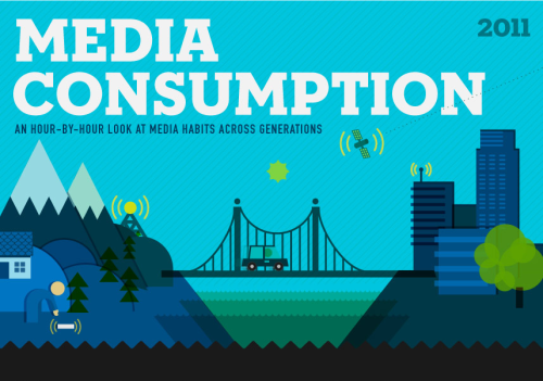
(Image Credit: Ad Age, MBA Online, Magid Generational Strategies) This cutesy inforgraphic from Ad Age and MBA Online presents the reader with a breakdown of media use by type, time and generation. The initial study was performed by Magid Generational Strategies. At first blush this seems to present a thorough overview of how different populations consume media, but on closer examination there are some signifigant issues. These issues aside, and in some cases because of these issues, this long image (I've broken it into several pieces for readability's sake. See the full image here) raises a number of questions about not which types of media we consume but how our methods of media consumption are changing to the degree that this infographic doesn't quite make sense. We're Watching You - Google Analytics and viz. Readership
Submitted by Cate Blouke on Thu, 2011-05-05 18:34
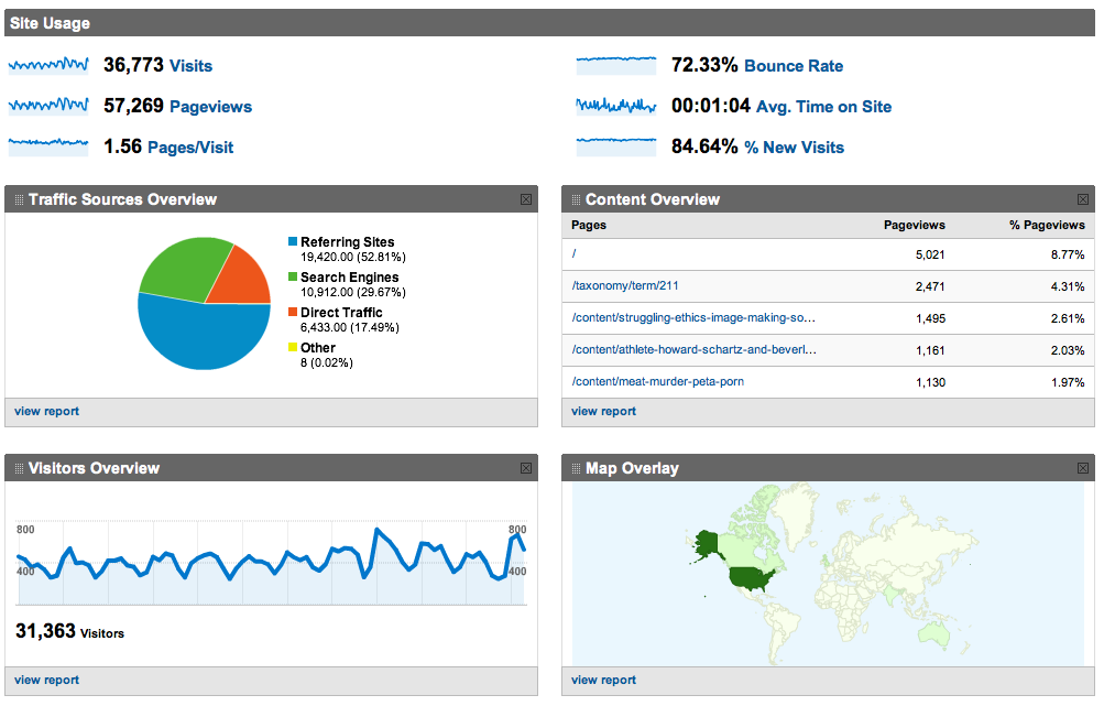
Screen Shot of Google Analytics dashboard view for viz. Earlier this semester, we here at viz. decided it might be nice to get a better sense of who we were talking to. As good rhetoricians, we felt it might be pertinent to know more about our audience. So we installed the handy-dandy (free) Google Analytics tool for tracking all sorts of information about our readership. The results have been surprising at times, reassuring on the whole, and ultimately quite useful for thinking about how better to serve you, our readers. The following is a discussion of both Google Analytics itself and the trends we've noticed on our site over the past few months. Visualizing the Economy and the Rhetoric of Infographics
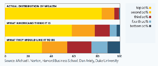
Submitted by Michael Widner on Tue, 2011-04-12 07:30
via Mother Jones, "It's the Inequality, Stupid" Infographics can provide visual drama and emotional impact to otherwise incomprehensible and dry numbers. As Ladysquire's recent post on The 12 States of America demonstrates, they can be particularly good at capturing income inequality. The image from Mother Jones above is another nice example of the striking disparity among Americans' perception of wealth distribution, what they wish it were, and what it actually is. Infographics and Image Creation
Submitted by catherine_c on Wed, 2010-10-20 07:59
Image Credit: Screen capture of Colors of the Web infographic from Colour Lovers by way of Cool Infographics Lately we've been discussing image production in our viz meetings including slide shows using Sound Slides, Animoto, and other ways of encouraging students to create images while getting beyond the basic slideshow. One of my pet projects for this semester was to learn more about creating infographics and to determine whether it would be reasonable to ask students to create a basic one-layer infographic (no statistics, just visual relationships) of an essay for an English or Rhetoric class. After the jump, I'll give a brief overview of my findings so far.
|
|
.png)
Recent comments
2 years 29 weeks ago
2 years 44 weeks ago
2 years 44 weeks ago
2 years 50 weeks ago
3 years 4 weeks ago
3 years 4 weeks ago
3 years 4 weeks ago
3 years 6 weeks ago
3 years 6 weeks ago
3 years 6 weeks ago