viz.
Visual Rhetoric - Visual Culture - Pedagogy
Site informationRecent Blog Posts
|
Infographics and Image Creation
Submitted by catherine_c on Wed, 2010-10-20 07:59
Image Credit: Screen capture of Colors of the Web infographic from Colour Lovers by way of Cool Infographics Lately we've been discussing image production in our viz meetings including slide shows using Sound Slides, Animoto, and other ways of encouraging students to create images while getting beyond the basic slideshow. One of my pet projects for this semester was to learn more about creating infographics and to determine whether it would be reasonable to ask students to create a basic one-layer infographic (no statistics, just visual relationships) of an essay for an English or Rhetoric class. After the jump, I'll give a brief overview of my findings so far.
I started off working with a guide to infographic generation by Sneh from Spyre Studios that explains the basic anatomy of an infographic, giving a basic idea of the visual and conceptual structure of infographics. The breakdown of infographics into visuals, content, and knowledge is particularly useful, as is the distinction drawn between one-level deep and two-level deep infographics - the former being simple and mainly driven by visuals and the latter being more advanced with thematic aspects and color coding. This tutorial would be suitable for students, perhaps even more suitable than a tutorial I later found helpful for issues with design. This guide covers the entire process from sketching and research to the difference between theme and reference graphics. Their approach makes it easier to wrap your head around the basics of what an infographic is on a more detailed level than a pretty or polished image relating data. After reading this guide, I tried to make an infographic. The results...were not pretty. I wrestled with creating the image using Photoshop and, by the end of designing the most basic of infographics, concluded that it was not so feasible for students.
Image Credit: From Spyre Studio's Anatomy of an Infographic
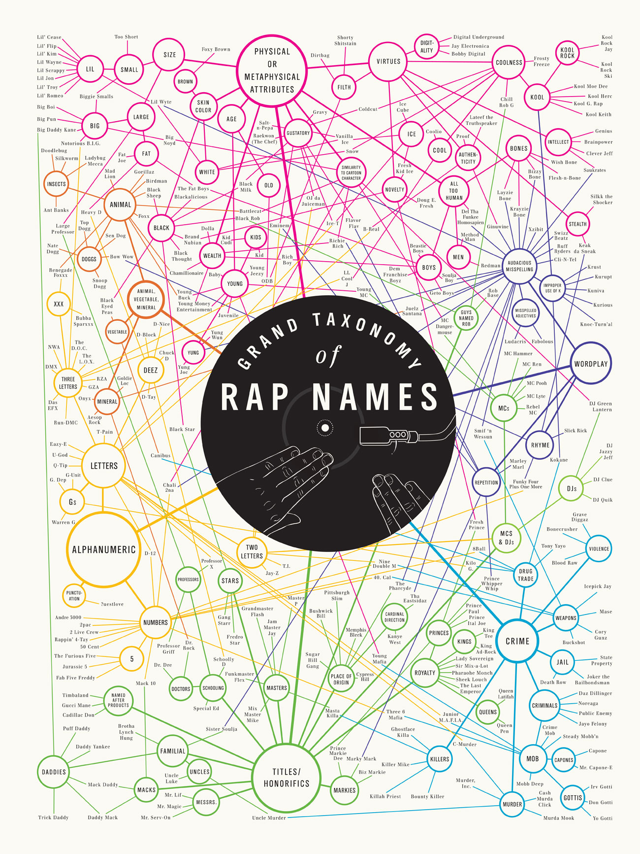
My next discovery came in the form of an outstanding step by step tutorial on creating infographics in Adobe Illustrator from Vector Tutorials. Jonathan Patterson has created a step by step guide (rated intermediate) to creating a sophisticated infographic in 3 hours using Adobe CS4. His step by step guide answers a lot of questions I had about design and formatting and shows that Illustrator is clearly a better choice for creating a complex visual document like an infographic. From creating a grid to filling in text and creating clip art images, Jonathan's guide is informative and yet simple enough for a student or infographics noob like myself to follow along. I haven't had a chance to sit down with Illustrator yet, but I hope to shortly. In closing, I would like to take a moment to discuss why infographics might be a great option for use in the classroom. Encouraging students to reconceptualize their ideas according to a visual rather than a textual schematic will cause them to approach and address their ideas in new ways. Like mind mapping, infographic creation requires students to come up with a visual schematic to organize their argument or information, but it goes beyond even the sophisticated media embedding achievable with Nova Mind in giving them ultimate freedom. At the same time, the assignment can be as bounded as instructors need or would like. My original draft of the assignment required students to use different colors to indicate their argument and formal, cultural, and historical approaches which form the basis of my sophomore level English course and required that they incorporate a set number of images. The possibilities are even more unlimited for rhetoric classrooms as the "Colors of the Web" and the following "Grand Taxonomy of Rap Names" from World Famous Design Junkies suggest:
Image Credit: World Famous Design Junkies
My primary concerns remain the amount of time required to teach students and whether or not, within that amount of time, they will be able to create a visual work in which they can take pride. Spending several hours on a rather basic and boring infographic in Photoshop has made me all the more concerned with the learning curve and quality of results. At the same time, the one to two class periods that it would take for students to follow along with Jonathan Patterson's tutorial could be made up by having abbreviated presentations or web presentations. Translating infographics, which are generally used to make statistics or data sets more inviting or for marketing purposes, to the writing classroom presents a number of challenges, but also a wide range of possibilities. |
|
.png)
.png)
Recent comments
2 years 29 weeks ago
2 years 44 weeks ago
2 years 44 weeks ago
2 years 50 weeks ago
3 years 4 weeks ago
3 years 4 weeks ago
3 years 4 weeks ago
3 years 6 weeks ago
3 years 6 weeks ago
3 years 6 weeks ago