viz.
Visual Rhetoric - Visual Culture - Pedagogy
Site informationRecent Blog Posts
|
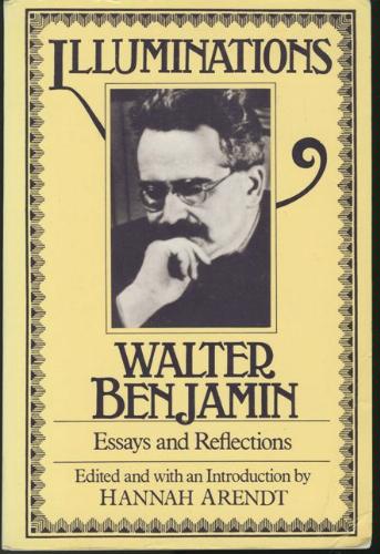
politicsWalter Benjamin on photography and film
To wrap up our semester on viz., our staff showcases new static content we've added to our "teaching" and "visual theory" sections. Below is my discussion of Walter Benjamin's canonical essay on photography, film, and the politics of mass media, "The Work of Art in the Age of Mechanical Reproduction." Each day this week, we'll feature a new piece of static content on our blog. We hope instructors, students, and persons interested in visual rhetoric will browse our archives (linked in the top bar) and find useful material for research, pedagogy, and all forms of intellectual inquiry. Benjamin, Walter. "The Work of Art in the Age of Mechanical Reproduction." Trans. Harry Zohn. Illuminations. 1955. Ed. Hannah Arendt. Reprint ed. New York: Schocken Books, 1986. 217–52. By Laura Thain In this seminal essay, originally published in French in 1936, Benjamin outlines shifts in the way art produces meaning after the advent of the photograph. His essay takes places in fifteen parts, which explore how film is physically produced, how that production influences the way that audiences interact with film, and how those audiences reconcile film with their pre-existing value structures and beliefs. Benjamin ultimately suggests a method of reading photography and film that accounts for both their material production and how that material production supersedes or alters prior methods of criticism. Central to critical practice in the age of mechanical reproduction is the establishment of critical distance between audience and media form, so that the audience can resist pure enjoyment and instead ask how photography and film can help us see differently, even as they attempts to perfectly replicate the way we already perceive the world. Writing from Paris, Benjamin, a Jewish German expatriate disturbed by the rise of Hitler and the Third Reich, explores the political implications of new, mechanized art forms in a rapidly-changing 20th century.
What's Haunting Dove's Real Beauty Campaign?
Submitted by clsloan on Mon, 2014-04-21 08:57
Image Credit: People's Lab Every image is haunted by the excluded. Every social movement is haunted by flaws. After reading Avery F. Gordon's Ghostly Matters: Haunting and the Sociological Imagination and Nivedita Menon's Recovering Subversion: Feminist Politics Beyond the Law, I became a bit haunted by the possibility of subversion. These two texts tell us that ghosts, in various forms, are absolutely everywhere, and after ruminating on their content and methodologies, I started to see ghosts, too. State-Craft or The Art of Leadership in George W. Bush's Paintings
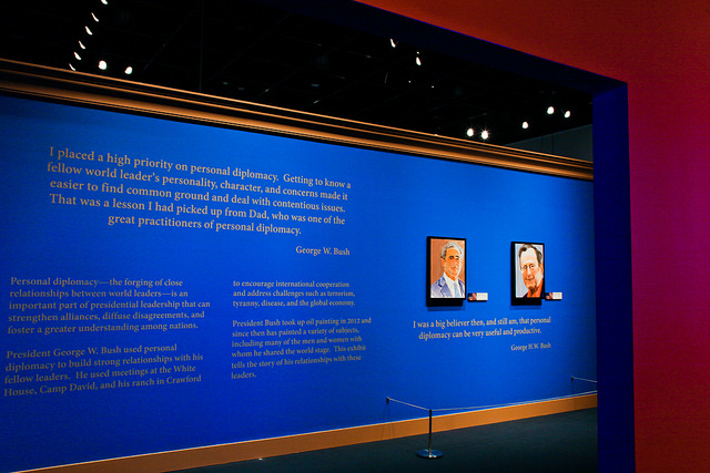
Submitted by Rachel Schneider on Sun, 2014-04-06 23:17
Image Credit: Kim Leeson / George W. Bush Presidential Center Last year, an adventurous hacker found and leaked pictures of paintings made by former President George W. Bush, including two revealing self-portraits from the shower. Now, the private hobby has been made public by President Bush himself. The George W. Bush Presidential Library, up the road in Dallas, has just opened an exhibit, The Art of Leadership: A President's Personal Diplomacy, which features portraits Bush painted of the world leaders he once encountered as President, paired alongside mementos from his travels and his musings about statecraft. However, what makes these paintings remarkable for viewers? Texans Getting Campy
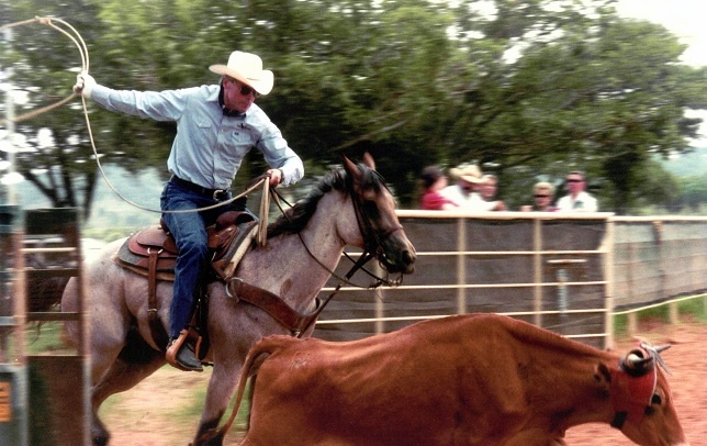
Submitted by Laura Thain on Wed, 2014-01-15 14:33
Image Credit: daviddewhurst.com Hey y'all, in case you haven't heard, we're electing a new Lt. Governor this year here in the great state of Texas. With four Texas Republicans competing for the position, a campaign is taking shape to see who can be the cowboy-iest candidate of 2014. With a fight like that, you might expect to see some campaign ads that border on self-parody. And what, my friends, do you get when sincerity fails? Well, of course, a whole lot of camp!
Commercial and Cooperative Subjectivities: Does an Independent Lens See Differently?
Submitted by Laura Thain on Mon, 2013-10-21 10:09
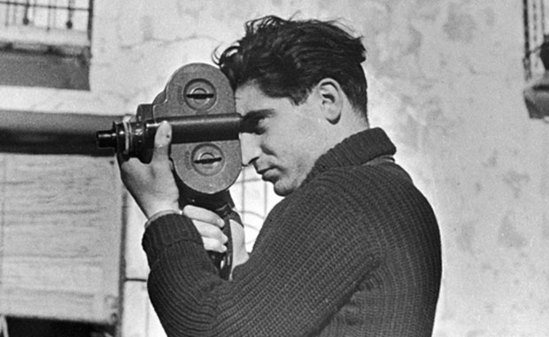
Image Credit: Hudson Valley Almanac "If your pictures aren't good enough, you're not close enough."--Robert Capa, founding member of Magnum. d. 1954, landmine accident Currently on exhibition at the Harry Ransom Center is a carefully curated selection of Magnum photos, drawing from the organization’s archive housed at the Center. Magnum, an elite professional photographic cooperative, brings together some of the world’s premiere photographers in a collaboration resistant to the commercial demands of photojournalism. This week on viz., we’ll feature the exhibit and explore issues central to visual argumentation and mass media. This post will explore what possibilities arise when photographers become their own producers and distributors—what influence do the conditions of production have on the genre of photojournalism itself? What is graffiti and who does it belong to?
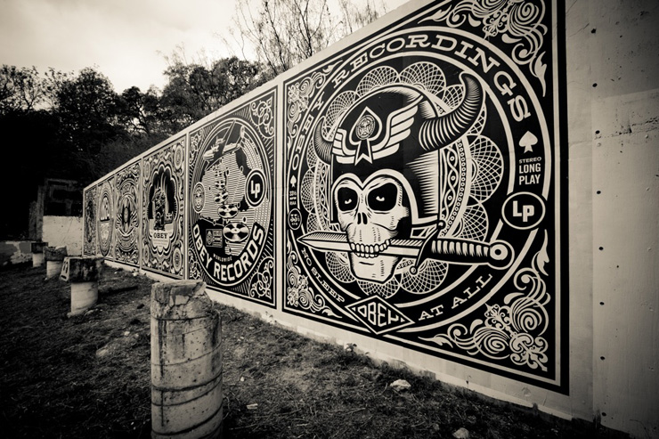
Submitted by Laura Thain on Mon, 2013-09-16 15:00
Image Credit: Geoff Hargadon This week on viz. we'll be exploring graffiti culture in Austin and beyond, beginning with an interactive graffiti map that we'll use to begin archiving graffiti in and around the community in which we live. Please visit and contribute! In this post, I'd like to introduce some issues central to reading graffiti as both a performative and political act. I take as my primary examples the HOPE Outdoor Gallery on 11th St. and Baylor in Austin's Clarksville neighborhood and graffiti from inside a now-demolished bicycle shop that once operated in West Campus. Using these examples, I'd like to explore definitions of graffiti and raise questions of property and ownership in public spaces. Join our interactive mapping project and follow our posts this week as we take a closer look at Austin graffiti.
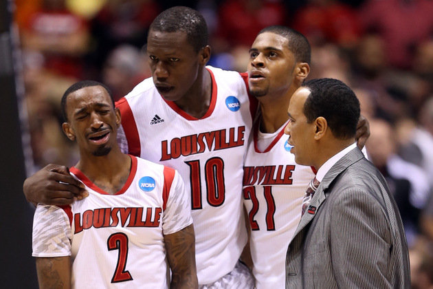
Violent Encounters
Submitted by Laura Thain on Fri, 2013-04-19 17:39
Louisville Cardinal players react to Kevin Ware's leg injury during March Madness. Image Credit: Yahoo Sports I’ll admit, I stayed up way past my bedtime last night listening to the Boston police scanner, following as closely as I could the developments in the Boston Marathon bombing. In the wee hours of this morning, I thought about documenting the dozens of news items (as well as widespread speculation across message boards and social media) to take a tally of how much of the information proliferating in the uncertainty of Friday morning would be disproved by Friday afternoon. As I began the project, it soon proved futile—there was far too much information and I ran into (as I might have anticipated) problems discerning journalistic fact from fiction right from the get go. It was only when I stopped documenting and trying to quantify the evidence that I began to think about the relationship between violence and speculative practice and assemble a quite different archive. [GORE WARNING: the images beyond this cut are NSFW and may shock and disturb some viewers. Discretion is advised.]
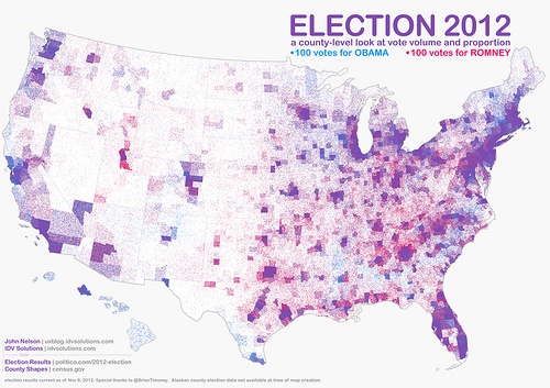
How USA Really Voted on November 6
Submitted by Chris Ortiz y P... on Sat, 2012-11-17 10:10
Image Credit: IDV Solutions What a wonderful map! This IS the popular vote on November 6, 2012. John Nelson gave us this map, and we thank him for it. It's called a "pointillist map:" one blue dot for every 100 votes for President Obama, randomly distributed in the county in which the votes were cast. One red dot for every 100 votes for Mr. Romney. You've heard of purple states? Well here's our purple country. Click the link on the image credit to find a large and hi-def version of this map. Then meet me back here, won't you?
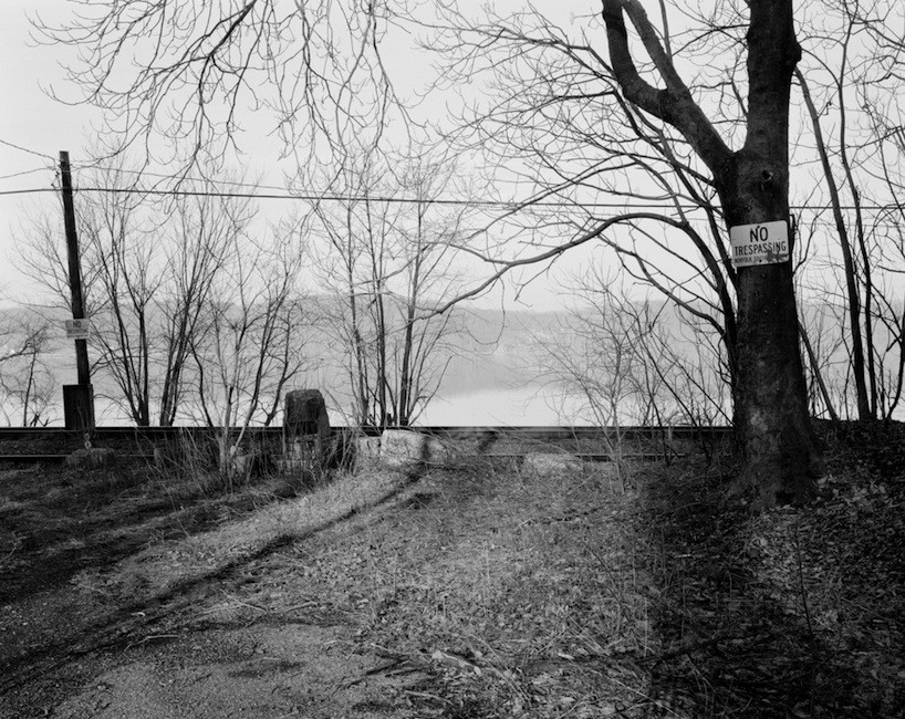
The Secret History of Lines
Submitted by Laura Thain on Mon, 2012-11-05 13:53
Image Credit: Colin Stearns With 24 hours to go, media outlets projecting the outcome of election day are covered in geographical maps of states and counties painted starkly in red and blue. I’ve enjoyed the responses of armchair intellectuals like Randall Munroe, who playfully reinterprets the red/blue divide to create a complex and comprehensive visual history of the Republican and Democratic parties. The proliferation of regional and ideological divides across multiple media this week urged me to explore two important questions in visual rhetoric: What does it mean to visualize a geographical boundary? And what does it mean to visualize an invisible line? (I would be remiss not to mention the enormous amount of border studies that exist in postcolonial and Anglophone literature and criticism—but today on viz I will try to confine myself to a discussion of the visualization of intranational borders.) Here to help me is the photography of Colin Stearns, Assistant Professor of Photography at Parsons. Stearns' current project is photographing the Mason-Dixon line in order to capture "this border of cultural distinction at the places of its occurence." Each of his photographs contain the invisible interstate line somewhere within their composition. I'll also put Stearns in dialogue with William Byrd II, the 18th century commissioner of the colonial line between North Carolina and Virginia.
Secret Ballot, Public Voting: The Subtle and Not-So-Subtle Persuasion of the "I Voted" Sticker
Submitted by Todd Battistelli on Sun, 2012-11-04 11:37
Image Credit: Kevin Lau The image above of feline Lefty sporting an "I Voted" sticker is not, as some activists might worry, evidence of voter fraud. Rest assured, cats and other domestic animals are not posing as voters. Lefty's message is much less nefarious if vehement: "YES, I am talking to YOU! GO VOTE TODAY!" I already wore my "I Voted Early" sticker last week, thanks to the early voting available in Travis County, Texas. And I look forward to seeing fellow citizens from across the nation sporting "I Voted" stickers tomorrow regardless of their choices inside the voting booth.
|
|


Recent comments
2 years 29 weeks ago
2 years 44 weeks ago
2 years 44 weeks ago
2 years 50 weeks ago
3 years 4 weeks ago
3 years 4 weeks ago
3 years 4 weeks ago
3 years 6 weeks ago
3 years 6 weeks ago
3 years 6 weeks ago