viz.
Visual Rhetoric - Visual Culture - Pedagogy
Site informationRecent Blog Posts
|
Reply to commentVisualizing the Economy and the Rhetoric of Infographics
Submitted by Michael Widner on Tue, 2011-04-12 07:30
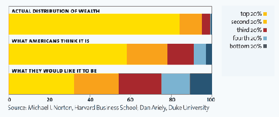
via Mother Jones, "It's the Inequality, Stupid" Infographics can provide visual drama and emotional impact to otherwise incomprehensible and dry numbers. As Ladysquire's recent post on The 12 States of America demonstrates, they can be particularly good at capturing income inequality. The image from Mother Jones above is another nice example of the striking disparity among Americans' perception of wealth distribution, what they wish it were, and what it actually is. Americans clearly desire an equitable distribution that, while allowing for the accumulation of great wealth, nevertheless lifts all boats. Yet the sad reality is not only different from what the population wants and believes it to be, but is also a difference not just of degree, but nearly of kind.
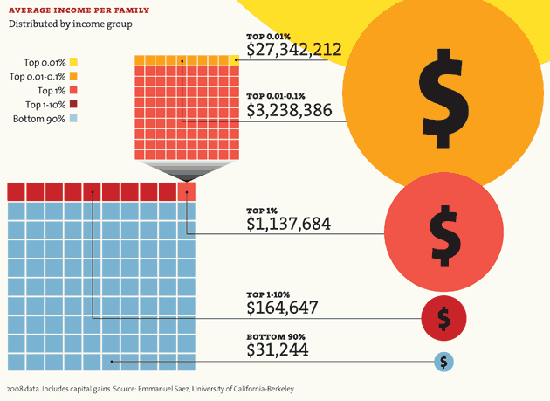
via Mother Jones, "It's the Inequality, Stupid" Another rhetorically useful element of such infographics is the multiple perspectives on similar data. The yellow circle of the top 0.01% income group barely fits on the page, itself a design choice intended to comment on disparity by imputing excess and greed to the wealthiest.
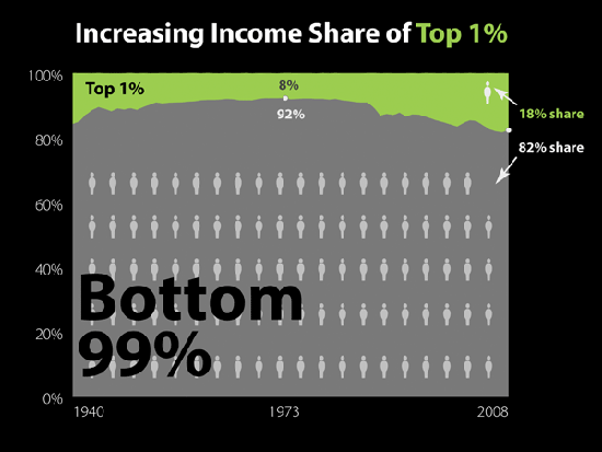
via Slate, "The Great Divergence in Pictures: A Visual Guide to Income Inequality" Slate's similarly focused visual guide represents each percentage of the population with a figure of a human, a choice that makes it all the more dramatic.
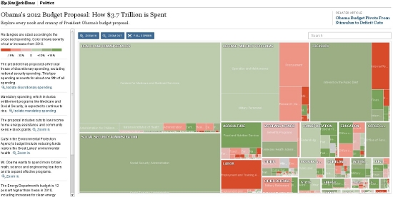
Screenshot of New York Times, "Obama's 2012 Budget Proposal" This interactive map (click through link above to interact) of President Obama's proposed 2012 budget makes it immediately clear that the potential cuts to the budget have pale in comparison to the overall costs and, even, increases in spending. Moreover, many of the cuts would disproportiately affect the most vulnerable. The polished simplicity of each of these and many related infographics serves multiple purposes. The data become not only more compelling, but also less likely to be questioned. While I don't doubt their accuracy, these infographics nevertheless leave little, if any, room for interpretation. Unlike a prose description of context and motivation, the images present bare facts and a single perspective. Although I happen to agree with the implicit arguments for more equitable income distribution these charts make, I also recognize that they make it nearly impossible to arrive at any conclusion other than the intended one of unjust inequality. ReplyYour contribution to the blog: Please Read Before PostingThe viz. blog is a forum for exploring the visual through identifying the connections between theory, rhetorical practice, popular culture, and the classroom. Keeping with this mission, comments on the blog should further discussion in the viz. community by extending (or critiquing) existing analysis, adding new analysis, providing interesting and relevant examples, or by making connections between that topic and theory, rhetoric, culture, or pedagogy. Trolling, spam, and any other messages not related to this purpose will be deleted immediately. Comments by anonymous users will be added to a moderation queue and examined for their relevance before publication. Authenticated users may post comments without moderation, but if those comments do not fit the above description they may be deleted. |
|
Recent comments
2 years 29 weeks ago
2 years 44 weeks ago
2 years 44 weeks ago
2 years 50 weeks ago
3 years 4 weeks ago
3 years 4 weeks ago
3 years 4 weeks ago
3 years 6 weeks ago
3 years 6 weeks ago
3 years 6 weeks ago