viz.
Visual Rhetoric - Visual Culture - Pedagogy
Site informationRecent Blog Posts
|
Center for American ProgressVisualizing the Economy and the Rhetoric of Infographics
Submitted by Michael Widner on Tue, 2011-04-12 07:30
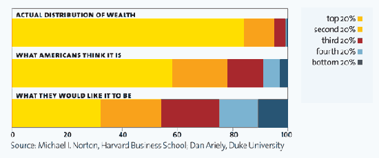
via Mother Jones, "It's the Inequality, Stupid" Infographics can provide visual drama and emotional impact to otherwise incomprehensible and dry numbers. As Ladysquire's recent post on The 12 States of America demonstrates, they can be particularly good at capturing income inequality. The image from Mother Jones above is another nice example of the striking disparity among Americans' perception of wealth distribution, what they wish it were, and what it actually is. |
|
Recent comments
2 years 29 weeks ago
2 years 44 weeks ago
2 years 44 weeks ago
2 years 50 weeks ago
3 years 4 weeks ago
3 years 4 weeks ago
3 years 4 weeks ago
3 years 6 weeks ago
3 years 6 weeks ago
3 years 6 weeks ago