viz.
Visual Rhetoric - Visual Culture - Pedagogy
Site informationRecent Blog Posts
|
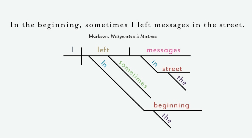
data visualizationMilitant (Feminist) Grammarians
Submitted by Jenn Shapland on Wed, 2014-03-05 15:49
Cropped from image below You know you’re a huge nerd when multiple people from various corners of your life all forward you the same link, and that link is a bunch of diagrammed sentences. This snazzy, minimalist new print from "renowned" infographic artists Pop Chart Lab satisfies the demands of everyone's favorite niche demographic (all those grammar-fiends/”classic-literature”-snobs/data-visualization-enthusiasts/fans-of-quality-design in your life) to a T. But before you place your order, let’s take a closer look at what this “Diagrammatical Dissertation” actually visualizes. A Workshop from a Visionary about Data Visualization
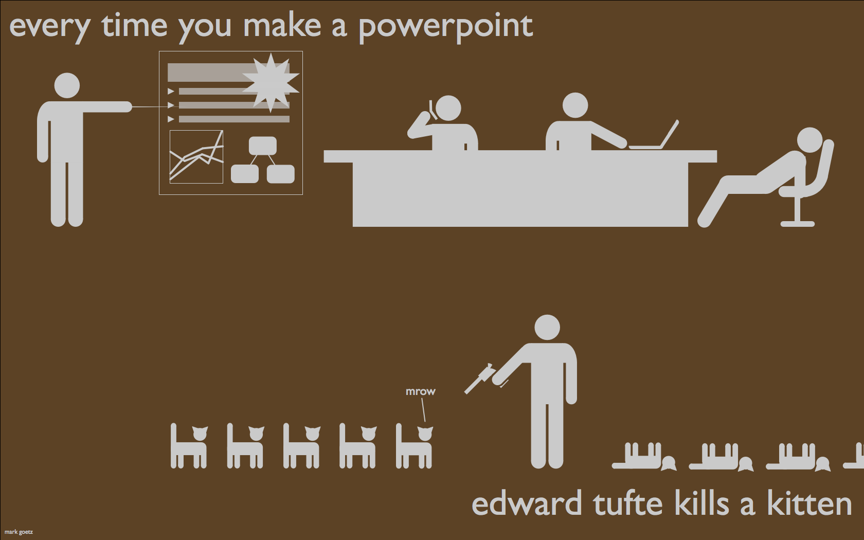
Submitted by james.wiedner on Thu, 2013-05-02 13:51
Source: Mark Andrew Goetz About 2 months ago Austin was lucky enough to be among the handful of cities selected as a stop on a one-day presentation and workshop featuring Mr. Edward Tufte. What's more: The DWRL agreed that covering the cost of admission for a few of their staffers to be money well spent (thanks, Will Burdette). For the uninitiated, Mr. Tufte is the granddaddy of all things related to visual representations of large amounts of data, complicated concepts, historical trends, and- quite literally- just about anything else you could think of. Hailed as “The Leonardo Di Vinci of Data," by the New York Times. Tufte was synthesizing massive amounts of information into beautiful visuals before the term “big data” had even pushed “the cloud” out of the way as the buzzword(s) of the moment.
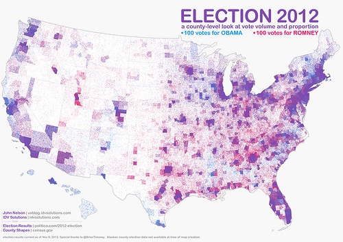
How USA Really Voted on November 6
Submitted by Chris Ortiz y P... on Sat, 2012-11-17 10:10
Image Credit: IDV Solutions What a wonderful map! This IS the popular vote on November 6, 2012. John Nelson gave us this map, and we thank him for it. It's called a "pointillist map:" one blue dot for every 100 votes for President Obama, randomly distributed in the county in which the votes were cast. One red dot for every 100 votes for Mr. Romney. You've heard of purple states? Well here's our purple country. Click the link on the image credit to find a large and hi-def version of this map. Then meet me back here, won't you?
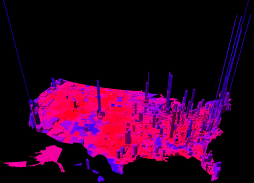
Colorful Geographies of Beliefs
Submitted by Calliope on Fri, 2012-11-16 14:31
Image Credit: MIT Technology Review This electoral map, created by Princeton mathematician Robert J. Vanderbei, uses a spectrum of colors between blue and red to represent the ratio per county of Democrat to Republican votes. The height of the verticals indicate the number of votes in each county. Vanderbei's representation of the U.S. votes by region accounts for nuances in the data that other red-and-blue-state maps miss: the political dividedness of certain counties, the intensity of partisanship in others, and centers of strong voter turn out. From a visual standpoint, the map is eye-catching because it is purple. Purple is not a color usually associated with political belief. But other data crunchers, looking to complicate our picture of national voting trends, have unveiled maps this year with a similar palette. See my fellow viz. contributer Chris Ortiz y Prentice's post for an electoral map that also reveals (through pointillism instead of 3-dimensional modelling) the nation's purplish complexion. It might be mere coincidence that Chris and I both decided to write about visualizing ideological regionalism; but it's possible that our posts register an increasing need to redraw and redefine assumptions about voter demographics. That said, I'll leave the actual work of redefinition up to political analysts and turn to the far more obscure aims of this entry: to discuss the rhetorical role of color in images that chart belief systems and controversial policies.
|
|
Recent comments
2 years 29 weeks ago
2 years 44 weeks ago
2 years 44 weeks ago
2 years 50 weeks ago
3 years 4 weeks ago
3 years 4 weeks ago
3 years 4 weeks ago
3 years 6 weeks ago
3 years 6 weeks ago
3 years 6 weeks ago