viz.
Visual Rhetoric - Visual Culture - Pedagogy
Site informationRecent Blog Posts
|
artScience Art: Notorious
Submitted by emcg on Sun, 2009-10-25 20:10
Image Credit: Luke Jerram H/T to io9 With the swine-flu pandemic ramped up to a national emergency on Friday, it seems a fitting moment to discuss Luke Jerram’s virology art, which includes the stunning depiction of H1N1 above. Mesmerizingly beautiful and painstakingly researched, Jerram’s sculptures of notoriously deadly microbes also function as wry commentary: they target both the sensationalism of popular medical reportage as well as the claims to objectivity that underlie scientific visualizations. Tags:
Darwin in (Endless) Circulation
Submitted by emcg on Wed, 2009-10-14 13:54
Anticipating 2009 as the Year of Darwin,* Olivia Judson offered this suggestion last year: let’s get rid of Darwinism. She criticizes the Darwin-centric focus of both specialist and popular discourse as “grossly misleading. It suggests that Darwin was the beginning and the end, the alpha and omega, of evolutionary biology.” Judson’s complaint, of course, is nothing new: as a peeved St. John Mivart notes in Man and Apes (1873), “Again, the doctrine of evolution as applied to organic life…is widely spoken of by the term ‘Darwinism.’ Yet this doctrine is far older than Mr. Darwin…”
Image Credit: Cartooning Darwin H/T: Seed Daily Zeitgeist While preparing to teach this week, I came across a couple of intriguing resources that help to explain how the figure of Charles Darwin entered circulation as a scientific celebrity, an icon of sorts, beginning in the late 19th century. They suggest the active role of popular visual culture in the intertwining of Darwin with evolution, even as the meanings of that term remained multiple, fragmentary, diffuse. Chuck Close: Daguerreotypes and (Re)production
Submitted by noelradley on Tue, 2009-10-13 11:19
Image Credit: Chuck Close I recently went to the Chuck Close exhibit at the Austin Museum of Art, which gave me a lot to think about. Close is known for the scale of his portraits (think: 9-by-7 foot painting of a face). He is also known for paintings that make you think you are seeing a photo. As Donald and Christine McQuade explain in Seeing and Writing 3, his style is "photorealism or super-realism, which attempts to recreate in paint the aesthetic and representational experience of photography." In the recent exhibit at the Austin Museum of Art, Close's scale is not quite so collosal; there are several 8-by-6 foot tapestries, but most of the images are more like 2-by-1 feet (the digital pigment print pictured above), or even 15 very small images, which are 11-by-9 inches. There are no paintings. Science Art, Part One
Submitted by emcg on Thu, 2009-10-01 11:22
Image credit: The IFF by Alyssa Gorelick. H/T to io9 Noel’s last post, in which she calls for “incisive, creative visualizations of ecological crisis," got me thinking about two recent, ongoing art projects that engage with the challenge of visualizing Eco-Perils: namely, the loss of biodiversity and the dying coral reefs. Ultimately, they suggest that our failure of vision, our inability to see ecological danger, is intimately linked with a failure of scientific understanding. White (art)House
Submitted by timturner on Tue, 2009-06-23 16:07
Image credit: National Gallery of Art, Washington D.C., via the WSJ News that the Obamas have been updating the art displayed in the White House has prompted stories in both old and new media outlets (click through to see a list of sources). Eschewing the more traditional nineteenth-century landscape and portraiture usually typical of White House decor, the Obamas have chosen to highlight colorful, abstract, contemporary works by American artists of diverse backgrounds. (As the original WSJ article on this subject notes, the permanent White House art collection includes over 450 works but only five by African-Americans.) These works include the Ed Rushca painting "I Think I'll" from 1983 (from the permanent collection of the National Gallery of Art). Tags:
Digitial Immersion
Submitted by timturner on Mon, 2009-06-22 14:19
Image credit: Peter Greenaway, in the NYT Students of art, art history, and digital media environments will not want to miss this NYT review of an art installation by Peter Greenaway for the Venice Biennale. Greenaway's project centers around--recreates? or remixes?--Veronese's 1562 painting "The Wedding at Cana" (reproduced after the jump). Using a variety of new media techniques, Greenaway re-presents the image, and his interpretation of it, to his audience. The reviewer concludes with an argument about the best possibilities of new media technology to enhance perception: To a certain extent all the digital manipulation works its own temporary miracles. Even the inane conversation begins to resemble things that might have floated through Veronese's mind as he determined his figures' attire, body language and facial expression. And instead of the usual art-history-lecture spoon-feeding of information, you have the illusion of seeing and thinking for yourself with heightened powers. The next stop should be the Louvre and the real thing. If any of viz.'s readers are lucky enough to see it for themselves, we'd love to hear your thoughts. Hat tip to new media, and a colleague: first spotted at John Jones's Twitter feed Tags:
Shakespeare Portrait Unveiled
Submitted by timturner on Mon, 2009-03-09 12:48
There is a lot of noise in the press today about the unveiling of a portrait that is now believed to be of William Shakespeare (see here, here, here, here, or here). The painting is believed to be the original source for the only two surviving likenesses of Shakespeare from his era, both of which were produced in the decade after his death. This painting, inherited by the descendants of the playwright's patron, is believed to have been painted in Shakespeare's lifetime. There is no definitive proof to show that the painting is unquestionably of Shakespeare. The evidence includes its association with the family of Shakespeare's patron, its supposed resemblance to existing portraits, and the results of "scientific testing" and the nebulous testimony of "experts" who are quoted as being "90% certain" that this is a portrait of Shakespeare. The articles also rely heavily on the ethos of Stanley Wells, noted Shakespearean scholar and chair of the Shakespeare Birthplace Trust. (But as one of the commentators on the NYT blog entry notes, Wells is responsible for the inclusion of Edward III in the Oxford Shakespeare, a decision that has been met with considerable skepticism among Shakespeare scholars.) I wouldn't exactly say that I'm skeptical of the claim that this is a portrait of Shakespeare. But I am interested in the extent to which the reception of the portrait is shaped by everyone's apparent desire for this to be a portrait of Shakespeare. In the absence of definitive proof either way, everyone seems to have decided that it's simply more exciting to assume that it is than to be circumspect about whether it could be. Further, it's interesting to consider how the particular details of this story brings to life many of the fantasies of Shakespeare biography and criticism. The longstanding desire to discover Shakespeare's "lost" works--an event that would establish the critic as a celebrity of some standing among Shakespeareans--is often imagined as peeling an old playtext off the back of an abandoned painting in a dusty antique shop. In this case, life imitates art (or fantasy). UPDATE: Today there is a wonderful little item on the painting in the NYT, with the following question: We somehow want the young Shakespeare to look like Joseph Fiennes, fiery and slashing. But what if he looked like Ricky Gervais? Would the plays mean less to us? Irish comics wiki
Submitted by John Jones on Wed, 2008-07-02 09:18
I’m not very familiar with the Irish comics scene, but the site links to some great-looking comics. The panel to the right comes from The Ulster Cycle, a web comic based on Irish mythology by Patrick Brown (who also appears to be the creator of the wiki). Tags:
Revenge of the attention economists?
Submitted by John Jones on Sat, 2008-06-21 19:00
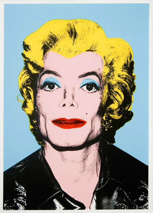
J O’Shea at SuperTouch has posted a review of an art show by Mr. Brainwash (AKA Theirry Guetta). According to O’Shea, Brainwash is a hack, ripping off the style of pop artists like Warhol and street artists like Banksy and Shepard Fairey.
The antics of Mr. Brainwash, and the reaction of O’Shea to them, made me think of Richard Lanham’s at times scathing review of pop art in The Economics of Attention. It is interesting to note that artists like Duchamp and Warhol, who Lanham calls “attention artists” or “attention economists,” were pranksters who may have really liked the joke that O’Shea so deplores: somebody sees how much money and prestige comes from making pop art, declares himself a pop artist, and starts to receive money and prestige through the wholesale copying of other artists’ methods and works. Mr. Brainwash is merely manipulating what Lanham calls the “Interpretive Bureaucracy of Attention Economists,” the establishment of art critics and promoters who can be trusted to find importance and meaning where there is none. I would be interested in hearing from other readers of Lanham’s book to see how they think Mr. Brainwash’s work fits into the author’s description of the Attention Economy. via Right Some Good |
|

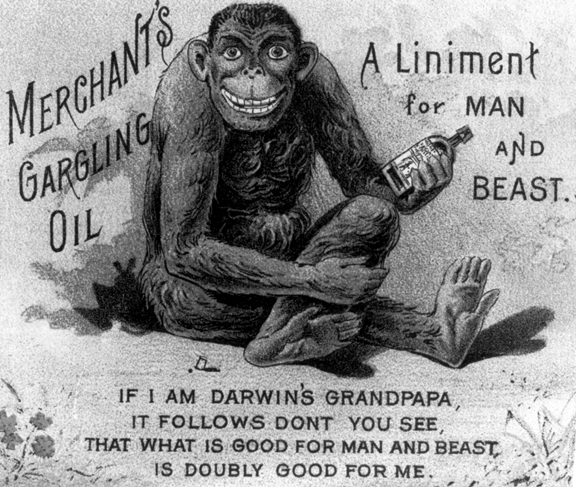
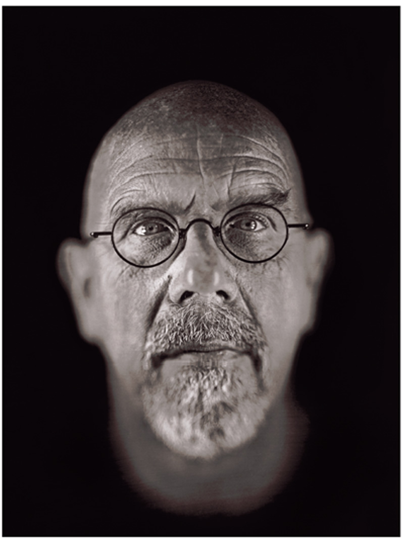
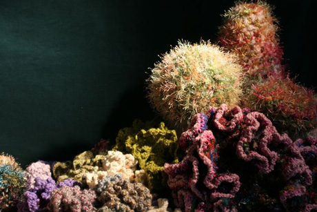
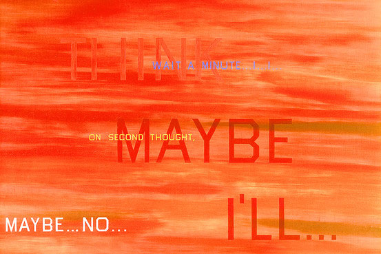
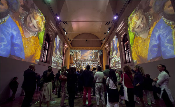
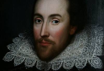 Image credit: AP Photo/Lefteris Pitarakis
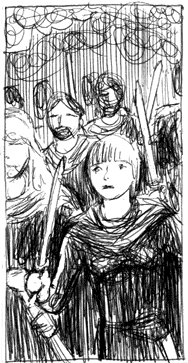
 After following pioneering street art legends like Banksy and Shepard Fairey around, camera in hand, shooting hundreds of hours of footage, however, the lure of cheap & easy fame began to eat away at [Guetta]. The desire to mint an original style proved more elusive. It all began several years ago with a series of uninspiring wheatpaste posters in the style of nearly every stencil artist that came before him depicting Guetta, with trademark facial hair and fedora, holding a camera, fused to the walls of Hollywood’s most heavily trafficked corridors. Further inspired by the success of Banksy’s self-produced “Barely Legal” solo show in 2006 (and with the encouragement of Sir Banks himself—possibly his biggest art prank on us all to date?), and having established sufficient ”street cred,“ Guetta began to plot his own ascent. The result is the exhibition in question, titled “
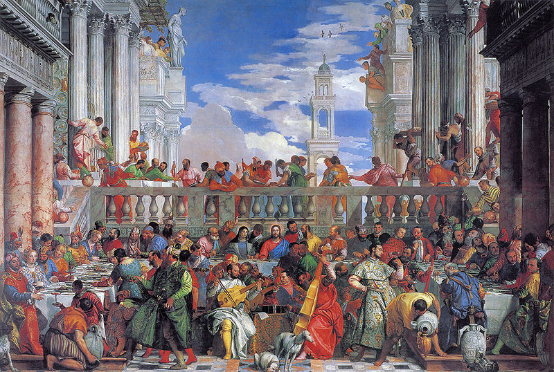
Recent comments
2 years 29 weeks ago
2 years 44 weeks ago
2 years 44 weeks ago
2 years 50 weeks ago
3 years 4 weeks ago
3 years 4 weeks ago
3 years 4 weeks ago
3 years 6 weeks ago
3 years 6 weeks ago
3 years 6 weeks ago