Site informationRecent Blog Posts
Blog Roll
|
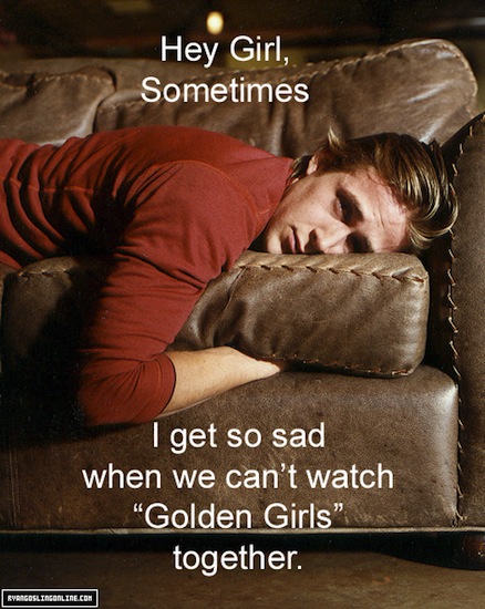
rhetorical analysisHey Girl, I Made This Meme For You
Submitted by Rachel Schneider on Thu, 2012-02-23 09:00
Image Credit: F--- Yeah Ryan Gosling Some recent procrastinating led me to Jezebel and thus Joey Thompson’s recent YouTube video, in which he teaches men how to look like actor Ryan Gosling. I was intrigued because I have been following the proliferating Ryan Gosling memes for a while—which have gone on long enough that they’ve been accused of jumping the shark. Still, I’d like to take some time to think a little bit about what their newest evolutions might tell us about memes, form, and feminine desire. Victory Gardens and Retro Propaganda
Submitted by fc on Fri, 2010-04-09 12:16
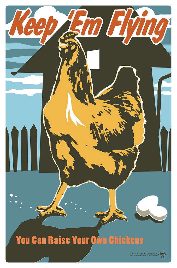
Image Credit: Joe Wirtheim In the interest of full disclosure, I must confess that I have always had a soft spot for "victory gardens" and mid-century propaganda. It may be a result of the countless times I watched Bugs Bunny steal carrots from the Saturday-morning victory gardens of my childhood (how many of us were introduced to serious political concepts like shortage, rationing and military conscription through the Flatbush intonation of Mel Blanc?). It may have been the vintage singns and posters ("Loose Lips Might Sink Ships") hanging on the wallls of the local burger joint that was a favorite haunt of my grandfather. Whatever the reason, my eye is always drawn to the bold fonts, severe angles and jingoistic slogans of WWII era posters, particularly those aimed at action on the home front. This week, while trolling for vintage design and espirit d'corps, I came across "The Victory Garden of Tommorrow," Joe Wirtheim's modern day art/propaganda campaign that repurposes and reinvents the genre. More on Wirtheim's project, refurbished propaganda and mobilizing the population after the break.
Delivery and Comparative Rhetorical Analysis
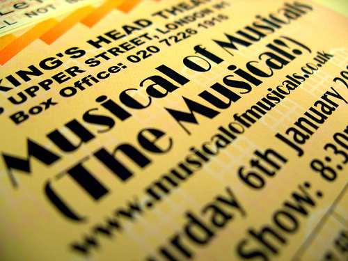
Image Credit: Phil Gyford For a handout, download the PDF document outlining this assignment. Notes for the Instructor: The design of this unit is to teach students to do analysis of visual media like musicals, which include song and dance as well as traditional scripts and visual elements, by focusing on the issues of rhetorical delivery (specifically, the performance of the actors within the stage/camera shot, and the visual elements associated with that performance). This unit was built to go after a more traditional unit that focused on analyzing the lyrical content of musicals’ songs, and to encourage students to tie lyric to delivery. The elements of the unit included as follows: Week 1: Introduce terminology of delivery, do comparative analysis of examples in class. Week 2: Watch two versions of a full-length musical and analyze them in class. Week 3: Write a short comparative rhetorical analysis (1-2 pages in length), bringing in new material to go with material already covered in class. Week 4: Write and workshop full-length (5-7 pages) paper.
Goals: The goals of this unit were to make students aware of visual forms of rhetoric and the delivery within performance contexts, as well as to make them consider how those gestures work to constitute meaning along with more traditional elements (like words and lyrics). This unit is also to help them expand their researching skills by learning how to research in multiple venues (electronic and non-electronic, performance reviews, books on composers and lyricists, etc). Images of the Statue of Liberty in science fiction
Submitted by John Jones on Mon, 2008-01-21 22:07
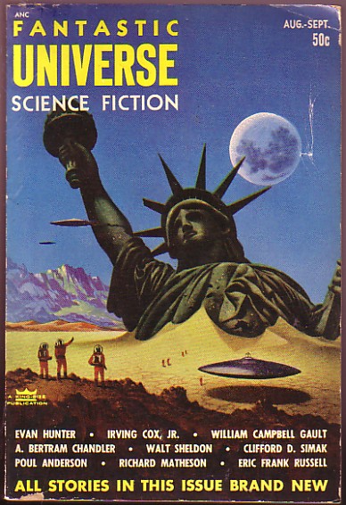
Gerry Canavan has posted a collection of images of the Statue of Liberty taken from science fiction stories and films.
Visual analysis of the Strait of Hormuz incident
Submitted by John Jones on Sat, 2008-01-12 12:40
Lucaites at No Caption Needed has posted an interesting analysis of the recent dustup between the U.S. and Iran in the Strait of Hormuz. According to Lucaites, the argument that the Bush administration has tried to make about the incident through the images—photos and video—released by the U.S., “relies upon two optics or visual logics, one drawing upon a Cold War consciousness and the other drawing upon the logic of the ‘suicide bomber.’ ” Analysis of political campaign posters
Submitted by John Jones on Sat, 2007-11-24 11:41
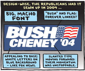
The New York Times has posted a slideshow by Ward Sutton, “Reading Tea Leaves and Campaign Logos,” analyzing the posters and bumper stickers of presidential candidates. Filet a fish, or: Why do people hate some advertisments?
Submitted by John Jones on Wed, 2007-08-08 11:58
I’m a big fan of Seth Stevenson’s advertising columns at Slate (he’s going on sabbatical and will be missed). On Monday he posted a new column, where he discusses readers’ submissions for the worst ads on TV. Like a therapist, Stevenson doesn’t so much agree with the contributors as he commiserates with the feelings of anger, betrayal, emptiness and loss directed at or prompted by these advertisements. One question that we can ask ourselves (and our students) is: Why do we care so much about ads? Take this McDonald’s ad for example:
Comparison and Rhetorical AnalysisNotes for the Instructor: This is a unit-long assignment, which asks the students to write first a short paper (300–500 words), in which they compare two images/objects/spaces and their respective messages, and then produce a long essay (4–5 pages), in which they incorporate the text they have already produced in the short paper, but make an argument about the rhetorical effectiveness of the two images/objects. In other words, in the short paper they discuss message alone; in the long paper they discuss both the message and its reception. The assignment involves doing extensive research into the respective culture/ideology, which produced the images/objects. Both the short and the long essay should contain a rhetorically crafted, comparative description of the images/objects, which should serve to set up the main argument, i.e., to make the reader more receptive to it. Here are two sample arguments (quoted with the students’ permission):
Assignment Description: Write a short comparison, which leads to the creation of a rhetorical analysis. Category: Individual Project. Goals: This assignment has several goals: a) to give the students the opportunity to realize that successful arguments about rhetorical effect can be quite complex and require much research, b) to give them a chance to revise and incorporate some of their own writing into longer pieces of text with different goals, c) to help them realize that no description or comparison is “neutral;” all descriptions/comparisons have a particular rhetorical goal and audience, and their language and selection of elements is important. Short EssayChoose two closely related images/objects, which are at least fifty years old and write a short essay (300–500 words), in which you make a comparative claim about their respective messages. In order to make a sustainable claim, you will need to research the historical and cultural context in which the images/objects first appeared. Before you begin, consider again the following questions:
Requirements:
Grading Criteria:
Long EssayBuilding on your short paper, write a long argumentative essay (4-5 pages), in which you make a comparative argument about the rhetorical effectiveness of two closely related images/objects. Your images/objects must be at least fifty years old. In order to make a sustainable claim, you will need to research the historical and cultural context in which the images/objects first appeared. You claim must involve the ideologies and messages of your images/objects as well as the reception of those messages. Before you begin, consider again the following questions:
Requirements:
Grading Criteria:
|
viz.
Visual Rhetoric - Visual Culture - Pedagogy
Site informationRecent Blog Posts
|
rhetorical analysis |
Recent comments
2 years 29 weeks ago
2 years 44 weeks ago
2 years 44 weeks ago
2 years 50 weeks ago
3 years 4 weeks ago
3 years 4 weeks ago
3 years 4 weeks ago
3 years 6 weeks ago
3 years 6 weeks ago
3 years 6 weeks ago