Recent Blog Posts

The University: instituting culture, institutional culture

UT tower with illuminated #1

This summer I taught a rhetoric course that focused on the idea of a University. The course used Cardinal Newman's nineteenth-century treatise as a jumping off point but also looking at other ways a university might define itself as an institution. One of the more interesting discussions in class was one in which we investigated the relationship between art and the university...

The University of Texas, our home institution and object of study, has an archive (describing itself as a "world-renowned cultural institution") that not only houses important pieces of visual, textual, and performing art but also has its own galleries to put these objects on display. The building itself was recently renovated, and the atriums converted into "galleries" themselves that display the Center's significant collections on etched glass windows:

Display on Display

This video does a great job explaining the economics of display at play in contemporary advertising. While visual communication research does a nice job reading visual content, sometimes we tend to overlook the basic necessity of surfaces of display that anchor visual communication in particular spaces. To that end, the video also might serve as a nice way to introduce questions of visuality that may be prior to an image’s content.

Analysis of political campaign posters

The New York Times has posted a slideshow by Ward Sutton, “Reading Tea Leaves and Campaign Logos,” analyzing the posters and bumper stickers of presidential candidates.

analysis of Bush/Cheney campaign bumper sticker

Rambo has a posse

I hope Shepherd Fairey is getting a check out of this:

Shepherd Fairey-style Rambo poster

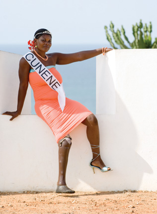
Miss Landmine Angola

Miss Landmine Angola is an art project by Morten Traavik designed to raise awareness for Angolan landmine survivors. Here’s the Miss Landmine Manifesto:

* Female pride and empowerment.
* Disabled pride and empowerment.
* Global and local landmine awareness and information.
* Challenge inferiority and/or guilt complexes that hinder creativity-historical, cultural, social, personal, African, European.
* Question established concepts of physical perfection.
* Challenge old and ingrown concepts of cultural cooperation.
* Celebrate true beauty.
* Replace the passive term ‘Victim’ with the active term ‘Survivor’

And have a good time for all involved while doing so!

The project is complicated, seeing as it is based on the controversial beauty-contest model, but it might serve as a useful classroom example for talking about the body and the ways it can be represented.

via: Boing Boing

Website documents lascivious Fox News content

Fox News Porn collects racy images and videos culled from Fox News and dresses them up on a pseudo-porn site with Girls-Gone-Wild-type disclaimers. (Be advised: the link above and parts of this post are probably not okay for work.)

Tags:

Animation backgrounds blog

Background from Snow White

If you are interested in animation art, you’ll probably enjoy Animation Backgrounds, a blog dedicated to the backgrounds from classic animated films and shorts.

via Boing Boing

Slippery Images

Edmonton Swastikas, 1916

Paul Lukas, who runs a weblog called Uni Watch (the obsessive study of athletics aesthetics), has an entry up on the swastika and uniforms from the early 1900s. This picture shows the Edmonton Swastikas from 1916. Lukas details the popularity of the swastika graphic prior to its ignominious use by the Nazi party. Lukas’ piece is interesting for a variety of reasons (including some nice images and a link to a “Canadian artist/mystic” devoted to rescuing the swastika from its association with the Nazis), but it got me thinking about the ease with which images become iconic (at times unintentionally or at cross purposes with an image’s original meaning) and the kinds of control this easy iconicity demands in visual practice.

Getting the Most Out of Your Graffiti (and the first bounty offered on our blog)

I've always thought that the best graffiti is on train cars. Maybe it's not always the best graphically, but I like the statement--not only has the tagger tagged, but the canvas is mobile and likely to get pulled all over the country, set forth into the world. It's bold. Not as bold as the graffiti on interstate signs where some kid crawled out on a metal pole over 80 mile-an-hour traffic, but bold nonetheless.

Train Car Graffiti

Women in Art (more rhetoric of the montage)

Perhaps a good point of departure for a discussion of Women in Film would be the creator's earlier attempt to give us an overview of Women in Art:

Does high art create/communicate normative body structures or gender roles in the same way as popular culture?

Recent comments