The distinctive visual style of the Obama campaign has prompted a number of visual responses, as critics have appropriated this style in order to challenge the Senator’s policies and behaviors.
Below I’ve posted some examples of images that are critical of Obama, yet derived from campaign posters. I’ve placed some original Obama posters to the left of the copies for comparison purposes. You can click on individual posters for linkbacks to the sources where I found them.
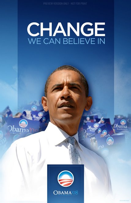
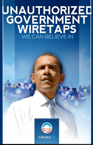
Recently, a number of Obama supporters have become disenchanted with his change of heart on the FISA legislation, particularly the way in which this move makes the senator’s rhetoric about hope and change appear to be mere political calculation.
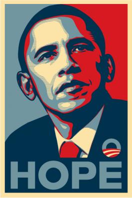
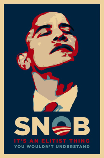
The poster on the right is a reference to what critics have described as Obama’s “elitism.”
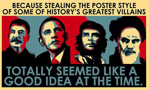
This interesting poster criticizes the Obama campaign for using a poster style associated with revolutionaries like Che Guevara.
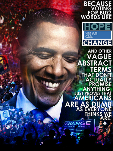
Finally, this poster criticizes the rhetoric of the campaign, insinuating that it is built on buzzwords and lacks ideas.
Recent comments
2 years 29 weeks ago
2 years 44 weeks ago
2 years 44 weeks ago
2 years 50 weeks ago
3 years 4 weeks ago
3 years 4 weeks ago
3 years 4 weeks ago
3 years 6 weeks ago
3 years 6 weeks ago
3 years 6 weeks ago